• Global community
    • Language:
      • Deutsch
      • English
      • Español
      • Français
      • Português
  • 日本語コミュニティ
    Dedicated community for Japanese speakers
  • 한국 커뮤니티
    Dedicated community for Korean speakers
Exit
0

Typographic alignment questions

New Here ,
Aug 10, 2012 Aug 10, 2012

Copy link to clipboard

Copied

hi guys,

as you see in the below image,

what should be the Typographic alignment of ltalic? ( the frist letter C & S)

Screen Shot 2012-08-10 at 9.49.01 PM.png

Views

1.5K

Translate

Translate

Report

Report
Community guidelines
Be kind and respectful, give credit to the original source of content, and search for duplicates before posting. Learn more
community guidelines
Community Expert ,
Aug 13, 2012 Aug 13, 2012

Copy link to clipboard

Copied

LATEST

Sam,

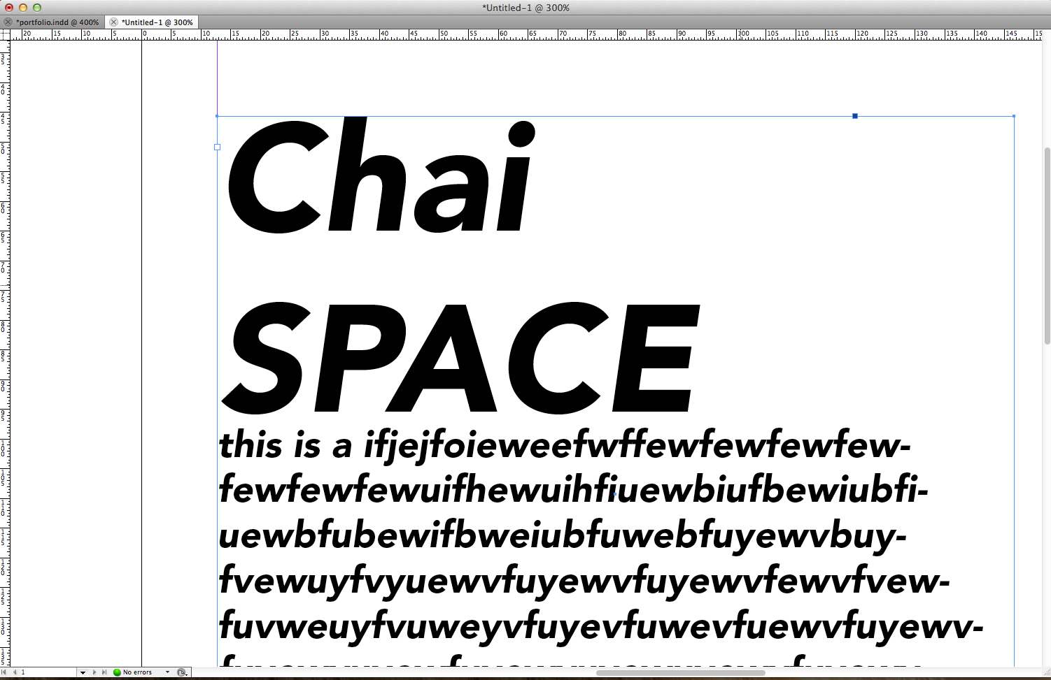
In this case with general left alignment, it would make sense to have the heading left aligned.

You may (or ought to be able to) expect the detailed alignment to correspond to what is inbuilt in the font when used with left alignment (or justification) in applications such as Illustrator, InDesign, and hopefully word processors.

You may use that as a reference.

Basically, in a case like the one shown, the pointed/narrow left side shapes such as the S, t, and f, will extend (a little/tiny bit) further left than the rounded shapes such as the C and the u, to give the appearance of left alignment (the appearance of everything starting at one and the same vertical line).

Appearance being the key word, you may say that what looks right is right (if you look in the right way).

This may be sufficiently woolly.

Votes

Translate

Translate

Report

Report
Community guidelines
Be kind and respectful, give credit to the original source of content, and search for duplicates before posting. Learn more
community guidelines