Copy link to clipboard
Copied
I'm intending to use Arabic Myriad for our next project and I was stting up the styles when I realised that there are serious problems with this font. Some ligatures are wrong and diacritics are overlapping some letters. Can anybody let me know if they have the same problem? Could it be that a newer version of the font available with these problems fixed up? Is there a way to report these problem to Adobe to get them fixed?
Michel
 1 Correct answer
Michel,
Thanks for the details.
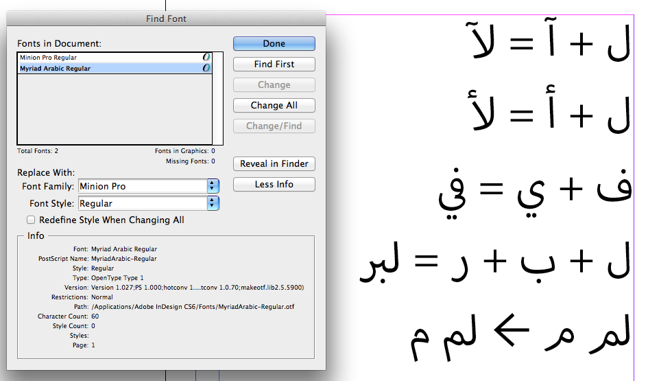
I tested the font in InDesign CS6 Mac and everything worked as expected.
Also, the alternate form of the Meem exists in the font already; to get it you need to use Stylistic Set #3.
See screenshot below.

Copy link to clipboard
Copied
What version of the font do you have?
What application are you using? (name, version number, platform)
Can you provide a screenshot or a PDF, so we can see exactly what issues you're seeing?
I'm a member of Adobe's Type Development team, and our group made the fonts. This is a fine venue to report any problems.
Copy link to clipboard
Copied
Hi Miguel,
The version I'm using is 1.027, and I'm using Indesign CS6 on Mac.
The issue I found so far are:
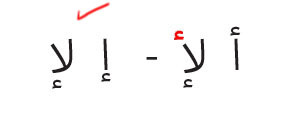
1- The wavy line (Madda) above the "Alef", when used with "Lam" (L) the Madda goes below the "Alef" (the Madda is always above the "Alef". See attached image, The red is the correct placement.

2- Same problem for Hamza, when used above "Alef" when the letter joined with "Lam" it goes below the "Alef". See attached

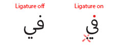
3- The third Problem is just when Ligature is on. The letter "Yeh" when it connect with "Teh", "Feh", "Beh" it becomes wrong. See attached example of Feh (F) + Yeh (Y)

4- Is a problem with the dot of the "Bah" (B). When the "Bah" comes after a "LAM (L) the dot falls very low see attached file.

5- Another problem is with Diacritics, whenever is used on a Ligature character, they overlaps. However this can be fixed with controlling the diacritics horizontally.
6- is a wish. Can we have an alternate Glyph for the "Mim" M when it's at the end of a word?
The reason I'm asking is because I work in Education and the font is excellent for use in educational books because of its legibality, and cleanliness. However the font got rejected from schools because the "Mim" (M) (when it is a the end of the word) it's not very obvious for kids. The shape is more stylistic than traditional and it get confused by kids for a "Ra" (R). see attached sample.

Hope that helps?
Let me know If I can help further.
Michel
Copy link to clipboard
Copied
Michel,
Thanks for the details.
I tested the font in InDesign CS6 Mac and everything worked as expected.
Also, the alternate form of the Meem exists in the font already; to get it you need to use Stylistic Set #3.
See screenshot below.

Copy link to clipboard
Copied
Thank you Miguel,
I can confirm the font is working fine. I tested it at my personal computer using Adobe CC and everything looks great.
I'm not sure where the problem is on my computer at work, I know we are not using an ME version (Which more likely is the problem) but because I didn't have the same issues with "Adobe Arabic" font I thought it must be the font.
The sets 2 and 3 also looks great, BTW. This is an amazing achievement for Adobe.