 Adobe Community
what word spacing?
Copy link to clipboard
Copied
I am reading this tutorial here on typography: http://webtypography.net/Rhythm_and_Proportion/Horizontal_Motion/2.1.1/http://
In chapter 2.1.1 makes a reference to word spacing, it mentions some general guidelines.
The problem is that it stays to them, it does not go any further.
It says for example:
ideal word space varies from one circumstance to another, depending on factors such as letterfit, type color, and size.
Yes, but what type color, letterfit and size.
For example, the typography on my site is blue, 12px, and the font is Berlin Sans FB.
What is the ideal word spacing given the above details?
Thanks.


 11
Replies
11
11
Replies
11

Copy link to clipboard
Copied
"Color" does not mean color in the sense of the rainbow. It applies to
the optical sensation of the ratio between the black print and white
background.
Copy link to clipboard
Copied
Sorry, i do not quite understand your answer.
Obviously we are not talking about rainbow.
In this specific instance, the font color is blue(#05058C) and that of the background light blue(#C7C7FC).

Copy link to clipboard
Copied
"Font color" is not an color like blue, red, or any other color "of the rainbow."
"Font color" is a somewhat abstract idea of how dense a font is. Just replace the words with "how the font looks."
Copy link to clipboard
Copied
Just replace the words with "how the font looks."
Can you give me a practical example please.
Sorry, i am confused.
Copy link to clipboard
Copied
Practical example --
Take a very thick, dark, heavy, extra bold, font and create a paragraph.
Then take a very thin, extra-light font, and type the same paragraph.
The heavier font will need much looser word and letter spacing to look
half-way decent; otherwise the 'color' of the page will be too dark.
The light font, on the other hand, can be set with very tight word and
letter spacing, because otherwise the page color will be too light.
Think of it as the fonts' effect on the percentage of the page covered
with ink. A high percentage is a dark color, a low percentage is a light
color. Changing the spacing will change the percentage - i.e., the
color. Once more - the word color here is a typographic term that has
nothing at all to do with redness or blueness.
- Herb

Copy link to clipboard
Copied
The only time you should need to adjust word spacing is if the typeface is being used at a size substantially different than what it was designed for. In that case you tighten slightly when a typeface is being used at much larger sizes than it was intended for, or loosen when it is being used at smaller sizes than intended.
For example, a typeface like Verdana, intended for body text on screen, being used for a large heading, might benefit from tighter word spacing.
Herb's a sharp guy and has done a great job of explaining what typographic “color” is.
Yet, as a typographer, I disagree rather strongly with Herb's assertions about the need for a user to change the spacing of type based on the "color" of the font. I'd be willing to bet a very nice dinner that the overwhelming majority of typographers would agree with me. Color is essentially inherent in the chosen font, and messing with the word (or worse, the letter) spacing to try to even out the color will just make a mess. Lighter fonts are deliberately designed with looser spacing, and bolder fonts with tighter spacing, as the space between letters is roughly the same as the space inside letters. That isn't something that needs “correction” in order to achieve some different typographic color. Pick a typeface that achieves the color you want, or increase the line spacing, but don't munge the word spacing (or worse, the letter spacing) to get a different color. That will just harm the readability and appearance of the page.
Copy link to clipboard
Copied
Tom is absolutely correct. The only time that a font's built-in spacing
characteristics should be changed is if the font was poorly designed in
the first place, or, more rarely, if some special effect or appearance
is sought.
I have (rarely and I hope judiciously) modified letter and word spacing
when text blocks had to be justified and didn't look quite right
otherwise. Of course this had nothing to do with color.
To go back to JimVag's original question, he mentioned Berlin Sans FB, a
well-formed, interesting font by David Berlow, a founder of the Font
Bureau. It should be used as is.
- Herb
Copy link to clipboard
Copied
Now, i am begining to getting a grasp of the issue, typograpic color etc.You said Thomas that Verdana is intended for the body segment, primarily.
Let us forget for a moment i use Berlin Sans FB in the body text.
Is there any rule that dicates that in the body text we should use some 4-5 fonts(verdana, ariel etc...). Many sites in the web stick to these 4-5 fonts.Probably they do it cause
these fonts are installed in the vast majority of PCs.
Is there a problem if someone starts to experiment with various fonts regarding the body text-taking into consideration always all the important factors(readability etc..)?
And just to understang that i got the lesson , i am attaching a photo, with the background i have in my site and with Verdana font. If i am correct, the combination of the these tho does not "feel" good together (very light) so i must choose i font with thicker typographic color, or maybe i should make it bolder...i don,t now i have the feeling that sth is not good in the picture below. Difficult to pinpoint it correctly.
What do you think?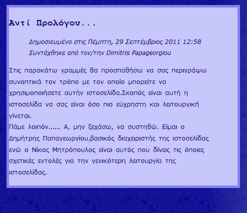

Copy link to clipboard
Copied
Dimitris,
now i have the feeling that sth is not good in the picture below. Difficult to pinpoint it correctly.
What do you think?
In the third and seventh lines, the space after the punctuation mark is missing (before Σκοπος and βασικος).
Copy link to clipboard
Copied
Jacob Bugge wrote:
Dimitris,
now i have the feeling that sth is not good in the picture below. Difficult to pinpoint it correctly.
What do you think?
Jacob, besides that.
I mean, aesthetically, how the paragraph stands, in relation to the combination of colors and fonts used.
Copy link to clipboard
Copied
I know, Dimitris, sorry, it was stronger than I.
There should be a bit of space to the left, of course, between the frame and the text.
Obviously, the italics part is tighter, and the regular part is wider. At the (type)face of it, something in between might be nicer. One way of assessing the look itself is to view it upside down (replacing the text with something nonsensical works to a certain extent).
But, apart from the way it looks, the right spacing between words may depend on both the reader and the text. A A bit tighter may be suitable for easy reading, a bit wider for careful reading.
 AdChoices