- Home
- Type & Typography
- Discussions
- wrong character in garamond premier pro
- wrong character in garamond premier pro
Copy link to clipboard
Copied
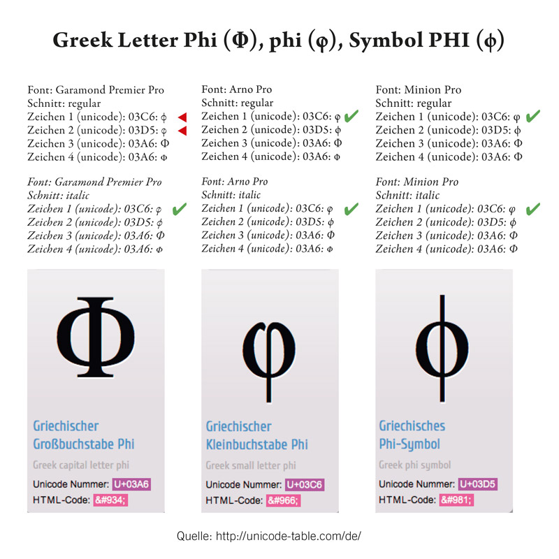
hi, i just found a character miss-match in the font "garamond premier pro" regular (italic = fine).
it´s the symbol PHI (U+03C6) and the letter phi (U+03D5) they are mixed up.
i know there are several variant forms of the symbol "phi" - but they should be consistant in one fontfamily.

 1 Correct answer
I confirm that this was a bug in version 1.014 of the family, which got fixed in the next major version (2.x).
The italics are correct. The bug affects only the phi symbol (U+03D5) of the upright weights; the shape of that character should resemble a circle with a vertical bar through it.
The shape of the italic phi letter (U+03C6) without the vertical stroke above the x-height is "as designed". The shape of that letter in the upright weights is also "as designed".
It seems like you have the older
...Copy link to clipboard
Copied
for clarification:

Copy link to clipboard
Copied
I confirm that this was a bug in version 1.014 of the family, which got fixed in the next major version (2.x).
The italics are correct. The bug affects only the phi symbol (U+03D5) of the upright weights; the shape of that character should resemble a circle with a vertical bar through it.
The shape of the italic phi letter (U+03C6) without the vertical stroke above the x-height is "as designed". The shape of that letter in the upright weights is also "as designed".
It seems like you have the older version of the family. I will send you the corrected version off-line.
Find more inspiration, events, and resources on the new Adobe Community
Explore Now