• Global community
    • Language:
      • Deutsch
      • English
      • Español
      • Français
      • Português
  • 日本語コミュニティ
    Dedicated community for Japanese speakers
  • 한국 커뮤니티
    Dedicated community for Korean speakers
Exit
1

Full discussion list, Content link practically invisible

Explorer ,
Aug 13, 2019 Aug 13, 2019

Copy link to clipboard

Copied

I keep running into this every time I access these Community forums once every few months. That is, infrequently enough to forget the completely unintuitive UI design of this forums -

How do I see the full list of discussions!?  Not just the finite "recent" list, quick links, top issues etc. that are on the Overview pages. Those are all dead ends.

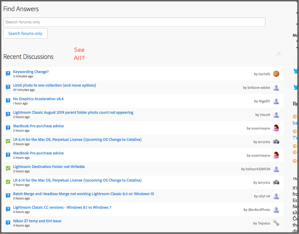
I always look for a "See All" type of link, right near the Recent Discussions section. It screams out to have something like that there. All there is a More button, and it loads a few more, and that's it. No more, no all...

Screen Shot 2019-08-13 at 6.50.36 PM.png

I imagine they think the Find Answers search is the be-all-end all of AI-fueled navigation, so no need for such archaic ideas as a simple list.

Oh, it's the tiny, single, "Content" link up in one of the 2 or 3 headers... (or maybe not. That link in this Forums Help forum is a dead end of sticky posts.)

And in the Lightroom Classic forum, the Content link is camouflaged in the header filmstrip graphics.

Screen Shot 2019-08-13 at 6.54.16 PM.png

Please, in something called a "Forum", please show or lead to the basic forum front and foremost. Then add all the extra stuff around that, not instead of that.

Views

288

Translate

Translate

Report

Report
Community guidelines
Be kind and respectful, give credit to the original source of content, and search for duplicates before posting. Learn more
community guidelines
Community Expert ,
Aug 14, 2019 Aug 14, 2019

Copy link to clipboard

Copied

vrvince  wrote

I keep running into this every time I access these Community forums once every few months.

For following all of the forum content, that is not enough. You either need to look regularly or you need to follow-up by e-mail.

"Standard" users (those with the problems) show anyhow only up when they have a problem. And they follow "their" thread and not all threads.

...but I can confirm you: The fora are not very intuitive and they are by far not user friendly. I'm also struggling from time to time...

ABAMBO | Hard- and Software Engineer | Photographer

Votes

Translate

Translate

Report

Report
Community guidelines
Be kind and respectful, give credit to the original source of content, and search for duplicates before posting. Learn more
community guidelines
LEGEND ,
Aug 16, 2019 Aug 16, 2019

Copy link to clipboard

Copied

vrvince  wrote

I imagine they think the Find Answers search is the be-all-end all of AI-fueled navigation, so no need for such archaic ideas as a simple list.

And you would be correct. The Powers That Be work on the assumption that people only visit the forums to get a specific question answered, and that the only possible routes to achieve that are (1) to type in the search box, and (2) to ask a new question. They reject the idea of "browsing". This is a Q+A database, not a place to chat; hence why the "Adobe Community" name was dropped.

Some of us have been arguing for a more recognizable "bulletin board" style user interface ever since the old software was replaced (which - surprise surprise - looked like a forum) and Adobe actively try to block that idea by removing and obscuring the navigation. On the Embark pages Adobe have removed the mode links (overview/content/people/etc) completely, and said if anyone wants to get to the content page "they can just edit the URL" ... assuming they can guess what to type.

You can imagine how difficult it makes our job as ACPs/MVPs!

The banner graphics and the layout of "widgets" on each page are entirely controlled by the product managers. When they edit a page almost all the widgets are fixed by the corporate theme, so the editor just moves a few boxes around and changes titles. I would say in very slight defense that when editing the overview page the mode links look a bit different - but as soon as you save the changes it's blindingly obvious when the color combination doesn't work. Nobody proofs the changes or checks for accessibility compliance.

Votes

Translate

Translate

Report

Report
Community guidelines
Be kind and respectful, give credit to the original source of content, and search for duplicates before posting. Learn more
community guidelines
Explorer ,
Aug 16, 2019 Aug 16, 2019

Copy link to clipboard

Copied

LATEST

Kafkian.

Use cases -

- A new version of software is released. I am considering upgrading, may not get around to it for a few days, so I go to the forum to BROWSE the topics since the release, to see any issues that have come up.  The Recent list is too short, doesn't go far back enough. The Search is not helpful because the terminology for the upgrade is all over the map and not intuitive (8.4, "august update" "latest update".)

- I come to the forum with a very specific question. Search is only partially helpful because the terminology is all over the map. I'll recognize a relevant question when I see it, but wouldn't have guessed the right search terms in a million years because of the terminology that particular poster used.

- 80/20 rule. If product management is ignoring the 20% who need simple Browse, because they are a minority and not cost-effective to address, consider that this particular 20% might be particularly generous in their spending on adobe products, more sophisticated than than the average user (and thus could contribute better insight, solutions to problems), and the fact that it doesn't cost much to put a simple text link, a few of them in fact, on a page.

Votes

Translate

Translate

Report

Report
Community guidelines
Be kind and respectful, give credit to the original source of content, and search for duplicates before posting. Learn more
community guidelines