 Adobe Community
Known Issues in new skins

Copy link to clipboard
Copied
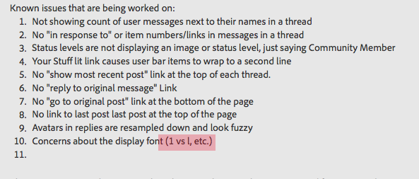
Issues reported in the forums that are being worked on:
- Not showing count of user messages next to their names in a thread
- No "in response to" or item numbers/links in messages in a thread
- Status levels are not displaying an image (meatballs, sausages, red bars) or status level name, just saying Community Member
- Your Stuff lit link causes user bar items to wrap to a second line
- No "show most recent post" link at the top of each thread.(It ssays Latest Reply now)
- No "reply to original message" Link
- No "go to original post" link at the bottom of the page
- No link to last post at the top of the page (same as #5)
- Avatars in replies are resampled down and look fuzzy
- Concerns about the display font (1 vs l, etc.). Jive's editor uses a different font than the actual message posts.
- No navigation links at top of page for threads with multiple pages. If you click into a message that has 2 or 3 (or 100) pages of responses there is no indication that you've been plopped down in the middle of the conversation. This is compounded because the initial message is not differentiated (See #18) and all pages in the thread look alike.
- New/Updated threads in a list not as discoverable (still say Updated, though)
- Inconsistent placement of the Reply button in different locations between question and non-question threads (Was this Helpful link in the question threads in first position, Reply in first position in non-question threads). Was this helpful slow to load, so buttons move around as you try to click on them.
- Advanced Editor not available when replying to posts
- Code in messages (via Advanced editor) is very large:
http://forums.adobe.com/thread/999038 - Replies posted by the person who created the thread are no longer highlighted in the thread.
- Initial message not styled different from replies. And all replies run together in the seamless gray background (related to #16)
- Adobe Employee status doesn't need to be bright orange. But should still be obvious.
- Your own posts are no longer styled different from other posts in a thread
- Keywords difficult to see (white on gray on gray)
- Too much wasted vertical white space on Discussions page (http://forums.adobe.com/message/4383393#4383393)
- User Names wrapping under Avatars
- The MORE link on the thread list on the Overview page takes you to the Disussions page which makes all the breadcrumb links point to Discussions. It isn't clear how to get back to the Overview page from there (click on the large forum name that doesn't look like a link).
- Trademark, Copyright, Registered Trademark symbols unreadable on main forum page
- Going back to the list of discussions takes you back to the latest in the list instead of taking you back where you were when you clicked to go into a discussion.
- Title of thread not displayed when thread grows to more than one page of messages
- If you reply to a message in the middle of a long multipage thread your are taken to the end of the thread instead of staying on the page you were on when replying and it is difficult to go back and pick up again where you were when you posted the reply.
PLEASE NOTE: You may need to clear your browser cache to see some of the updates/fixes as they are released in the forum.
The Forums team is planning reqular releases with new enhancements and fixes soon. Please report additional items and check back soon for updates on release timing and status.


 245
Replies
245
245
Replies
245
Copy link to clipboard
Copied
Takes me to the last one. I tried both the Overview and Discussion views and the "xx minutes/hours ago" link in both took me to the latest post.

Copy link to clipboard
Copied
I would like to see a little large font. The old font of 10 points was small enough seems like this is even smaller.
Copy link to clipboard
Copied
There is also no "Last Post" link at top of page. Very useful when the thread gets long.
Also, there is no post # so difficult to referece comments.

Copy link to clipboard
Copied
Chrome looks almost all white for me.
Also Adobe logo in top left is missing.
GLenn
Copy link to clipboard
Copied
Clear the cache in Chrome to fix that.
Copy link to clipboard
Copied
For me, there is an obvious difference between a 1 and a lowercase l (el) on my computer...
Still keeping it on the list in case it is a browser or platform issue.
Copy link to clipboard
Copied
Thanks John.
Cleared Chrome cache and all looks the same as other browsers.
GLenn

Copy link to clipboard
Copied
The small big small layout needs some love too: http://forums.adobe.com/community/labs/photoshopcs6/
Copy link to clipboard
Copied
Thanks! Looks like they haven't updated to the wide/narrow/narrow layout. Easy fix. I'll take care of it.
Copy link to clipboard
Copied
Noticed the absence of tabs on the CS6 forum? (overview, discussions...)
Copy link to clipboard
Copied
You might not be an admin in that forum. Tabs only show to admins in the new skin.

Copy link to clipboard
Copied
Well, I'll be... Just a few hours in a funeral and I find this long thread (don't know easily how long because messages are not numbered).
1. The button for seeing details in the Announcement on top does nothing in Firefox/Mac, and takes me to a list of topics in Explorer/Win 7.
2. No "reply to first message" button in either combination.
3. No "advanced editor" (or whatever) in either.
3. All messages in white in Firefox/Mac; as described in Explore/Win.
4. Only Reply and Mark as buttons in FF/M; only Reply in Explorer/W; and I am tired of people asking me to clear caches for everything.
5. Avatars so small as to make them useless.
6. And while you are at it, could you get the typeface changed to something more readable on screen as Verdana (which I cannot use right now)?

Copy link to clipboard
Copied
adobe-admin wrote:
Known issues that are being worked on:
- Not showing count of user messages next to their names in a thread
- No "in response to" or item numbers/links in messages in a thread
- Status levels are not displaying an image or status level, just saying Community Member
- Your Stuff lit link causes user bar items to wrap to a second line
5. No "show most recent post" link at the top of each thread.

Copy link to clipboard
Copied
Over in http://forums.adobe.com/community/premiere the related links box on the right side has gone away, so there is no way to go to Encore or Premere Elements forums
I don't think this is a caching issue, as I have IE9 set to flush "everything" every time I exit the program (holdover from requirement at work)
Copy link to clipboard
Copied
I believe that Todd is updating the layout there. I'm sure he will get that fixed up.

Copy link to clipboard
Copied
Low constrast of text overall.
Most specificially light blue over gray, and sometimes white over light gray (keywords).
And the gray background makes each post more difficult to read.
Keywords turned into hashtags for some odd reason.
Orange labels on employee posts are obnoxious. They need to stand out, not stab your eyes out.
Mixed font sizes on topic lists.
Difficult to read colors on topic lists (light blue and gray on gray).
Lots of wasted space above and below each topic -- making half as many topics fit on screen.

Copy link to clipboard
Copied
Not sure if this has already been reported; it's not one of the points in the original message.
I seem to be unable to toggle the advanced editor; without it I cannot post any code.
Copy link to clipboard
Copied
Thanks for the reminder on the Quick Editor. On the list now.
Copy link to clipboard
Copied
But when code is posted, the font is so large that it is near impossible to read; see http://forums.adobe.com/thread/999038 for an example.

Copy link to clipboard
Copied
I just want to reiterate this comment since it didn't seem to make the list:
Pat Willener wrote in #42:
But when code is posted, the font is so large that it is near impossible to read; see http://forums.adobe.com/thread/999038 for an example.
The font size of posted code is so huge it's really annoying. This is especially annoying bceause frequently lines of code are long, and then users have to scroll or wrap to read them. If anything the code should be smaller, but definitely not larger.
Example:
|
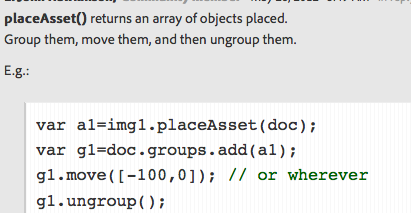
I assume this is an easy CSS change. (I don't suppose CSS changes can be made off-cycle...)
Also, while I'm here, we seem to have lost the ability to add
?decorator=print&displayFullThread=true to a thread in the UI. This was awfully handy when you want to scan a multipage thread to find a post (as I just did now, looking here for Pat's and any comments on it). I suppose it's fine if you can remember the strings to add, but it'd be nice to have them back (was it called print-friendly view? I can't even remember...ah , "View print preview" according to google's cache).
Edit: Bah, it's annoying having to put screenshots inside tables to give them borders so you can distinguish them...
Copy link to clipboard
Copied
The New, Your Stuff, History, Browse pull-downs are inserted arbitrarily just about anywhere, depending on where in the forums we are.
Example, at http://forums.adobe.com/index.jspa it's inserted in the middle of the text:

Inside some topics it's overlapping other links, e.g. in http://forums.adobe.com/thread/999007

Copy link to clipboard
Copied
Pat - I'm not seeing that.
Which browser, version, and OS?
Copy link to clipboard
Copied
Chris Cox wrote:
Which browser, version, and OS?
Sorry, I wanted to post that...
Firefox 12 on Windows XP.
I also just tested it on IE8, it looks exactly the same.
It may have something to do with the screen resolution; mine here is 1024x768.
I will check later when I get home, where I have a much higher resolution.

Copy link to clipboard
Copied
Sorry I did not see this thread before I posted my concern with the minimum size to be able to view the forum correctly
Out of luck if you have a screen size of 1024x768 and that would have your browser occupy all the real estate. Basically at the moment the minimum size to get correct formatting is 1280x768 or thereabouts.
You can see the effect of the different screen sizes by going to the developer tools in IE9 - or hit f12 - then go to tools then resize and you can see the view at differing screen sizes.
MK
Copy link to clipboard
Copied
Chris Cox wrote:
Pat - I'm not seeing that.
Regarding the New, Your Stuff, History, Browse pull-down bar - it looks perfectly fine at home (Windows 7, FF12 or IE9, screen resolution 1366x768); the bar is aligned on the right side, with plenty of space between the left-aligned content.
So the problem only appears on older systems with relatively low screen resolution. If no-one else observes it, I suggest to not waste much time on it.

 AdChoices