 Adobe Community
Turn on suggestions
Auto-suggest helps you quickly narrow down your search results by suggesting possible matches as you type.
Exit
- Home
- Using the Community
- Discussions
- Please change the layout of the overview page
- Please change the layout of the overview page
0
Please change the layout of the overview page
Contributor
,
/t5/using-the-community-discussions/please-change-the-layout-of-the-overview-page/td-p/10756623
Nov 22, 2019
Nov 22, 2019
Copy link to clipboard
Copied
Hi,
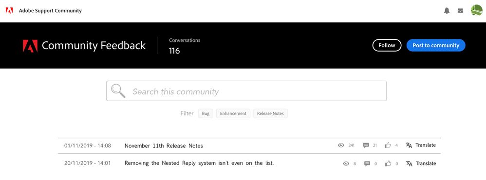
Could you please consider changing the layout of the overview page?
The current layout ignores basic UX/UI principles and uses a lot of unnecessary space. Please make it more compact and readable.
Make the key search feature the main focal point, and add the filters just below. Make the toppic overview section single line...
Thank you.
TOPICS
Enhancement
Community guidelines
Be kind and respectful, give credit to the original source of content, and search for duplicates before posting.
Learn more
Have something to add?
Join the conversation
Resources
Community Quick Tips
Community Guidelines
Community Users and Ranks
Copyright © 2024 Adobe. All rights reserved.
