 Adobe Community
- Home
- Using the Community
- Discussions
- Re: My eyes failing, or has Jive been messing with...
- Re: My eyes failing, or has Jive been messing with...
My eyes failing, or has Jive been messing with the typographical color and contrast of text?
Copy link to clipboard
Copied
Are my eyes failing more egregiously, am I having another one of my increasingly frequent senior moments, or has Jive been messing with the typographical color and contrast of text in the forums?
For some reason, I'm noticing today a very weak gray text and diminished contrast between text and background?
Monitors regularly and often calibrated with hardware pucks.
I had my eyes checked and new prescription glasses in the last few months, now I wondering what other tests I may need. Or is it really Jive messing with us again?
Thanks in advance.


 7
Replies
7
7
Replies
7

Copy link to clipboard
Copied
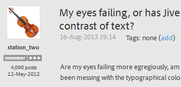
No changes; the site looks normal to me. Any chance you can post a screengrab?
Here's a 24-bit PNG from my display, even if there's something hinky with you browser's rendering of the page, this image should be accurate.
Copy link to clipboard
Copied
Hi,
I don't think that things have changed for a long time but I also have problems reading the forums.
To help me, I have overridden the background colour so that mine looks like this
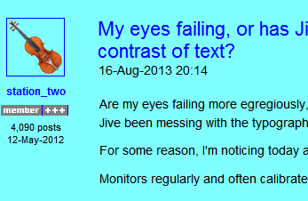
If you are using windows and IE, I could give you further details if they would help you.
Brian
Copy link to clipboard
Copied
LittlePaleFace wrote:
…To help me, I have overridden the background colour……If you are using windows and IE, I could give you further details if they would help you…
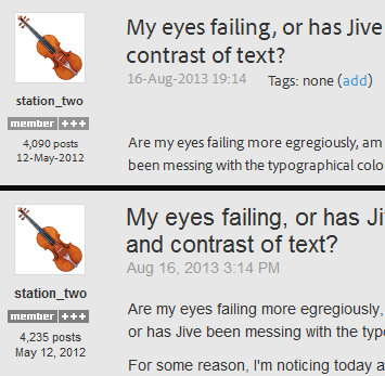
Thank you, Brian, but I'm on a Mac and Firefox 23.0. 
I use a Firefox add-on called "No Color 0.3", which makes the threads look like this:

Copy link to clipboard
Copied
Notice how the gray of the text is also taken out to leave it pure black.

Copy link to clipboard
Copied
There have been many complaints about the grey backgound making reading more difficult, but they have been ignored. However, messages from MVPs and staff are awarded a white background; shouldn't this be the other way round?
Copy link to clipboard
Copied
If Jive hasn't messed with the forum, it's kind of strange that it hit me of all of a sudden today.
Maybe I just need to get some sleep…
Copy link to clipboard
Copied
I hope you have slept well, my friend, and again find the forums to be as pleasurable to use as always. 
Your screen grab seems exceptionally clear and contrasty to me, when shown at full-size.
I have personally blocked typekit.com so as to avoid using the Adobe fonts entirely. That seems to have helped me deal with this place better.
Here's what Dave sees (his screen grab from above) vs. what I see here (mine's on bottom):
Latest trouble for me is that for about the past week I have to log in every time I visit, regardless of the selection of [ ] Remember Me. That's just a little too much trouble to go through to be at this wonderful place. Sigh.
-Noel

 AdChoices