 Adobe Community
- Home
- Using the Community
- Discussions
- Re: Why is the reply box so fricken big?
- Re: Why is the reply box so fricken big?
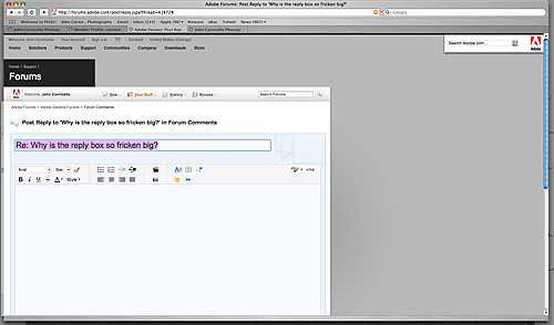
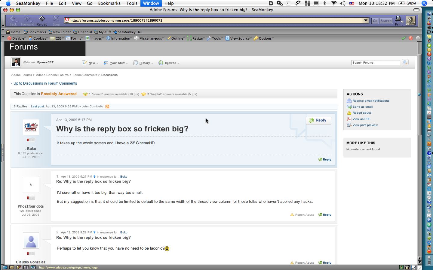
Why is the reply box so fricken big?

Copy link to clipboard
Copied
it takes up the whole screen and I have a 23' CinemaHD


 15
Replies
15
15
Replies
15

Copy link to clipboard
Copied
I'd sure rather have it too big, than way too small.
But my suggestion is that it should be limited to default to the same width of the thread view column for those folks who haven't applied any hacks.

Copy link to clipboard
Copied
Perhaps to let you know that you have no need to be laconic?

Copy link to clipboard
Copied
More importantly (to me at lwast)...Why is the actual posting area so SMALL and fixed in size?
Copy link to clipboard
Copied
Width or height?
Width appears to be set. I cannot get it to stretch out across the screen.
Height is broken. It is supposed to be resizable and is supposed to stick. Right now you can resize, but the new height doesn't stick.

Copy link to clipboard
Copied
Methinks some of us are using one of the user style sheets that allow for flexible width.
#jive-wrapper {
width:100%;
}
I know that when I do, the TinyMCE window stretches nearly as wide as the browser window. <tests....yep>
We should not be giving you feedback about the look of the forum while using hacks that defeat that look!
But I suspect the OP is complaining about the height as you may have sussed out. I really appreciate the height, since I tend to post more code than talk - when I'm in my normal forums. Getting it to be sticky would be a plus, though.
Copy link to clipboard
Copied
Mark A. Boyd wrote:
We should not be giving you feedback about the look of the forum while using hacks that defeat that look!
Agreed 100%.
Copy link to clipboard
Copied
I can appreciate the advantage of a big box for pasting in a big chunk of code but surely that is for a small minority.
Most good answers are short and to the point and I find it irksome scrolling down to that Post Message button every time.
The whole interface is a scroller's nightmare. We'll be getting RSI in our scrolling fingers.
Copy link to clipboard
Copied
John Joslin wrote:
Most good answers are short and to the point...
Hmm...I believe that to be wholly dependent upon the nature of the question.
But anyway, the whole UI has a LONG way to go before it could be considered anywhere close to efficient.

Copy link to clipboard
Copied
Any of you folk bother to scroll down and look in bottom right corner?
The window is resizable Just scroll down, resize vertically then type your reply.
And besides when you are typing a reply you don't have to scroll down to get more real estate to use to right in.
I don't use the bottom of the window to write in.
Copy link to clipboard
Copied
The window is resizable Just scroll down, resize vertically then type your reply.
Well duh!
The aim is to avoid scrolling.
The default should be small and the minority who want big can resize.
Copy link to clipboard
Copied
Just type at the top left corner. Don't worry about the window size.
That's the least of the problems Bother me. The outrageously long subject lines in the emails notifications, the (explicative deleted) serial numbers. No form of sorting subject date, whatever, doesn't allow threading
Copy link to clipboard
Copied
Here's what I see:
Copy link to clipboard
Copied
My Screen:
Copy link to clipboard
Copied
Your screen shot doesn't show the reply box.
Copy link to clipboard
Copied
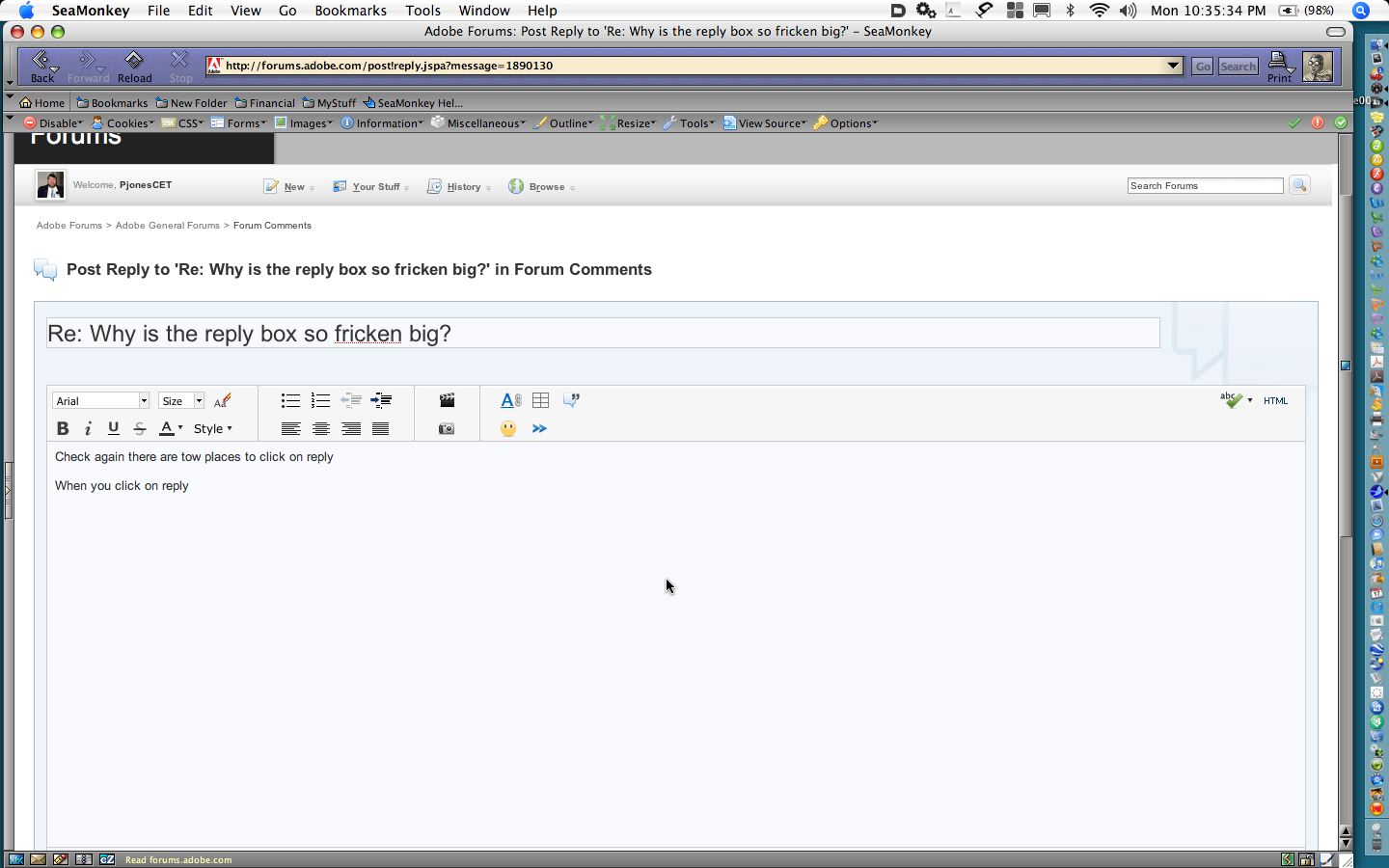
Check again there are tow places to click on reply
When you click on reply this box opens up the when prely is sent only the original and the filed in replies are shown .
This doesn't work like WebX

 AdChoices