 Adobe Community
- Home
- Acrobat
- Discussions
- Re: Acrobat DC User Interface: Way to Change Theme...
- Re: Acrobat DC User Interface: Way to Change Theme...

Copy link to clipboard
Copied
Just installed Acrobat Pro DC -- an first thing I notice compared to my typical darker themes (Windows, Office, and even previous Adobe product versions) is that the user interface is extremely bright. It's like surfing bright webpages, and hard on the eyes.
Is there any way to darken the UI (Themes, etc.) ?


 1 Correct answer

Hi Travis,
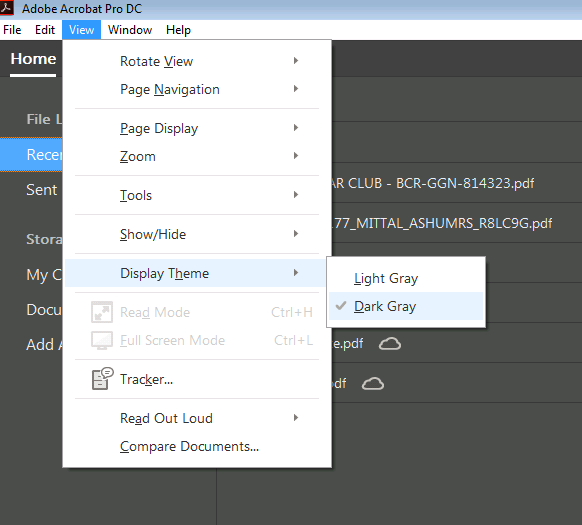
Acrobat DC update released today (10th May, 2016) introduces a new darker theme. Please open Acrobat DC application and go to Help > Check for updates to apply the latest update (2015.016.20039).
Next, go to View > Display Theme > Dark Gray and restart Acrobat.
More details here: What's new in Adobe Acrobat DC
Please try this out and let us know your feedback.
Thanks,
-ashu
 101
Replies
101
101
Replies
101

Copy link to clipboard
Copied
The interface is so terrible. I couldn't take it any longer. I had to revert back to Acrobat Pro XI and now I'm so much happier. It didn't take long. I followed these instructions and it worked:
Acrobat DC uninstalled Acrobat XI | How to get Acrobat XI back

Copy link to clipboard
Copied
This UI is new, but that’s about the only positive attribute I can give Acrobat DC. It’s a classic example of oversimplification to the point where basic features are not accessible in an intuitive way anymore!
Its not just the brightness, the whole UI is terrible! I really hope this new UI is an April fool’s joke... It would be a nightmare if this teletubbies design spills over into Premiere or Photoshop!!!
Thanks for posting procedure for reinstalling Acrobat XI. Will do!
PS: Form should follow function and not the other way round!

Copy link to clipboard
Copied
Gotta add my 2 cents worth. Aside from all the comments here about the look, As I customized the top bar, the icon for Display: Single Page view and Zoom to page level are nearly identical! Hope this screen snippet works:

That's just silly. Even an entry-level UI designer wouldn't do that.
Copy link to clipboard
Copied
Yes, I've noticed problems with the new toolbar also. Those buttons looking nearly the same is ridiculous. In addition, the new toolbar is only one level high and the buttons are a little too big so I can't fit hardly any of my own custom buttons and they end up being stuck in the "..." menu. I wish they would make the buttons smaller and allow a second level of toolbar buttons if desired.
In addition, after the program is (I should say "was" since I reverted back to XI) loaded for a few seconds, it logs into my Adobe account and shows my name in the top right and takes up more space on the toolbar and some of my custom buttons disappear.
Also, what's with the GIANT "Home Tools Document" taking up a huge piece of real estate on the left of the toolbar? I'd like the option to remove those. I don't find myself ever needing Home or Tools. All the tools I want are on the right already or in the toolbar (but I can't see them!), and all that Home shows is basically recent documents which can be simply shown in the File menu (pretty much the standard for most programs for many years), and there is no need for a whole page for that.

Copy link to clipboard
Copied
Oh wow... this is just terrible. I use the "zoom to page level" button so much as well as the "single page view" button and can't believe someone would design something this ridiculous.

Copy link to clipboard
Copied
One short look a the new UI and I immediately dumped it and re-installed Acrobat 11. Thank God I'd saved the previous download on a server drive location....
But I gotta ask... Are you guys (at Adobe) kidding me (us)..?! I was barely able to find most of the 'tools' I've gotten quite accustomed to using, and now seemingly 'need'... and if I'm wasting time looking for what I need, just how productive is that?
But apparently, it might appear that you've adopted one aspect of Microsoft's new 'mantra' - "change for the sake of change..." - and damn the customer input... ("WE know what you REALLY want/need... Just ask us ...")
MAJOR redesign mistake... Sorta like Windows 8 - or for that matter, Vista - and now 10...(?!) Um, guys? How's about you just ASK us what we'd like in the next version, and what we'd like to see changed ...? (What a concept...)

Copy link to clipboard
Copied
Fine....some upper management suit just LOVES his glaring, bright white app background contrasting against his seemingly always dark documents. So, naturally, that means NO ONE can EVER change it?!?! I'm stumped.

Copy link to clipboard
Copied
I have to add my name to this series of complaints...
The new design is appalling. As others have said, it is way too bright with no contrast between documents and interface and no way to skin the UI the way you would like to. Not only that but it fails to remember where you last stored docs, instead featuring an annoying pop up asking me what I want to do next. Coming from the top design software suppliers in the world ( I thought ), you wonder why the team that designed this was not forced to lie on the floor while the rest of the Adobe designers laughed at them.
Seriously, was this designed for a 10 year old occasional user? Take that back a 10 year old would have moved on....
And that ghastly menu which takes up all that space with no contrast. And I know my name, you dont have to include it on the top right.
I really thought XI was a great tool and nice to use. This is a real step back.
Please give us some or all of the following:
- A customisable interface
- An option to choose an "old-style" Adobe Acrobat XI option if we prefer
- The ability to remove annoying features in a proper preferences setting (such as my name - did I mention, I know who I am)
- The ability to alter contrast
- Advanced settings
- etc etc - Everything anyone has said above
And please - if anyone at Adobe actually listens, do NOT take this design and transfer it to your other software.
Copy link to clipboard
Copied
Agree the UI is way too bright. The feature request form they suggest using doesn't have Acrobat DC listed as a program.
Copy link to clipboard
Copied
Yeah, I noticed that, too. I submitted a bug report anyway. Basically saying that it looked like the UI was hijacked. I doubt Adobe will appreciate the humor.

Copy link to clipboard
Copied
As others have said, I very much agree that the UI is way too light. Makes it difficult to distinguish between the white pages in my PDF and the interface.

Copy link to clipboard
Copied
Totally agree. The interface too bright. Personally i'm not a fan at all of this minimalist approach.

Copy link to clipboard
Copied
OMG, who can help with this paper white interface of the UI. This too bright paper white is killing me.

Copy link to clipboard
Copied
You all got a nice thread going on anyway, but it’s hard not to add to this …
Though reflecting on the interface choices for Acrobat DC it is kind of hard to keep a civil tongue.
That for example Photoshop has a dark color theme by default nowadays has been an unfortunate decision at Adobe (as Photoshop is – as far as I can tell – still not primarily video or film editing software) but deciding on a basically white interface for Acrobat seems flabbergasting.
Copy link to clipboard
Copied
The UI is terrible. All the options in a dropdown menu look grayed out. How could anyone think making it this light could be a good thing? The changes that Adobe has incorporated with DC are terrible with no feedback from customers. Seems like some software engineers just trying to justify their jobs by fixing something that didn't need fixing. Well... now it needs fixing.

Copy link to clipboard
Copied
I hate this new DC version so much I have rolled back. I just wonder if there is any way to get notification when they fix the broken mess. There were a few good features, if only they hadn't broken the interface.
This also gives me serious concern about the Adobe Monopoly. Since they are effectively the only solution for my design business what do i do if this revisionist insanity creeps into Illustrator and In design?
I seriously cannot use DC. I am upset that I am paying a subscription for software I can't use. Adobe team; by making this change you have devalued your subscription.

Copy link to clipboard
Copied
I am using Acrobat DC right now and I am about to roll back. The UI is just terrible.
Not only is the interface too bright, the UI itself is child-like and counter intuitive.
The Save As PDF dialogue is just stupid. Seriously, what were the designers thinking? Just give me the standard Windows File Explorer.
Wow, this is an update for the sake of an update.

Copy link to clipboard
Copied
My god this newUI so terrible I can't work with it! It took me about an hour to realise that everything wasn't greyed out, whats more this is in utter conflict with the darker thems of all the other adobe creative suite products. How this was ever allowed to be produced is incredible!
Does anyone know how to roll back to the old version (I am a monthly subscriber - I suspect this means I am stuck with this drivel).
Thanks to anyone who can help.
Copy link to clipboard
Copied
From my earlier post:
The interface is so terrible. I couldn't take it any longer. I had to revert back to Acrobat Pro XI and now I'm so much happier. It didn't take long. I followed these instructions and it worked:
Acrobat DC uninstalled Acrobat XI | How to get Acrobat XI back
Copy link to clipboard
Copied
@ pilvi - cloud - LEGEND. Thanks so much. Arrhh such a relief to have XI back 

Copy link to clipboard
Copied
I agree with all the comments posted herein. I have used all the previous versions up to XI in my previous workplaces, now at my new workplace I'm forced into using DC and it's hideous. All icons are far too indistinct and have too much padding space around them, making them spill off when they could more than easily fit on. It took me ages to work out how to get the basics like the thumbnail pane visible. Or how to add a text box. Even when I managed to turn the thumbnail pane on, I found that I have to extend the width to about half the monitor-width before it shows 2-a-side thumbnails. Again it pads them with a whopping great amount of dead space in between them - just like icons on a Mac in Finder (one of the reasons why I prefer Windows).
The selection marquee behaviour feels very sloppy and slippery, you can't really 'feel' when you've selected something.
All of these points also apply to MS Office 2013. That is hideous too. I can't believe that when 2010 and 2013, or XI and DC are shown together, that people can genuinely believe that the latter in each case is really more "beautiful" or "clean" or "intuitive". In fact, the mere fact that everyone who applauds these changes on web fora always use the same set of adjectives, leads me to believe they're written by plants working for Adobe, Microsoft or (in the case of Android Lollipop), Google. You know the ones I mean, "at last, a beautiful, clean, intuitive UI ! What's with all the haters ?" I think it must be a standard line trained to them all.
I think they're doing it just to brainwash us into becoming unquestioning, undemanding, unproductive drones who end up having to let go of any desire to be in control of what the cloud should do for us, rather than have the cloud decide what we should do for *it*, because in the end people will give up rebelling against these unwanted changes just for a quiet life and so as not to go mad.

Copy link to clipboard
Copied
I only have one comment. The white space was apparently introduced for slate users. The excess white space is a lot less than originally used in the betas. Many of us complained about the extra white space and what is currently in DC is a substantial improvement to the original. For instance the original tools screen took 3 or 4 pages, depending on your screen. It is down to about 1.5 screens. If you would like to see future changes, the best way is to submit a request on the Feature Requests sub-forum. These other sub-forums do not help in getting the requested changes to Adobe, but do provide an outlet for folks to vent.
Copy link to clipboard
Copied
A white (edit: sorry, it is rather a bright gray) background in an application used, amongst others, to evaluate products intended for print seems plain nonsense.
Copy link to clipboard
Copied
Is there a timeline on an update for DC? I cannot use it and have rolled back to XI pro. There are a couple of features that look useful, but this damned non Adobe interface just makes me shudder. Adobe; please go back to Classic Coke!
This is what happens when a race is won. Macromedia swallowed, Corel banished to the hinterlands. Adobe becomes a tyrant inflicting its whim on the design community. This interface is a prime example of the arrogance of a design team cut off from reality. Did they not roll out Betas? Fix the problem, I cannot upgrade!
Copy link to clipboard
Copied
This update is so painfully awful!! Has made me upset more than any software as ever before. Designed by the utmost stupidity.
Does anyone know if you switch to dynamic zoom mode (so scrolling on your mouse zooms instead of scrolling), how you can switch back to normal scrolling? Because just clicking back on the icon won't do that. Why would it?
I hate you Adobe.

 AdChoices