


Copy link to clipboard
Copied
Hello,
is Adobe XD using dp, px, pt? I can´t find this information in the gui.
Is there a option to change between units now?


 2 Correct answers

Hi!
XD currently uses a virtual pixel for most of its measurements (including font size), which should be the same unit of measure as a CSS pixel, or most measurements in iOS. It's roughly equal to 1 physical pixel on a 72 dpi monitor (and, incidentally, a point).
I'm afraid there's no option to change the unit currently. Which units would you find useful?

Hello there,
The pttopx converter you linked is using the conversion of number of pixels = number of points * (pixels per inch / points per inch), where the pixels per inch (or DPI) can change, and 72 is the typical number of points per inch. This whole problem of converting design units to a physical size is tricky, and so, at least for now, XD kind of sidesteps it.
It's easiest to think of XD as unit-less, kind of like a vector graphic, and focus instead on the relationships between elements. Le
... 101
Replies
101
101
Replies
101
Copy link to clipboard
Copied
Hi!
XD currently uses a virtual pixel for most of its measurements (including font size), which should be the same unit of measure as a CSS pixel, or most measurements in iOS. It's roughly equal to 1 physical pixel on a 72 dpi monitor (and, incidentally, a point).
I'm afraid there's no option to change the unit currently. Which units would you find useful?
Copy link to clipboard
Copied
Hello,
I work on iOS and Android Applications.
For Android our developer wants to have the font sizes communicate in pixel, but based on a 160 dpi view which is the base size for Android.
But I even make the test:
Saved a view from XD as PNG. Opened it in Photoshop as a 72 dpi view. And checked the size of the fonts. Its the same I use in XD.
Cool.
Thank you for your help.

Copy link to clipboard
Copied
SO are you saying that the system XD uses is the same as point when on a 72dpi screen?

Copy link to clipboard
Copied
I would use PT, like Sketch does, due to diverse pixel densities across devices. My monitor, for example, is 96 dpi. So, for a 20px font to render the same size as a 20pt font I have to increase the font size to 27px. But say, another person were viewing my design with a 72 dpi screen then the 27px text with would be much larger than I intended. It would render as the equivalent size of a 27pt font.
So, this becomes a huge issue in a work space where the design may be viewed or created on multiple screens with differing pixel densities.

Copy link to clipboard
Copied
I just want to be super clear in understanding this answer about font sizes...
Are you saying that I can take the text that was meant to be 46px in CSS size
Enter that size directly into an Adobe XD artboard that is 1920x1080 in size
and this will be an accurate representation of the font size for my development team?

Copy link to clipboard
Copied
To be very clear: if you're developing in relative sizes, your developers should be able to use the relationship between your font size and your artboard size and give you exactly what you're looking for.

Copy link to clipboard
Copied
yeah, what if they dont? Like mine, dont relay on dpi's, screen sizes, only on DP, which XD in theory handles awsome, in practice, not so well
Copy link to clipboard
Copied
Currently my development team doesn't even know what relative screen sizes mean... To be honest I barely understand the concept my self, but I do know that it is essential to understand the way your type needs to scale for a screen. I just wish there was a XD could aid designers in figuring this out.
Copy link to clipboard
Copied
elainecc could somene explain me some 100% working ratio?
like for example if i have a 1080 x 2160 pixels resolution (~409 ppi density)
what should i insert in Adobe XD that would be equal to 1:1
so 1 dp = 1 dp for developers
10 font size = 10 font size for developers
because now, if the devs are giving me some screen shots like for example something that should be 360dp wide.
is NOT 1:1 with the design, and vice versa

Copy link to clipboard
Copied
iOS only uses points and it is not true that pixles to points is 1:1, it grows as the number gets bigger. Here is an example of a converter to demonstrate, http://pttopx.com/
Convert PT to PX - Points to Pixels Converter & Calculator
PT PX
1.33 1
13.33 10
26.66 20
66.66 50
This becomes a huge issue for translating font sizes and dimensions to my iOS developers. For an Xd artboard of iPhone 6/7 is at 375x667 PIXELS, however iOS specs list it as 375x667 in POINTS. There is no conversion what so ever, but uses the same number.
Copy link to clipboard
Copied
Hello there,
The pttopx converter you linked is using the conversion of number of pixels = number of points * (pixels per inch / points per inch), where the pixels per inch (or DPI) can change, and 72 is the typical number of points per inch. This whole problem of converting design units to a physical size is tricky, and so, at least for now, XD kind of sidesteps it.
It's easiest to think of XD as unit-less, kind of like a vector graphic, and focus instead on the relationships between elements. Let's say you design an iPhone 6/7 artboard at 375x667 units, and it uses type with a 10 unit font size. That relationship is the same, no matter what physical size your design is scaled to. You could rasterize your design to an image where each unit maps to 1, 2, 3, or even more physical pixels. And this mapping happens quite frequently, when you render to the screen, or export a bitmap image, or preview the design on your phone. On MacOS/iOS this abstract "unit" is called a Point (see Points vs Pixels, and PaintCode's Ultimate Guide to iPhone Resolutions), which typically matches up with the 1/72 inch definition above (for example, when printing), but not always (displaying on a monitor). So in the above design, since you are designing with the mapping of 1 XD unit to 1 iOS point, the artboard dimensions you can give to a developer are 375x667 points, and the font size would be 10 points. The key here is that you will need to always think about what that final mapping is, from an abstract XD unit to the final development one, be it pixels, points, or something else.
Down the road, we're hoping we can more thoroughly investigate the problem of design to display unit conversion, but this is how the application currently works.
Hope that helps,
-Bear
Copy link to clipboard
Copied
In addition to Bear's answer it's useful to note that on iOS 1pt in a native app is equal to 1px in CSS, and on Android 1dp in a native app is equal to 1px in CSS. So if you have an image and display it at 100x200pt on iOS, 100x200dp on Android, and 100x200px on a web page, they will appear at the same size on the same device.
(Also note that CSS has its own pt unit, which is 1.333 (96/72) times larger than a px, however this is different from an iOS pt.)

Copy link to clipboard
Copied
thanks for the info.

Copy link to clipboard
Copied
Ok this is super confusing. Anyway to just answer this...If I'm handing off designs to the developer do I need to make any conversions I designed at 375x667 and used the spec export (beta). In looking at the specs no matter what you choose px, pt, dp they are all the same. I have been given a conversion of px=dp*(dpi/160). So if designing for multiple phone screens (iOS/android) do I need to do any conversion or trust that if my text is 60 (XD unitless) away from the side that I don't have to do a conversion??
Copy link to clipboard
Copied
Ok this is super confusing. Any way can this be answer straight out...If I'm handing off designs to the developer do I need to make any conversions I designed at 375x667 and used the spec export (beta). In looking at the specs no matter what you choose px, pt, dp they are all the same. I have been given a conversion of px=dp*(dpi/160). So if designing for multiple phone screens (iOS/android) do I need to do any conversion or trust that if my text is 60 (XD unitless) away from the side that I don't have to do a conversion??
Copy link to clipboard
Copied
You will not need to do any conversion, as long the developer is working in `pt` on iOS, `dp` on Android, and `px` in CSS. This is why the units don't change in design specs 
If the developer is using any other unit, such as native `px` on iOS or Android, then they will need to make the conversion, however this conversion depends on the pixel density of the device the application is running on. The formula you have above is correct for Android (see Supporting Multiple Screens | Android Developers ) however it is up to your developer to make this calculation based on the current device's pixel density. If you, as the designer, make this calculation in advance then the measurements will be incorrect when the application is viewed on, for example, a mdpi then an xxhdpi device.
I hope this helps!
Copy link to clipboard
Copied
This doesn't work, however, for the line-height and letter-spacing. If I want to translate it into CSS I have to divide type size by 1000 and then multiply whatever number is in the letter-spacing box. The same calculation doesn't work for line-height and I have no idea how to change this.
Please advise. It's holding up projects and super confusing
Copy link to clipboard
Copied
XD uses milli-ems (1/1000 of font size) for character spacing, and line spacing uses the same units as font size. For CSS conversion, this typically means:
CSS letter spacing = (XD line spacing / 1000)em
CSS line height = XD line spacing (using the same units as the CSS font size)
You should note that line spacing is not exactly the same as line height. Line spacing is a baseline to baseline measurement, where line height creates a box that positions inline elements. Often, there may be a small vertical adjustment of the entire text element when moving between the two. There is a pretty in-depth look at what CSS line-height means over at iamvdo.

Copy link to clipboard
Copied
Bear_Travis
You state above:
"CSS letter spacing = (XD line spacing / 1000)em"
What? How does this make sense? Was this a typo?
What are the units for character spacing in the desktop app? And then how are they converted in the Share For Development spec?
Thye always seem to be decimal numbers in the spec but how does that translate to pixels? There are no half or partial pixels.
Please resolve this ASAP.

Copy link to clipboard
Copied
I guess Bear_Travis made a mistake – he comes close, but it's not line spacing, it's not line height – it's character height/size. And it's measured in thousands of the size, just like in old-school typography in InDesign. So a value of 1000 means a whole "em" fits between the characters. Wanna know more about it, and how it is inappropriately converted into pixels for developement ?
Read my answer here (a bit further down...)

Copy link to clipboard
Copied
+

Copy link to clipboard
Copied
em's would be a pretty useful unit I guess
Copy link to clipboard
Copied
OK so i still have a problem disigning for Android screens. And what i researched, i came to this conclusion. Please tell me if i am thinking ok or not.
For many devices with many DPI the best way is to start a design with the width of 160dp
so selecting and XD android mobile 360x640 , resize it to 160x proportion. And from there 1dp = 1 font size and so on. Andeverything should be 1:1
from there we can use the font scaling dependin on DPI so:
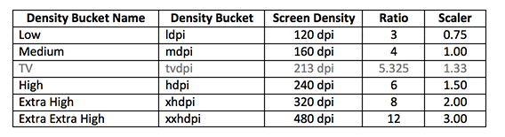
so if i start 1:1 160 dpi, and design for a 480 screen later on, i'll do 3x the font size, and everything should be ok?
also i was so angry hearing that windows font scaling affects the XD app, that was like , WTF.

Copy link to clipboard
Copied
How can i resize every artboard to 160x proportion?

 AdChoices