 Adobe Community
- Home
- Bridge
- Discussions
- Re: Bridge 2019 has big gaps between images in con...
- Re: Bridge 2019 has big gaps between images in con...

Copy link to clipboard
Copied
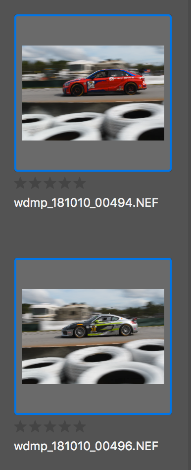
I am very frustrated. Bridge 2019 now has big, unused gaps between images in the "content" window and between my keywords. This means there is a lot of unused space, and more scrolling. Bridge 2018 was MUCH more compact. Is there a preference for "classic" view, or something like that? I have no idea what purpose this change served. Please help.


 1 Correct answer

Hi Wes,
Request you to let us know the issues or feature requests that you have for Bridge CC 2019 and post them on Adobe Bridge Feedback for further voting and discussion.
Regards,
Abhishek Seth.
 8
Replies
8
8
Replies
8

Copy link to clipboard
Copied
Adobe has a common interface and development framework, Bridge was changed over to that new UI. I'm guessing it was in part to have a common look and in part because of changes made by Apple and Microsoft to their operating systems.
Bugs have been submitted about issues with the new look. Please post on feedback.photoshop.com with specific information so for the Bridge team.

Copy link to clipboard
Copied
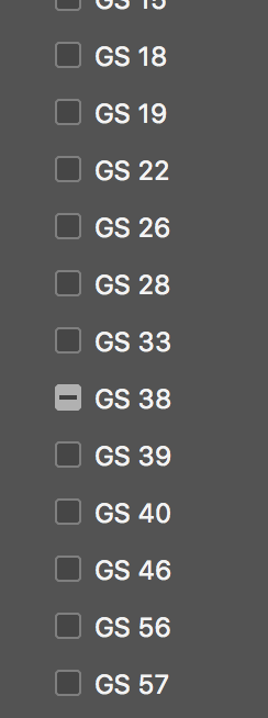
Yes, so much space between folders so now it is a bit of a hassle to scroll through as you're seeing half as much vertically.
Please vote for this on Feedback:
Copy link to clipboard
Copied

Copy link to clipboard
Copied
Hi All,
The change in spacing between images (in Content panel) is to allow some space for image/file deselection. There was user feedback about little space for deselection.
The change in vertical spacing is to increase Readability and Accessibility.
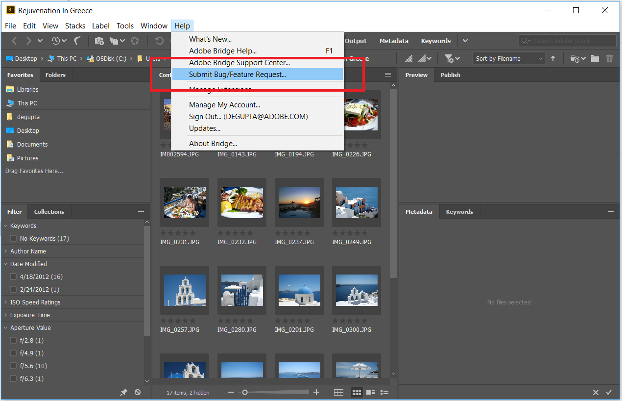
Bridge now has a uservoice webpage to submit feature request and bugs, and this webpage is accessible from product as shown in screenshot below. In case you need to report a bug, and want vote from other users as well, then you can log that on uservoice, and Bridge team will continue to look and address top voted issues.
Thanks,
Deepak Gupta
Copy link to clipboard
Copied
If users wanted more space, than Adobe is listening to the wrong users. Sounds like the users that requested this "feature" don't know how to use a mouse.
Copy link to clipboard
Copied
For what it's worth, I cannot submit feedback because I reverted to the previous version of Bridge because of this and other bugs. Version 8.1 is MUCH better in many respects. Just fix bugs with 8.1 and scrap this new version, please.
Copy link to clipboard
Copied
Hi Wes,
Request you to let us know the issues or feature requests that you have for Bridge CC 2019 and post them on Adobe Bridge Feedback for further voting and discussion.
Regards,
Abhishek Seth.

Copy link to clipboard
Copied
you think your's was bad, check out wide images. OMG. cant believe you cant adjust that. even my shrek thumb can deselect

 AdChoices