 Adobe Community
- Home
- Color Management
- Discussions
- Re: Is my color management wrong?
- Re: Is my color management wrong?
Is my color management wrong?

Copy link to clipboard
Copied
Hey folks!
I finally got myself a decent device for editing and started to get into the color management topic. I am quite confused by now and I hope it is alright to ask some questions!
So currently I am doing it like this:
I take a picture in RAW on my Nikon and load it in my macbook (air M2) into Lightroom classic. I basically understand that Lightroom converts this RAW Information into something? with a ProPhotoRGB color space. Now I do my Lightroom editing and afterwards export it as one JPG with sRGB and one JPG with AdobeRGB. I want to use the sRGB one for the internet (my website, instagram, sending to people) and the AdobeRGB one for showing the picture on my devices.
So, I am questioning a lot about this "workflow" by now.
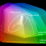
Is editing in ProPhotoRGB recommended with my Macbook set to Display P3?
I basically want to use all information I have for editing and if I understood this correctly, my Macbook will show me all the colors its possible to represent from the ProPhotoRGB color space and will fully use its native? P3 color space. In the end, Lightroom has more information for converting it into something smaller, like sRGB. Am I correct with this?
Is it nonsense to use AdobeRGB for my JPGs?
I want these JPGs for the archives and on my devices, for example my Macbook, to be able to fastly show them around to friends, family, ... and I want to do this with the best quality available. I hoped to get "more color details" with the AdobeRGB ones in comparison to the sRGB ones. It seems kind of disapointing having all the color information but in the end, everything ends within sRGB. Should I rather export them with display P3?
I hope this isnt asked to much and thanks in advance!


 18
Replies
18
18
Replies
18
Copy link to clipboard
Copied
Is editing in ProPhotoRGB recommended with my Macbook set to Display P3? - No, mainly because Display P3 is much smaller of a gamut than ProPhoto and your Macbook can not show you ProPhoto color space. Use sRGB if that is your final intended color space for making pixels. Adobe RGB is a good space to create images, but you need a wide gamut display to see it.
sRGB is a very small gamut suitable for the internet, but for most printing purposes, it's too small. Display P3 is an unknown quantity outside of your world. But saving embedded images is always better than not.
Color "details" will depend on your display. As mentioned above, a wide gamut display benefits a photography workflow.

Copy link to clipboard
Copied
ProPhoto is risky unless you're fully aware of the implications and understand how to handle such a huge color space. You will quickly end up with quite umanageable files that will not look good in any kind of output.
I'd recommend Adobe RGB for your master files, and sRGB for web and any other purpose where you don't know how it will be seen and treated.
Side note:
DisplayP3 seems to be used everywhere in the Mac community nowadays, which is actually very unfortunate. It's basically a display profile - but if you use that on document level, you're actually disabling all color management, simply because the two profiles are the same (null transform). That's not how color management is supposed to work. The problem is that this encourages bad habits, and if the color management chain breaks, it will not be noticed. It will probably work within the Apple bubble, but cause problems outside it.
In short, avoid DisplayP3.

Copy link to clipboard
Copied
@D Fosse " DisplayP3 seems to be used everywhere in the Mac community nowadays, which is actually very unfortunate. It's basically a display profile - but if you use that on document level, you're actually disabling all color management, simply because the two profiles are the same (null transform). That's not how color management is supposed to work. The problem is that this encourages bad habits, and if the color management chain breaks, it will not be noticed. It will probably work within the Apple bubble, but cause problems outside it.
In short, avoid DisplayP3."
As long as the P3 profile is embedded it should be OK outside mac users?
P3 seems to be coming, not only Apple devices but many handhelds have a P3 gamut. And quite a few display screens for sale are P3 too AFAIK, I can see a time when it becomes the default of the internet.
I hope this helps
neil barstow, colourmanagement net - adobe forum volunteer - co-author: 'getting colour right'
google me "neil barstow colourmanagement" for lots of free articles on colour management

Copy link to clipboard
Copied
D Fosse is a world-class colour management expert so I hate to contradict him but as as you are a beginner I suggest IMO you stick to sRGB until you get your head around colour management workflows.
Copy link to clipboard
Copied
Yeah, that works too 😉
Copy link to clipboard
Copied
@Florblad - @D Fosse writes: "ProPhoto is risky unless you're fully aware of the implications and understand how to handle such a huge color space. You will quickly end up with quite umanageable files that will not look good in any kind of output.
I'd recommend Adobe RGB for your master files, and sRGB for web and any other purpose where you don't know how it will be seen and treated."
He's right, ProPhoto is a massive colour space and users often push colours too far withing that colourspace. The fact that you cant see the entire ProPhotop gamut on any screen, let alone a P3 gamut screen is also an issue. Then the massive file has to be shrunk to a print gamut or maybe sTRGB for online use / sharing etc. Not ideal
You wrote:
"I take a picture in RAW on my Nikon and load it in my macbook (air M2) into Lightroom classic. I basically understand that Lightroom converts this RAW Information into something?"
Processing a RAW file creates an RGB file suitable for editing down the line.
It's good practice to archive the RAW too! It has more information than the RGB produced by processing it.
AND
"Is it nonsense to use AdobeRGB for my JPGs?
I want these JPGs for the archives and on my devices, for example my Macbook, to be able to fastly show them around to friends, family, ... and I want to do this with the best quality available. I hoped to get "more color details" with the AdobeRGB ones in comparison to the sRGB ones."
Using Adobe RGB for files to be shown on your Mac is fine. But for files which are to be shared and perhaps viewed outside of colour managed applicationsAdobe RGB may create issues. sRGB is better for web and sharing to non pro users IMO. So - you are right to make the sRGB version
You can read up about ICC profiles here
JPEGS - beware that format
I would not be resizing a JPEG but a TIFF then after resizing save as JPEG
Why?
A few notes on jpeg:
Jpeg files have compression applied, changing resolution or cropping and re-saving enhances the compression artefacts - this means that Jpeg is only really suitable for final file delivery/transfer - with the Jpeg created only once size and resolution (and any sharpening) have been completed.
So,Jpeg is a far from ideal for editing and not OK for archiving or for any file that may need to be resaved, resized or cropped down the line.
Jpeg is the worst possible format if you want to keep high quality - you should always archive a copy of your original, ideally with any adjustment layers intact - if you work with layers.
Jpeg compression (at any setting*) really is "lossy”, irreversible and cumulative, so Jpegs should ONLY be used only for final delivery and only created from the original file format AFTER resizing & cropping to the FINAL size and crop.
To explain: any edits to size or crop, or even just re-saving a Jpeg file means further compression, potentially that’s very damaging.
The JPEG compression damage is not always immediately apparent, which is perhaps why it's still widely used - however, that compression will soon cause issues if you do further work and save again. That’s when you’ll see a Jpeg with some real issues.
*don’t imagine that selecting maximum quality for your Jpeg is preserving the original data, it’s still compressing a lot which discards information.
SO, don’t re-use Jpegs if any resizing or resaving is needed. Always go back to the PSD/ Tiff originals, Jpegs are essentially a 'use once and trash' file type.
@D Fosse wrote earlier:
jpeg is the worst possible format if you want to keep high quality. Jpeg compression is always destructive, non-reversible and cumulative. Not only is it discarding original data, but it's also introducing compression artifacts. Don't be fooled by the setting sometimes called "maximum quality" jpeg, meaning least compressed - there is no such thing as maximum quality when it comes to jpeg. It will degrade the image at any setting.
The only purpose of jpeg is to reduce file size for final delivery, with the implication that the immediately visible quality loss is acceptable. The reason jpeg still survives is because that size reduction is incredibly effective, it can shrink a file down to 2-5% of native size.
Never work on a jpeg, never resave a jpeg if you can avoid it. It will degrade further with every new save.
Printing is usually done from TIFF. PNG is a web format, not intended for print-related work.
Jpeg is usually fine provided you only save out once, at the very end, for final delivery. Save out a jpeg copy from the original master, which should be PSD or TIFF.
While the jpeg damage is normally not immediately apparent (which is why it's still widely used) - it will soon hit you if you do further work on it. Then a jpeg rapidly falls apart.
I hope this helps
neil barstow, colourmanagement net - adobe forum volunteer - co-author: 'getting colour right'
google me "neil barstow colourmanagement" for lots of free articles on colour management
Help others by clicking "Correct Answer" if the question is answered.
Found the answer elsewhere? Share it here. "Upvote" is for useful posts.
Copy link to clipboard
Copied
He's right, ProPhoto is a massive colour space and users often push colours too far withing that colourspace. The fact that you cant see the entire ProPhotop gamut on any screen, let alone a P3 gamut screen is also an issue. Then the massive file has to be shrunk to a print gamut or maybe sTRGB for online use / sharing etc. Not ideal
By @NB, colourmanagement net
Just double-checking my assumptions about some things, so I’ll consider what you and D Fosse would say about this:
Do you think it’s reasonable to work in ProPhoto RGB if soft-proofing is used to check edited colors against the output color space, and if the file is being edited at 16 bits per channel (or higher)? Because that’s how I do it.
If soft-proofing shows that I am pushing colors beyond gamut regions reproducible by wide-gamut displays or extended ink set photo printers, I pull back those edits. And I am under the impression that the imprecision of 8 bits per channel can potentially result in banding when editing in color spaces larger than roughly Adobe RGB, so if I decide to edit in ProPhoto RGB it’s only at 16 bits per channel or more.
Copy link to clipboard
Copied
As always, it depends on what you do. The following is my experience based on the work I do (which is mostly "straight" naturalistic photography).
First of all - if you shoot raw, out of gamut colors aren't really a big problem anyway. You can always go back to the original and re-process, or even bring in a re-processed channel separately, or problem areas. No doors are shut. It's a different situation if you have a final ProPhoto RGB file which is out of gamut in the output space. That requires more extensive gamut remapping.
So on to my more specific reservations about ProPhoto:
With the virtually unlimited size of ProPhoto, your file will quickly contain colors that cannot be reproduced anywhere, in any medium. In other words, they will clip in output. Clipped colors never look good.
Here's how clipping looks. Note the blue channel in the histogram, and the dense unpleasant yellow in the shadow background - that deep yellow is contained in ProPhoto, but clipped in Adobe RGB. Gamut remapped version on the left, original on the right, both shown in Adobe RGB:

Then there's the compressed shadow values. With that huge gamut, something has to give.
Here's an image with an unpleasant blue color cast in the shadows. You can't quite put your finger on it, it just doesn't look good. In Adobe RGB, the problem is immediately apparent, easily diagnosed and fixed. In ProPhoto, it's almost completely masked. Trying to correct this in ProPhoto, if you can even identify it, will be very tricky:

So, I'm not a big fan of ProPhoto. The disadvantages far outweigh any advantages, which are mostly theoretical anyway. My philosophy of "good color" is that it's not about chasing maximum saturation, it's about color relationships.
Reproducing a live scene, you can never achieve colorimetric accuracy. What you need to aim for is not accurate color, because you won't get it, but equivalent color. That will be accepted as accurate.
Copy link to clipboard
Copied
@D Fosse that’s a great explanation with useful examples. @Conrad C does that cover it for you? Pro Photo is "OK" in skilled hands but has plenty of opportunities for messing up for others. Personally, I don't like it.
I'm a fan of Joseph Holmes' specifically targeted camera gamut colorspaces. There is a lot of sophistication there and the workflow enables some very elegant ways to adjust saturation without affecting luminance.
I hope this helps
neil barstow, colourmanagement net - adobe forum volunteer - co-author: 'getting colour right'
Copy link to clipboard
Copied
Neil, Just a heads up. "Joseph Holmes' specifically targeted camera gamut colorspaces" were all made with the presupposition that cameras had gamuts. They do not, and raw files are only sensor data. So the optimal container space will be, one that is easily transformed to the destination color spaces of any given workflow.
Copy link to clipboard
Copied
@Bob_Hallam hmm, you'd have to take that up with Joe.
I've found that, in practice, once an ICC input profile has been created using a decent target and software - to characterise the camera data under certain conditions, then the resulting file's gamut can be assessed up against Joe's various offerings - selecting one as a suitable container.
Meaning that data does not get clipped of detail in "out of destination gamut" areas by converting to an unsuitable (too small) working colour space. So many non ProPhoto colourapace users simply choose Adobe RGB and clip camera detail.
Happened all the time with scanner data, now it's happening with camera data - just my opinion of course.
I hope this helps
neil barstow, colourmanagement net - adobe forum volunteer - co-author: 'getting colour right'
google me "neil barstow colourmanagement" for lots of free articles on colour management
Copy link to clipboard
Copied
"then the resulting file's gamut can be assessed up against Joe's various offerings - selecting one as a suitable container." That is a very different thing than what you said earlier Neil. Producing an image gamut is not the same as "camera gamut colorspaces" Since there is no gamut on an image until it inhabits a color space in pixel format. Data from any Raw file that is transformed into pixels, regardless of the CIELab values associated with them will never be "clipped" going into that first color space. The pixels are rendered into that colorspace, whether ProPhoto, sRGB, or any other. Each will represent the image based on the gamut of the container space. Scanner data is not Raw sensor data. In a digital camera, sensor data is a text file that contains the information from when the sensor recorded the image. The user could "clip" that sensor data by over- or under-exposure, but an otherwise correctly exposed image will never be clipped if a Raw file workflow is used.
Copy link to clipboard
Copied
@D Fosse that’s a great explanation with useful examples. @Conrad C does that cover it for you? Pro Photo is "OK" in skilled hands but has plenty of opportunities for messing up for others.
By @NB, colourmanagement net
The points are all well taken, but they raise a follow-up question: If ProPhoto is not recommended, does that make editing color in Lightroom Classic and Lightroom not recommended (at least for the inexperienced), given that Adobe set ProPhoto RGB as the unchangeable native color space of the Develop/Detail raw editing module, and all imported files are brought into that color space?
Or, would it be recommended that people only use Lightroom Classic and never Lightroom, on the basis that Lightroom Classic (and not Lightroom) is able to edit while soft-proofing for Adobe RGB which also changes the histogram to Adobe RGB?
(Adobe Camera Raw is different because you can set the editing color space in Workflow settings to Adobe RGB if you want.)
Copy link to clipboard
Copied
That's a false comparison. Lightroom's internal color space is not the same as the ProPhoto RGB output color space.
You are supposed to remap that in processing. That's what processing is.
It's a common notion that you should use ProPhoto because that's what Lightroom does. But it doesn't, there's a conversion there in any case. These two are not linked.
I don't use the cloud Lightroom, but if it can't soft proof, that's a serious shortcoming. Soft proofing in LrC is equivalent to ACR's standard operation.
It has always been a basic tenet of image processing that it pays to do everything as early as possible in the process. That avoids much bigger problems later.
Copy link to clipboard
Copied
Except if you have a late binding CMYK workflow. In that case, it pays to keep your files editable and repurposable, keeping file sizes small.
Copy link to clipboard
Copied
Yes, agreed. That's the exception.
Copy link to clipboard
Copied
To add to the comments below, Checking an Image on screen in ProPhoto RGB is not possible, but some large gamut print processes are larger than Adobe RGB in places, so ProPhoto has its place for those. The normal workflow for printing to a high gamut device like described above is to export from Raw, which is just camera sensor data and contains no "gamut" into ProPhoto RGB, then convert to the printer profile in perceptual rendering so the gamut is not "Clipped" but this decision is image dependent. The color space is huge, but the image may not inhabit all of that space. That is why the space is used and why it is useful for this workflow.
In a high-end workflow, stick to equipment choices that support it. Adobe RGB is a large enough color space to provide bright colors, in good-quality print processes. sRGB on the other hand is smaller than most high-quality print processes and only good for internet files.
Copy link to clipboard
Copied
@Bob_Hallam It seems to be a common misconception that Perceptual rendering does not clip.
I believe it can clip - because it does not scale the entire input colour space into the destination space, on the outbound side of the PCS, it scales a preset "volume" that the profile software manufacturer expected to contain usable data (sometimes this is adjustable in profile making as you know).
If a Perceptual conversion did scale the whole of the massive pro photo colour space into a printer colour space then the image saturation overall would be very severely scaled and it's not.
I was taught the above by 'Mr. Photoshop' Thomas Koll and my friend Steve Upton at Chromix (who understands ICC profiles in ways I couldn’t even dream of)
This is what I teach:
In practice Perceptual Rendering is often less useful than it may appear it might be from the standard description of it’s features. The actual situation with a Perceptual Rendering is a little less ideal than it may at first seem because
1: Mapping is NOT of the entire source space to the destination space.
This means that clipping can result.
2: Conversion might result in un-needed compression of less saturated images
3: Generally, it seems that the Percepotual calculation is “centre” weighted, so that near saturated tones may suffer concatenation.
neilB
 AdChoices