

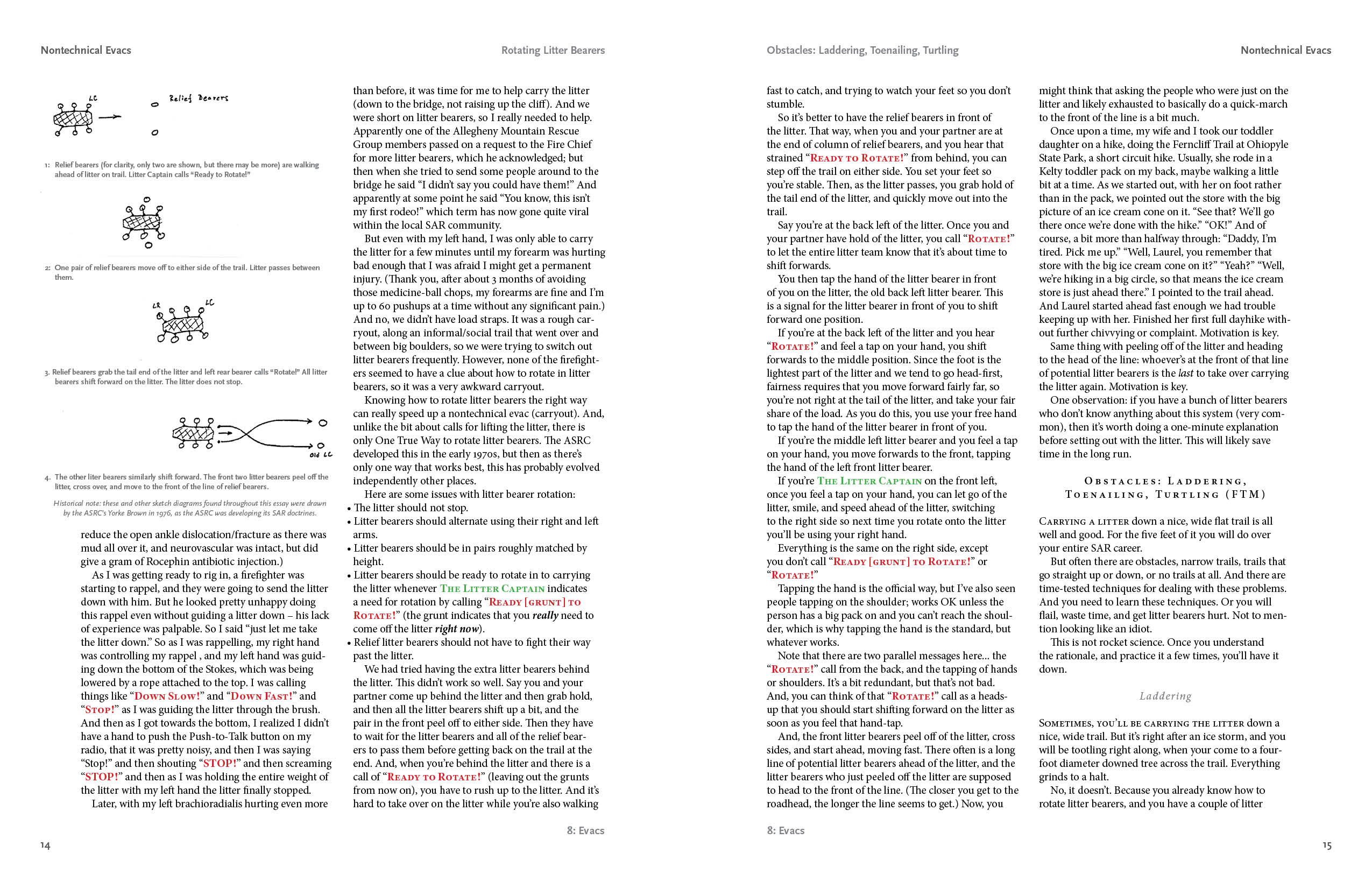
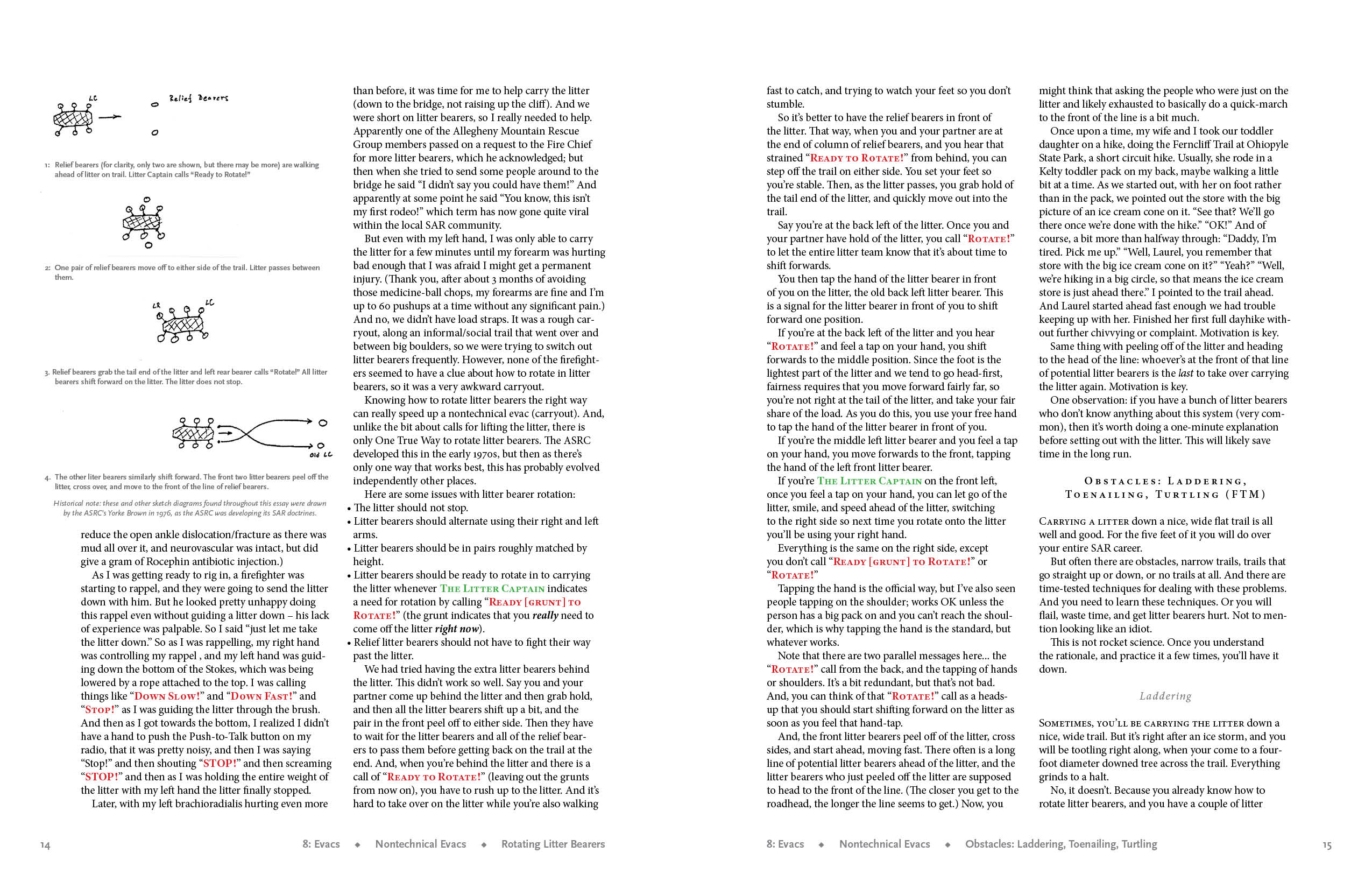
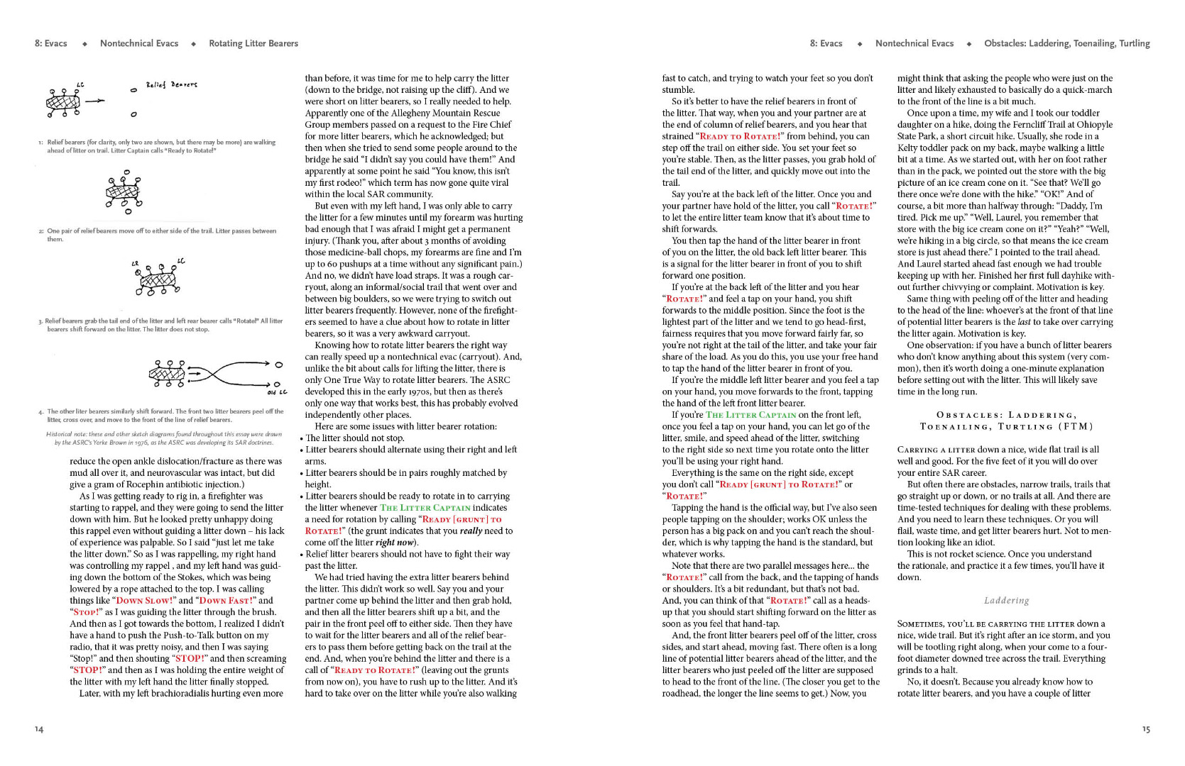
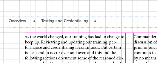
running section header DESIGN

Copy link to clipboard
Copied
This is not a technical question about how to create or format running headers. I've got that down (finally) and have posted on it elsewhere on this forum.
This is a question about using InDesign's running header/footer capability to best effect on the page.
I am writing a textbook that I am self-publishing online, and have to choose a design for the running headers. I would like to have page numbers, a notation of which chapter it is, a section header, and a subsection header.
I have developed two completely different styles of running headers/footers and can't decide between them. I would like your help, and I think the discussion might be of wider benefit, which is why I am posting this here.
The first uses traditional positions: top and bottom, both towards away from the spine and towards the spine. This gives you four places to put headers, though one of them you should use for a page number. I think most would agree that the top away from the spine is the most prominent place, the bottom away from the spine the next most important place, and then towards the spine on the top and then towards the spine on the bottom. So, you can place your headers and page number based on position, and this provides some sort of hierarchy.
You can also differentiate your section headers by using typeface weight or tinting. In general, I like tinting (fading) more.
But on websites, people are getting used to what we call breadcrumb trails to provide a sense of where you are in the website, something that for a printed book is provided by physical clues as well as section headers.
For example, at the top of a webpage, it might say Main Page > Subpage > subsubpage to give you an idea of where you are in the hierarchy.
So, here are two pages with two different ways to manage chapter title and section and subsection headers using InDesign. Please help me choose between them.
Thank you for your thoughts.


 14
Replies
14
14
Replies
14

Copy link to clipboard
Copied
Hi, Keith,
It's hard to tell what either will look like with all the grids and guides showing, but I think I prefer the second only because it's less traditional and would take up less space on a digital page. However, I'd want to see both without the grids and guides; I'm concerned that the gutter between the marginal note (?) and column 1 may not be wide enough.

Copy link to clipboard
Copied
I p[refer the placement of the first example, but the overall page design of the second.
Also, are the page numbers in either example (and the section head on the first example) actually aligning to anything? They seem to be floating on the page.
Copy link to clipboard
Copied
Here are the pages without the grids. The page number is deliberately hanging out there. I should align with the minimum sidebar/graphic, which I will do.

Copy link to clipboard
Copied
Hi Keith,
Although you aren’t asking, the second layout has two sets of duplicate words and the gutter does not match the underlying structure.
Are you using a baseline grid to automatically align the baselines or a document grid to manually check that they are aligned?
Jane
Copy link to clipboard
Copied
Hi, Keith,
Thanks for sending the designs without the grids. I get a better idea of what the pages might look like.
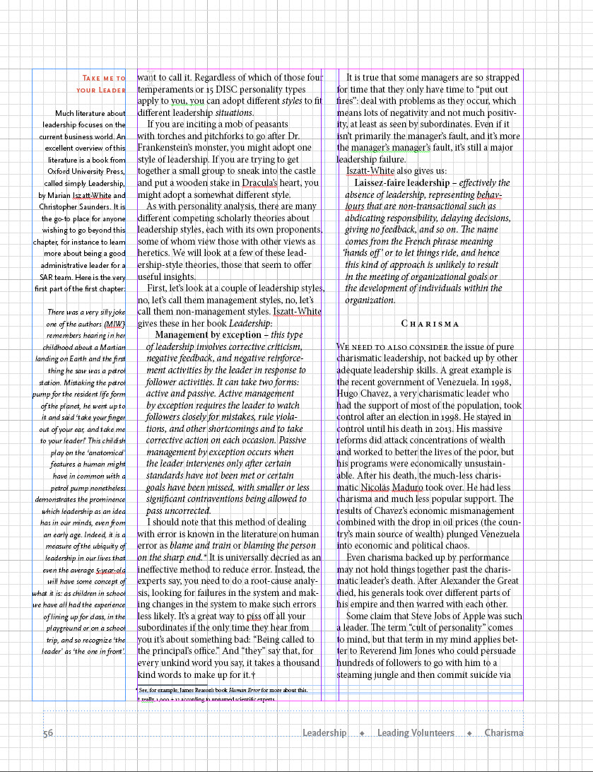
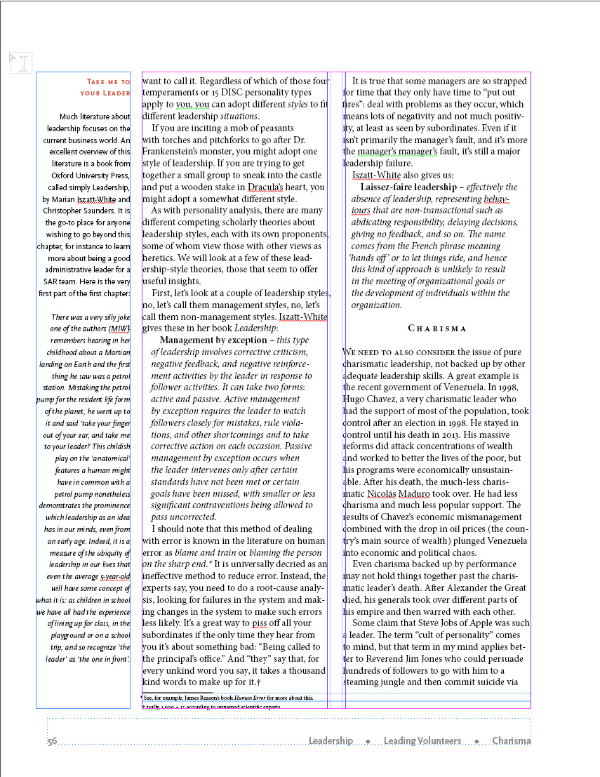
One possibility for a page layout that may work for you here is a five-column grid; that is, create a grid with five equal underlying columns with appropriate gutters, make the outside column the one you use for the marginal quote text and the other two, larger text boxes for continuing text. I think this is what Jane was getting at? Please make sure the gutters are wide enough so that the reader's eye doesn't simply cross over from one column to the next. If this is an online book, consider that people may be reading it on their phones. White space is god!
Thanks for letting us all chime in. I'll think about all this again when I design the next book.
Copy link to clipboard
Copied
Thanks for all your advice.
Right now I am looking for something that can be printed on 8.5x11" paper. Once InDesign and I get good enough at it, I hope to also convert it to a series of HTML pages that can be viewed in any web browser. My experience with trying this maybe 10 years ago was traumatic, though, so I will postpone this until I'm done with the boodk.
Jane, I am using a 1-pica document grid to align objects, and a 10 on 12 baseline grid. Since this is fairly graphic-intensive, I simply leave the document grid showing and that means I can always easily see that the text is neatly aligned to 12 points.
Laubender, I will paste in two spreads below with the two different designs.
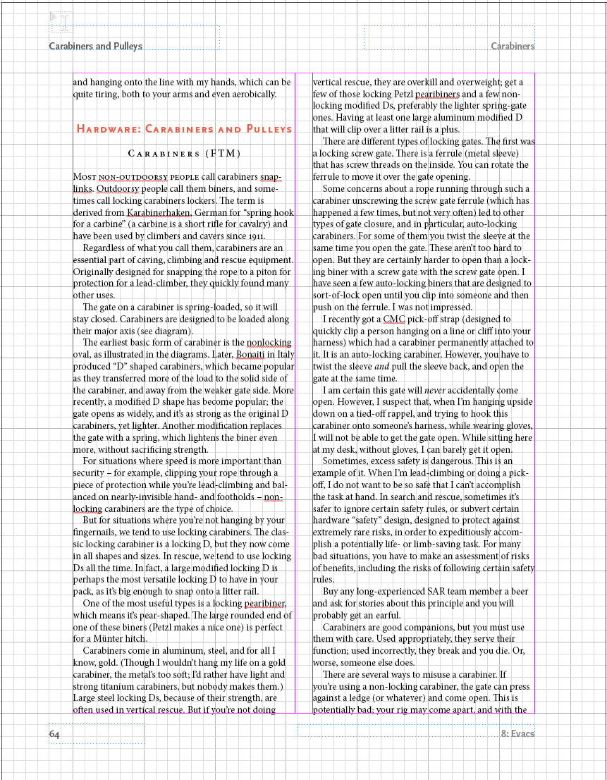
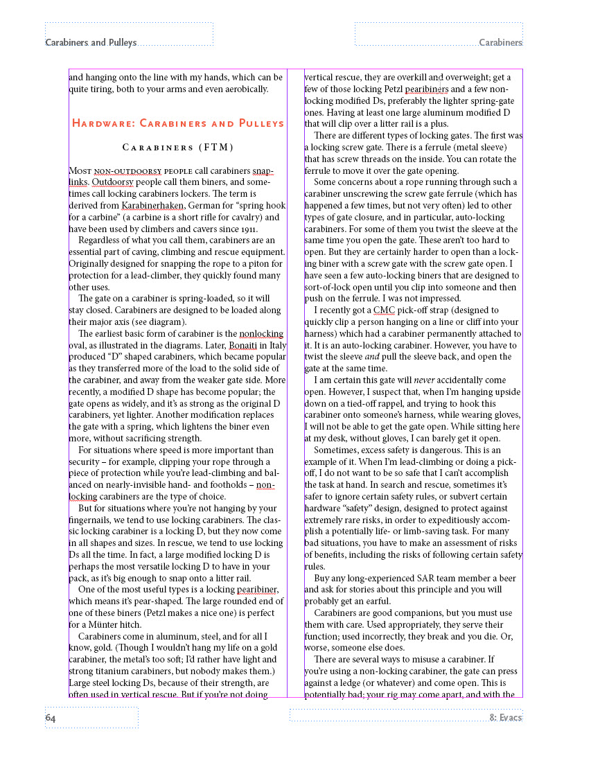
Cindy, I am using a two-column setup for text, with an outer margin of three picas all around, and an additional away-from-the-spine margin of 3 picas, which I can use for marginal notes. I also place graphics that use that away-from-the-spine margin and intrude into the text wraps, as seen below. The headers and footers are in the corners up against the 3-pica margins all around.
I am a big fan of white space as well (a Tufte disciple), but with the "breadcrumb trail" I used some dingbats to separate them instead of white space. I thought about using an arrowhead shape but thought it was too blatant. I also thought about placing the "breadcrumb trail" at the upper outer margin but haven't tried that yet.
Copy link to clipboard
Copied
I definitely prefer the second design, Keith. Have fun! May I suggest you not move to InDesign 2019; it has problems, as first releases always seem to do.
Best,
Cindy
[Cindy Shaler: this is a public forum. If you opt to reply via email, please take care to remove your email signature with your address and phone number for your safety. We removed it for you this time.]

Copy link to clipboard
Copied
Hi Keith,
if you want to discuss different designs show at least facing pages with no guides at all, only the edges of the pages.
And if we should compare designs show the same contents with different designs.
Regards,
Uwe
Copy link to clipboard
Copied
Thanks, Cindy. I decided that it makes more sense to have the "breadcrumb trail" at the top, so here is a spread with it that way.
Copy link to clipboard
Copied
Hi Keith,
I wonder why you are doing all body text with Justify Left instead of Justified.
Regards,
Uwe
Copy link to clipboard
Copied
Actually it's not even justify left, it's just left. I finally decided I like that better after having read through Robert Bringhurst Elements of Typography and digested it for a bit. At least for this particular text book. But also in general as a default.
Copy link to clipboard
Copied
Looks good to me!
Best,
Cindy
[Personal info removed by moderator - don't post on public website for your safety]
Copy link to clipboard
Copied
I finally decided that this "breadcrumb" footer deserved pride of place at away from the spine and at the top, and just a page number at the bottom. I am very pleased with the result. My text "subsection" and "subsubsection" text variables have a few spaces, the diamond bullet, and then a few spaces as "text before" in the text variable definition. The "section" text variable does not as it doesn't need it. However, this causes a problem if I have a section that has subsections but not subsubsections, in that the header looks like this:
If it weren't for that pesky "text before" then the workaround described in this post would take care of it:
https://forums.adobe.com/thread/2445029
I tried having the text variables with "text after" but that, as expected, makes no difference. I need some way to omit the entire text variable.
Yes, I could separate the text variables with just white space, I may end up having to do this, and Tufte and Bringhurst might argue for just white space, but I really like those little diamonds. Sniff.
Any thoughts on how to get what I want welcomed.
♦
Copy link to clipboard
Copied
I've done some more work on this project and I wanted to share it.


I have found that the bullet idea just won't work and, with regret, I have abandoned the bullets, using white space as separators instead. People like Edward Tufte would say this is better anyway.
I spent some time tweaking the process to where it works well, which is what I describe in this post. It would be nice if Adobe were to automate this by adding functions in the Text Variables panel, but until then this process works well to automate bread-crumb web-style headers in PDF or print documents.
It's a lot of work but the result is worth it.
Automatic Bread-Crumb Style Headings in InDesign
A web design usability principle is to provide a "Breadcrumb Trail" to provide situational awareness of where you are in the structure of the website. An example: Home > About Us > Contact Information. This is a way to reproduce this functionality for a PDF or print document in InDesign.
This is easier if you have a Table of Contents, have it set to create PDF bookmarks, and use the Bookmarks Panel to quickly navigate to each of the H1 and H2 headings, which in itself is a great trick for quickly navigating a long document. It does require that you manually update the Table of Contents on a regular basis to make it point to the correct pages after any significant edits to the document.
This is also easier with Type > See Hidden Characters on so that you can see the spaces at the end of the headings.
Start by setting up four heading paragraph styles named H1, H2, H3 and H4. Format these howeveryou want. Create a Table of Contents and nclude all four of these in your Table of Contents. For H1, H2 and H3 headings, the heading, or an abbreviated version of it, will appear in your breadcrumb header.The H4 heading will appear in the Table of Contents but not in the headers. Four items in a breadcrumb header is just too much. If a section with an H1 heading has no H2 or H3 headings within it, the H2 or H3 headings from the prior H1 section will not carry over.
Set up three character styles named HeadText1, HeadText2, and HeadText3. Make no changes to the default character style formatting for these character styles. These "character styles" do nothing to change the formatting of the text, they only exist to allow the breadcrumb headings to use a subset of the full heading text. Whatever portion of the H1 heading you have formatted with the HeadText1 character style will appear in the breadcrumb header. For long H1 headings this allows you to have a short version of the heading's text appropriate for a breadcrumb header at the top of the page. For short H1 headings you apply HeadText1 to the entire heading text rather than a shorter portion of the heading text.
Set up three Text Variables, Section, Subsection, and Subsubsection, set to the character styles as follows:
Section: character style HeadText1, Last on Page
Subection: character style HeadText2, Last on Page
Subsubection: character style HeadText3, Last on Page
In your document, format an appropriate-sized portion of each of your H1 headings with the HeadText1 character style. If the H1 heading is short, you can apply the HeadText1 character style to the entire heading. Make sure this character style does not extend into the paragraph mark (visible with Text > Show hidden characters) at the end of the heading, or into the subsequent text.
Do the same for all of your H2 heading's text with the HeadText2 character style.
Do the same for all of your H3 heading's text with the HeadText3 character style.
At the end of your first H1 heading, type a space, and then format it with the HeadText2 character style.Note that's the HeadText2 character style, not the HeadText1 character style. This is to prevent any H2 or H3 headers from the previous section to carry over, which can be a problem if your current H1 section doesn't have any H2 headings.
At the end of your first H1 heading's space formatted with the HeadText2 then type another space and format it with the HeadText3 character style.
Select and then copy both of these spaces to the clipboard.
Using your Bookmarks panel, double-click on the next H1 heading to go to it.
At the end of that H1 heading, paste your two character-style-formatted spaces. Do this for each H1 heading.
At the end of your first H2 heading, add a space formatted with the HeadText3 character style. Select it, copy it to the clipboard, then double-click all of the H2 headings in your Bookmarks Panel to go to them and paste your character-style-formatted space to the end of each of these headings.
One problem I have had with this is when I accidentally format an entire paragraph with, for example, the HeadText2 style, InDesign tries to fit the entire paragraph into the header with predictably bad results. The fix is easy, select the offending paragraph with a quadruple-click, then up at the top, change the character style to None.
I have also had situations where a paragraph mark has been formatted with, for example, the HeadText2 style and the header will look back to the beginning of the document to pick the text for a header. Changing the offending paragraph’s or paragraph mark’s character style to None, or when I couldn’t easily figure out where the errant character style is hiding, deleting a heading and retyping it, fixes these problems.
It would be nice if InDesign could do this automatically for you, but for now, this seems to work.
Thank you for reading this far.

 AdChoices