

GCR

Copy link to clipboard
Copied
Hello,
I need to print a several images in offset, these images are constructed in cmyk but they visually must seem like a BW image.
I want to know if use GCR in that images will they be better in quality? I would like to know what degree (value) in GCR - light medium or another one i can use.
The images are low key.
CanalPy


Explore related tutorials & articles
 15
Replies
15
15
Replies
15

Copy link to clipboard
Copied
Gray component replacement is built into current standard CMYK profiles. Since GCR both saves ink and cleans up areas of high ink usage, I would think it's already dialed up as high as practically possible.
My advice is just to make sure you get the correct profile from the printer. Here in Europe most presses are calibrated to ISO standards, and a profile like ISO Coated (ECI) 300% is usually very accurate. I have never noticed any color balance problems - and I send a lot of work to offset print, most of it color critical.
Copy link to clipboard
Copied
https://forums.adobe.com/people/Humberto+Pinh%C3%A3o wrote
these images are constructed in cmyk
You may actually have a small problem already, because if you created this using a different CMYK profile than the one that will eventually be used, results may not be optimal. CMYK to CMYK conversions should always be avoided for a number of reasons.
It's always best to work in RGB and not convert until the end.
Even if you do have the right profile, you need to be careful to not exceed total ink limit. This is again built into CMYK profiles, so a conversion from RGB is always safe. But any subsequent editing may put you over unless you're careful. The result can be smearing and drying problems.

Copy link to clipboard
Copied
I take it that you want black & white images to print neutral, without any color cast?
In my experience, this is practically impossible with a standard cmyk profile, and you're on the right track with the GCR.
(D Fosse - are you saying that you're getting neutral results printing B&W images with a standard profile?)
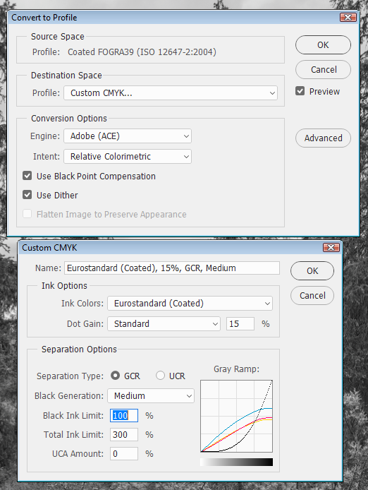
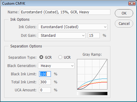
You have to discuss this with your printer, but setting Black Generation to Heavy should make the job easier.
This will use more black ink, and less CMY, decreasing the likelihood for color casts. (see the difference between Medium and Heavy in the screenshots below)
If your printer does a lot of this kind of work, they might even have custom profile for this.
This kind of work requires close collaboration with the printer - do not use Custom CMYK without talking to the printer first.
If the printer can't help you, or doesn't know what you're talking about, find a different printer.
Also, do a test run first, and be present during the actual printing.
Although the print may look neutral when viewed with the 5000K light by the printing press (or daylight), it may look very different when viewed under any other artificial light - fluorescent or incandescent. (this is called metameric failure, and a magenta cast is very common)
So it's very useful to have a different artificial light source available close to the printing press.
Copy link to clipboard
Copied
Never been a problem for me. But no argument, and I do see the point of the procedure - if it is a problem.
We have a regular printer that we always work with, and I suppose they're starting to know what we want... 
Yes, you're right that metamerism failure can pull unexpected tricks. I've never seen much of that with offset, seems to be more pronounced with inkjet. Maybe I just tend to look at publications in daylight.
My gut instinct is to not do surgery on profiles, it tends to open up cans of nasty worms. Especially in CMYK, where the profiles are pretty complex to begin with.
Copy link to clipboard
Copied
Come to think of it, there's no reason monochrome CMYK profiles shouldn't exist. If they don't maybe someone should invent them.
Copy link to clipboard
Copied
D Fosse wrote:
We have a regular printer that we always work with, and I suppose they're starting to know what we want...
Yes, you're right that metamerism failure can pull unexpected tricks. I've never seen much of that with offset, seems to be more pronounced with inkjet. Maybe I just tend to look at publications in daylight.
Yes, it probably helps to work with one (good) printer who knows what the customer wants.
As for metameric failure, I have found it to be a problem with offset only. For inkjet prints I use an Epson 9880 (with Advanced black & white), and the tonal difference with varying lighting is negligible. Since my artwork is black & white, and I publish books from time to time, I have spent a lot of time studying offset prints under different light sources. (and have had a lot of frustration with a magenta cast ...) Offset inks seem to reflect light very differently from injket inks, particularly magenta.
Stephen A Marsh wrote:
The Custom “legacy” CMYK engine is very powerful and flexible – however it is not based on any standard or modern condition which can lead to unexpected results unless the user is extremely knowledgeable.
I wasn't aware that Custom CMYK is considered "legacy". Do you mean that there have been developments in offset printing since this feature was introduced in Photoshop?

Copy link to clipboard
Copied
Per Berntsen wrote:
I wasn't aware that Custom CMYK is considered "legacy". Do you mean that there have been developments in offset printing since this feature was introduced in Photoshop?
Hi Per,
Definition of “legacy” = A thing handed down by a predecessor
What I mean is that there have been developments both in Photoshop and in colour separation methods/software.
The Custom CMYK engine pre-dates the use of ICC profiles and was revamped for Photoshop 5/5.5 – 1998-99 (memory fails me exactly). If memory serves correct, Photoshop 5/5.5 allowed the use of the revamped Custom CMYK that was based on the old colour look up table method from Photoshop 2-4 – or one could use ICC profiles. Certainly in Photoshop 6 the entire colour management system was overhauled and pretty much looks the same today, with the depreciated Custom CMYK engine hidden away in a single line in the interface (it may as well be marked “beware of the leopard").

Since Photoshop 6 was introduced in 2000, the colour conversion engine is ICC based. Custom CMYK is there to support legacy colour workflows and provides another option. Adobe even provided two ICC profiles based off the old CMYK engine, presumably to save folk the trouble of even playing with said leopard (Photoshop 4 Default CMYK.icc and Photoshop 5 Default CMYK.icc). It is not a great option for the majority of Photoshop users, especially today. Many mistakenly think that if they have a GRACoL profile loaded in their colour settings, that using the Custom CMYK engine to make a conversion with say heavy GCR is somehow actually using the GRACoL ICC profile, when it is not!
The technology behind Custom CMYK was fantastic and ahead of it's time. That it is still used today is testament to the flexibility, utility and power of the tool – combined with a fair bit of misunderstanding and lack of knowledge by many users. The Custom CMYK engine does not reflect the intent of specifications such as SWOP, GRACoL or Fogra, nor does it provide results targeted at these conditions. Some might say that Custom CMYK is a work of fiction, that sometimes happens to provide acceptable results. I can certainly explain this in more detail with screen captures when I have time if there is interest and if I will not put you to sleep with Lab colour values or ΔE* readings!
Copy link to clipboard
Copied
Custom CMYK is not…
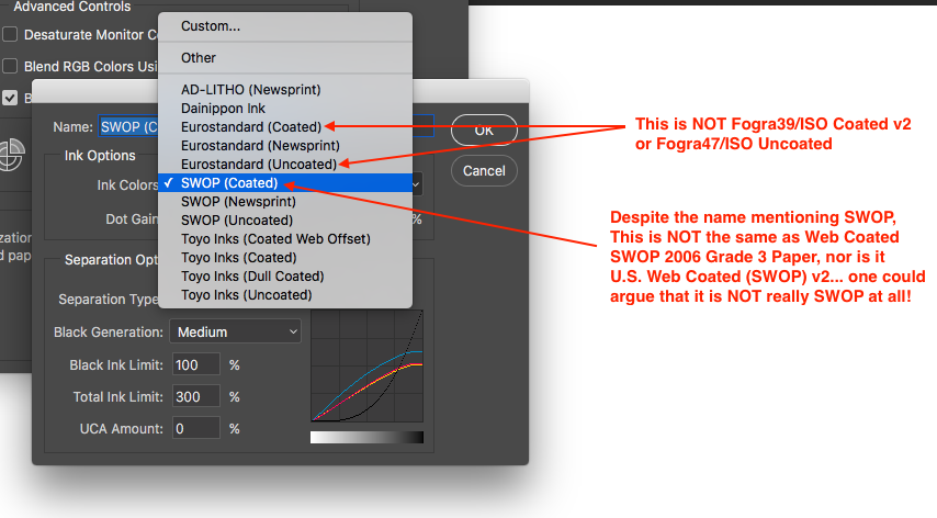
The “Eurostandard” ink colours are not Fogra/ISO/PSO etc. The default SWOP (Coated) ink colours are not the SWOP that is expected in modern or current printing specifications.
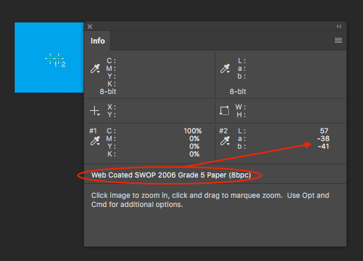
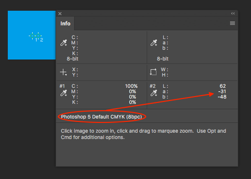
This is 100% cyan in Web Coated SWOP 2006 Grade 5 Paper:
This is 100% cyan in Photoshop 5 Default CMYK (which is the legacy default Custom CMYK SWOP 20% dot gain, medium GCR setting):
This is of course just a simple example of solid cyan, the same is true for other primary solids, tints and 2, 3, or 4 colour combinations.
Here is a neutral RGB gray step wedge converted to Web Coated SWOP 2006 Grade 5 Paper:

Here is the same neutral RGB gray step wedge converted to the legacy Photoshop 5 Default CMYK (SWOP) and then softproofed in Web Coated SWOP 2006 Grade 5 paper conditions:

The first image is neutral, the second image is slightly blue casted. With higher GCR this may be less of an issue as more K would be in use with less CMY. However for a full colour image or different output conditions, the discrepancy between Custom CMYK and the correct ICC profile may be more apparent (neutrals, colours, overall density etc).
Copy link to clipboard
Copied
Hi Stephen, thanks a lot for this detailed explanation. I'm afraid some of it is over my head - my knowledge about color management in offset printing is limited. What little I know comes from trying to get my black & white images to print neutral, and have as little metameric failure as possible.
I recently had a book printed,using a custom CMYK profile supplied by the printer.
The test print (which was mailed to me) was perfect, (very little metameric failure) but when we did the actual printing, it was difficult to match the test print. To get reasonable results, magenta had to be kept at a density of around 1.10.
I now suspect that the test print was done on a different press - am I right in assuming that a custom profile would only be correct for the particular press it was made for?
Copy link to clipboard
Copied
https://forums.adobe.com/people/Per+Berntsen wrote
am I right in assuming that a custom profile would only be correct for the particular press it was made for?
That seems like a fair assumption.
We had a guided tour at our printer's about two years ago, as they were in the process of installing an entirely new press, just arrived from Germany. What a monster it was, easily 50 meters from paper feed to exit. To my unending regret I didn't bring my camera that day.
Anyway, a big part of the process as it was explained to us, was calibrating the thing to ISO standards (I take it that's the ISO12647 you see in profile names). This took days and several flown-in operators.
The aim, of course, was that standard profiles should produce consistent results. We usually discuss different paper stock with these people, but are generally told to use ISO Coated v2 (eci) 300% or PSO Uncoated ISO12647 (eci), as appropriate. The results are always stellar.
If they all did it this thoroughly, different presses should give identical results. But if not...
Copy link to clipboard
Copied
Hi Stephen, thanks a lot for this detailed explanation. I'm afraid some of it is over my head - my knowledge about color management in offset printing is limited. What little I know comes from trying to get my black & white images to print neutral, and have as little metameric failure as possible.
Hi Per,
The overall principle is the same for offset as for inkjet, however offset is more variable across the sheet, from sheet to sheet and run to run. Although inkjet has it’s own set of challenges, with a good inkjet RIP it is very easy to get repeatable results.
The basic point that I was attempting to make is, just as you would use the right ICC profile for a given printer make/model/resolution/paper/viewing condition – the same is true for offset. You would not generally use a Canon ICC profile for an Epson printer and the same goes for offset presses. The custom CMYK engine of Photoshop does not match any condition, so it is not ideal… Can it provide acceptable results? Yes, indeed and the more one knows the more acceptable it can be made to behave, either before or after conversion. However if I was printing in Fogra39/ISO Coated v2 conditions, I would prefer to convert to CMYK using a Fogra39/ISO Coated v2 profile rather than using Custom CMYK. Less work, better results.
I recently had a book printed,using a custom CMYK profile supplied by the printer… I now suspect that the test print was done on a different press - am I right in assuming that a custom profile would only be correct for the particular press it was made for?
Generally most printers have moved towards proofing and printing to “specification”, such as GRACoL or ISO/PSO etc. They provide a proof that is aimed at the particular target condition. The press is then “aligned” to the condition and proof.
If one wishes to print to a “house” or “better than those other specifications” condition, then of course, a proof has to be generated for this custom condition and then the press is once again aligned to the proof and the press output is made to appear “close” to the proofing condition. It should not matter what press is in use, as long as it can be aligned to the proof condition. Offset printing is often variable, image content can change inking behaviour, so the same image on different pages and positions can be affected by other page content. A lot depends on whether the printer has good process control in place and has “on the fly” controls to measure colour and adjust ink on press.
Copy link to clipboard
Copied
Hi Stephen, thanks again for all this information - very interesting reading.
I do have a local printer, who has an amazing technician - he has changed the company from mediocre to excellent.
Among other things, he has calibrated the press, IIRC, it's calibrated for every 0.5% for all colors - I think it took him several days.
Unfortunately, I couldn't use them for my latest book, my publisher insisted on printing in one of the Baltic states, which cut printing costs by 40% compared to Norway.
As for metameric failure in inkjet prints - Epson's Advanced black & white is really a tritone (black + two grays) with very small amounts of CMY in addition. So no wonder the print doesn't change much in different lighting. But I still have a feeling that inkjet inks have a more uniform response to different light sources than offset inks.
Copy link to clipboard
Copied
Yes, thank you, Stephen, this is extremely interesting. This must be the first time in history I've printed out a thread to study at leisure, but I just did that 
Copy link to clipboard
Copied
Yes. I want black & white images to print neutral, without any color cast, you understand clearly what i want, thank you for that.
Your explication is very clear to me and help me to proceed my work with safety.
Thank you once more.
humberto pinhao
[email removed by moderator]
No dia 30/04/2017, às 10:26, Per Berntsen <forums_noreplyadobe.com> escreveu:
GCR
created by Per Berntsen <https://forums.adobe.com/people/Per+Berntsen> in Photoshop General Discussion - View the full discussion <https://forums.adobe.com/message/9486364#9486364>
I take it that you want black & white images to print neutral, without any color cast?
In my experience, this is practically impossible with a standard cmyk profile, and you're on the right track with the GCR.
(D Fosse <https://forums.adobe.com/people/D+Fosse> - are you saying that you're getting neutral results printing B&W images with a standard profile?)
You have to discuss this with your printer, but setting Black Generation to Heavy should make the job easier.
This will use more black ink, and less CMY, decreasing the likelihood for color casts. (see the difference between Medium and Heavy in the screenshots below)
If your printer does a lot of this kind of work, they might even have custom profile for this.
This kind of work requires close collaboration with the printer - do not use Custom CMYK without talking to the printer first.
If the printer can't help you, or doesn't know what you're talking about, find a different printer.
Also, do a test run first, and be present during the actual printing.
Although the print may look neutral when viewed with the 5000K light by the printing press (or daylight), it may look very different when viewed under any other artificial light - fluorescent or incandescent. (this is called metameric failure, and a magenta cast is very common)
So it's very useful to have a different artificial light source available close to the printing press.
https://forums.adobe.com/servlet/JiveServlet/downloadImage/2-9486364-1194618/custom-cmyk-1.png <https://forums.adobe.com/servlet/JiveServlet/showImage/2-9486364-1194618/custom-cmyk-1.png>
https://forums.adobe.com/servlet/JiveServlet/downloadImage/2-9486364-1194619/custom-cmyk-2.png <https://forums.adobe.com/servlet/JiveServlet/showImage/2-9486364-1194619/custom-cmyk-2.png>
If the reply above answers your question, please take a moment to mark this answer as correct by visiting: https://forums.adobe.com/message/9486364#9486364 and clicking ‘Correct’ below the answer
Replies to this message go to everyone subscribed to this thread, not directly to the person who posted the message. To post a reply, either reply to this email or visit the message page:
Please note that the Adobe Forums do not accept email attachments. If you want to embed an image in your message please visit the thread in the forum and click the camera icon: https://forums.adobe.com/message/9486364#9486364
To unsubscribe from this thread, please visit the message page at , click "Following" at the top right, & "Stop Following"
Start a new discussion in Photoshop General Discussion by email <mailto:discussions-community-photoshopadobe-v8.hosted.jivesoftware.com> or at Adobe Community <https://forums.adobe.com/choose-container.jspa?contentType=1&containerType=14&container=4694>
For more information about maintaining your forum email notifications please go to https://forums.adobe.com/thread/1516624 <https://forums.adobe.com/thread/1516624>.
This email was sent by Adobe Community because you are a registered user.
You may unsubscribe <https://forums.adobe.com/unsubscribe.jspa?email=hlpinhao%40gmail.com&token=297f75468bde139c8574e99b4...> instantly from Adobe Community, or adjust email frequency in your email preferences <https://forums.adobe.com/user-preferences!input.jspa>
Copy link to clipboard
Copied
I personally would not use or recommend Custom CMYK unless in a very specific situation. The Custom “legacy” CMYK engine is very powerful and flexible – however it is not based on any standard or modern condition which can lead to unexpected results unless the user is extremely knowledgeable.
You should get very good results with the following profile, even if the end conditions end up being GRACoL or SWOP rather than the intended Fogra39/ISO Coated v2 (yes, the GCR is that heavy for neutral tones!):
If the source RGB images are low key, then you should take care to create as much contrast as possible for “dark images” and err on the side of caution in making the darkest point that requires detail a little bit lighter just in case you wish to guard against the shadows plugging up too much. So make good use of tonal edits including curves and the shadow/highlight command and keep in mind that you can always have the RGB a little bit lighter, convert to CMYK and then add extra tweaks to the K channel (taking care not to push the total ink limit).
Good luck!


 AdChoices