 Adobe Community
- Home
- Photoshop ecosystem
- Discussions
- Re: The easiest way to brighten up the image but p...
- Re: The easiest way to brighten up the image but p...
Copy link to clipboard
Copied
Many times I had to brighten up the whole image, but care for those highlights that just blow up.
My current way of doing this is making a separate layer and applying Curves with the right end of the curve moving to the left. This effectively makes the image to be brighter and more vibrant, but all those highlight areas just disappear. Then I use the masking layer to hide the Curves on those blown up parts.
It does the job, but it's a bit rudimentary and I wonder if there would be some faster method yielding better results?
Thanks.
 1 Correct answer
I have found the lightest value a litho plate can hold and print consistently on coated stock is the equivalent of a Lab Color Lightness value of 97 or 98 which translates to RGB values of R246 G246 B 246 or R249 G249 B249 Set the Curves highlight eyedropper to one of those sets of values (or another you prefer) and save it as the highlight default value.
You will find that images that require a pin-dot in the highlights, using the highlight eyedropper to establish that value often also c
...Explore related tutorials & articles
Copy link to clipboard
Copied
Curves
Copy link to clipboard
Copied
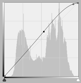
This is the type of curve you want, to avoid clipping the highlights:
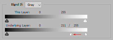
As an alternative, you can use Blend If:
Copy link to clipboard
Copied
Thanks guys. That Blend If model is quite novel for me, I rarely used it. Might try now!
Copy link to clipboard
Copied
Basically just use curves and bring down the curves for the highlight area. That would be the simplest, but you could also make a luminosity mask to protect the highlights also.
Copy link to clipboard
Copied
Just a personal preference. The dodge and burn tools are good, as you can choose to ignore the highlights and you can paint it in. Curves is good when working overall the whole image.
Copy link to clipboard
Copied
Right. However, sometimes I need to "physically" pull the luminosity of an image from, say middle gray area to the far right of the histogram. In the process I lose the entire higlight information, so I either use history brush to revert the change in the higlights or masking layer.
I thought there was some fancy masking tool that would 'sense' and protect the highlights automatically. I guess I should use Camera Raw filter more often. I tend to forget about it as soon as I leave LrC.
Copy link to clipboard
Copied
I duplicate the layer, brighten the parts that need it (Image>Adjustments>Brightness/Contrast) while ignoring the ones that don't. I then use a large soft eraser to erase the overly brightened parts and merge the two layers.
Copy link to clipboard
Copied
Thanks. Yeah, similar workflow as mine.
Copy link to clipboard
Copied
I would suggest running the shadow/highlight adjustment command before curves.
Copy link to clipboard
Copied
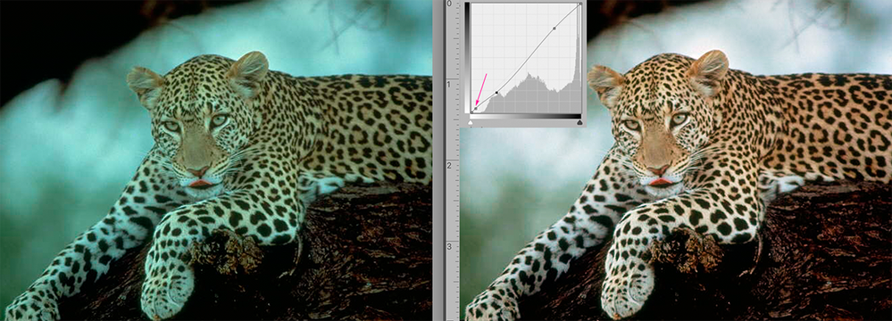
I have found the lightest value a litho plate can hold and print consistently on coated stock is the equivalent of a Lab Color Lightness value of 97 or 98 which translates to RGB values of R246 G246 B 246 or R249 G249 B249 Set the Curves highlight eyedropper to one of those sets of values (or another you prefer) and save it as the highlight default value.
You will find that images that require a pin-dot in the highlights, using the highlight eyedropper to establish that value often also contributes to correcting both color balance and contrast in the image, as shown above.
When the highest highlight in the image is apparent, choose Curves and click on that highlight with the highlight eyedropper. (If the highest highlight is not apparent in the image see the instructions below.)
Then click off the highlight eyedropper, and Cmd+click on the image highlight. It will place a point on the Curve to secure that value and modify the hightlight range. Now you are free bend the rest of the curve to adjust contrast without jeopardizing the highlight value.
***
If the highest highlight is not apparent in the image:
From the symbols at the bottom of the Layers panel, add a Threshold Adjustment Layer. You will be presented with a histogram, and below it, a slider. Move the slider all the way to the right; the image will go completely black. Inch the slider to the left until the first meaningful white patch appears. It is the location of the highlight extreme. Choose the Color Sampler tool. (It is nested with the Eyedropper tool in the Tools panel.) Click in that highlight location. The Color Sampler will mark the site.
You no longer need the Threshold layer, so drag it to the Trash. The point you
marked will remain. You have now successfully located and marked the highlight end point. Modify it with the highlight eyedropper tool.
Copy link to clipboard
Copied
So, if I got you right RGB 246 is the treshold for prints to actually have/reproduce the detail?
Thanks a lot on your thorough explanation also.
Copy link to clipboard
Copied
It will keep the Curve from blowing out the highlights as you bend the curve to increase contrast (meeting your posted criteria) in addition to making other contributions to the correction.
Copy link to clipboard
Copied
Norman, Thank you for this information. I have just opened my new Photoshop apps and find many new processes – not all of them easier or fun. I would prefer the oldest edition of Photoshop now available. Would that be PS18 or 19?
How shall I set my preferences including color? I used to magic-select highlights and run the exposure slide to mute white in the highlights.
Nice to see you on the forum.
Best regards,
Joan H
Sent from Mail for Windows 10
Copy link to clipboard
Copied
Hi Joan,
I’m sorry but I don’t know which older versions are currently available.
The Preferences default settings should work well, for starters. I have changed some based on personal experience. In addition, my panel setup is a modified version of one offered simply because I find the change more useful for me. It boils down to starting with the defaults (including color settings) and changing each when you find that the change would better suit your style of working or the deliver the desired result.
For example consider the basics: You may like the current New Document interface or prefer the older version, may like the new Transform key setup or hate it, be satisfied with Color Theme or prefer one that is darker or lighter, like the transformation values appearing as you work or think they are an intrusion. With each of the items, it’s your call.
This OP asked for advice when dealing with the highlight end of the scale and image contrast. He didn’t mark any reply Correct so I don’t know whether he tried them and whether any of them worked for him...which he would recommend to future readers of his post. If none, he might consider other options and change his settings when they consistently solve the problem.
So, to repeat, go with the defaults at the start and season to taste. Good luck.


