

Is this look intended?

Copy link to clipboard
Copied
I'm sorry, I guess I haven't been following quite closely enough (until my mailbox exploded this afternoon!), and I wasn't able to find any screenshots of how the interface is supposed to look in casual browsing.
Here is what I see:
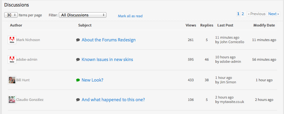
It seems to me like there's a huge amount of vertical space for each thread. About 3x as much as is necessary, which means the whole forum page is substantially longer, and far fewer threads fit on the screen.
I tried (halfheartedly) clearing caches and whatnot in case it was a stale CSS issue, but no change. Is this the intended look? (Is it what other users see?)
Thanks.


 1
Reply
1
1
Reply
1
Copy link to clipboard
Copied
OK, thanks for confirming it is seen by others (sorry for missing your post about it, Chris).
I see it's now #22:
22. Too much wasted vertical white space on Discussions page (http://forums.adobe.com/message/4383393#4383393)
on John's list. Oof.

 AdChoices