Participant
June 21, 2022
Question

Adobe color - Accessibility tool

  • June 21, 2022
  • 3 replies
  • 572 views

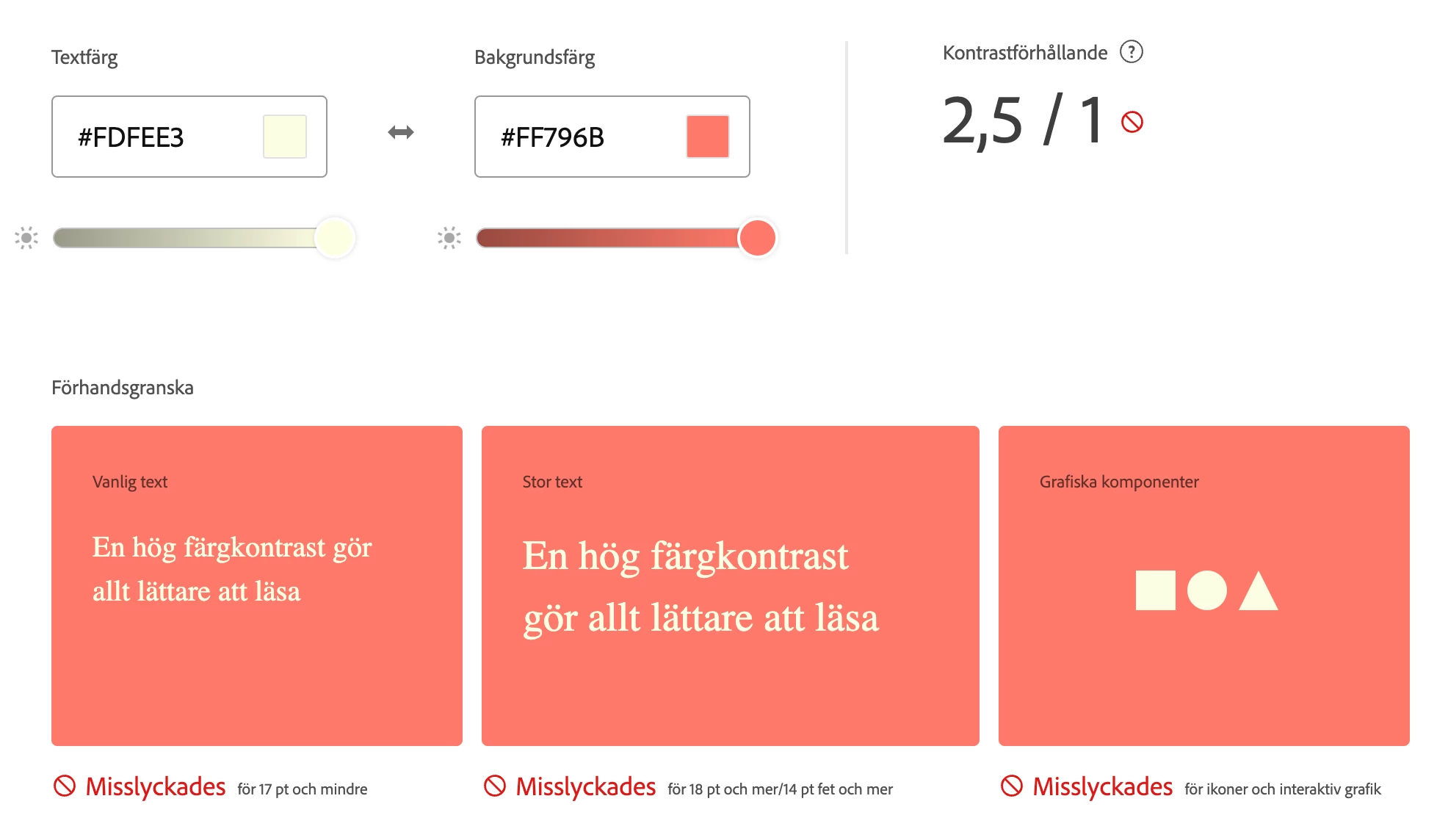
Hi! I am doing a color profile for a website and two of the colors I am using won't pass the accessibility function (AA). Is it against web standards/rules to use it anyways?

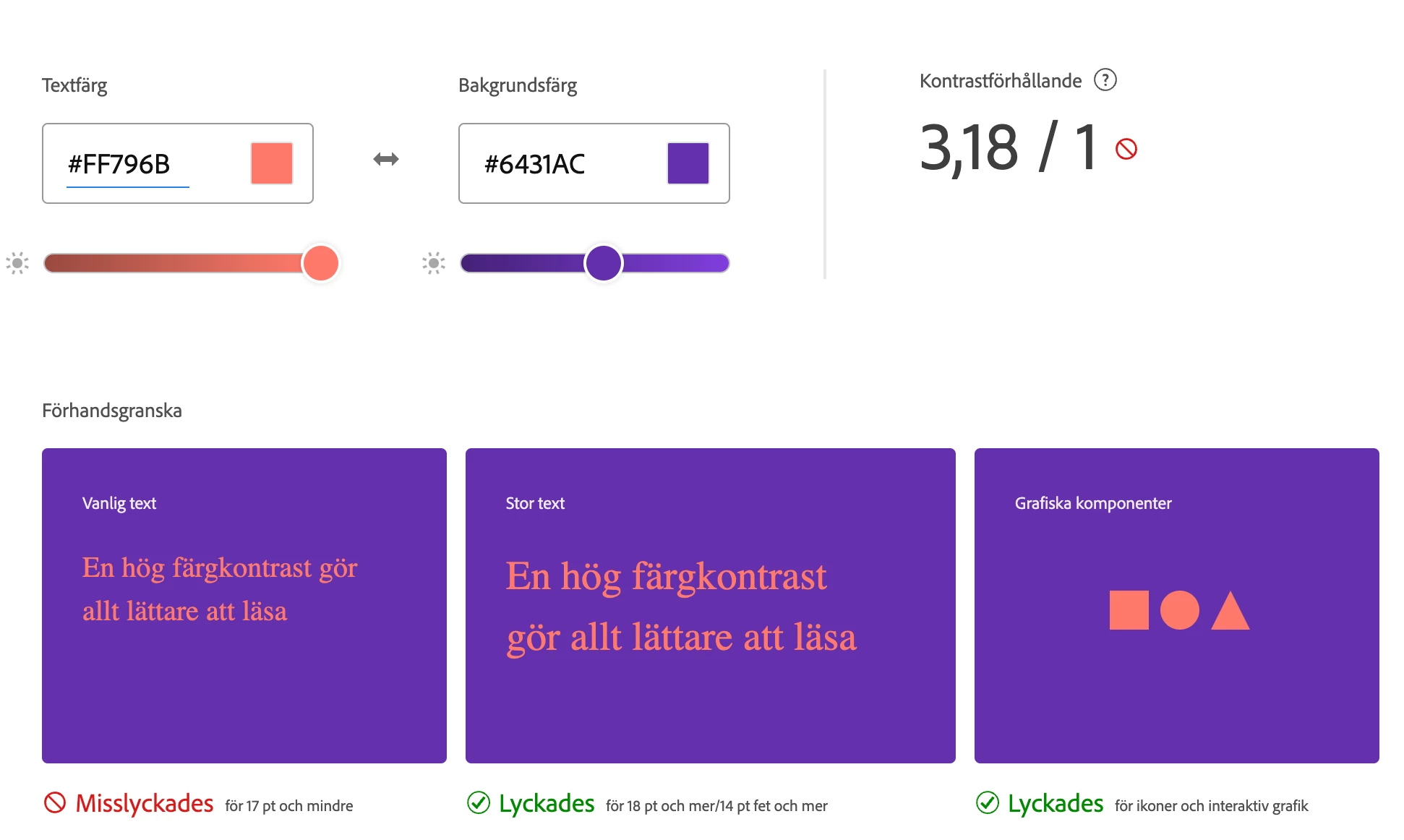
We have an alternative color combination, that gets approved, but to us the contrast is more difficult to see than the off-white alternative which won't be approved. How does this work?

Kind regards

    This topic has been closed for replies.

    3 replies

    maxwithdax
    Community Expert
    Community Expert
    June 23, 2022

    Remember that the Web Content Accessibility Guidelines https://www.w3.org/WAI/WCAG21/Understanding/contrast-minimum.html says that "regular text" should have a minimum contrast ratio of 4.5 to 1 and "Large Text" 3 to 1. When you are using brand colors that do not meet the standard you really have three choices. 

    1. Modify the color slightly to pull it into compliance (a shade darker or lighter)

    2. Choose a different background color while keeping the foreground color on brand

    3. Decide that staying on brand is the priority over maximizing accessibility for people with low vision or colorblindness.


    While conforming to WCAG is what I would suggest, sometimes the uphill battle with corporate branding departments can be exhaustive. All you can do is provide them options, explain the importance and let them give you direction on the approved solution. But the more options/alternatives you can give, the more likely they will adopt accessibility.


    Good Luck


    Adobe Employee
    June 22, 2022

    When you check contrast ratio of 2 colors, there are some suggestions shown in right side panel (please see image below). you can select another set of colors which are compliant (and closest to your colors), if that works for you?

    if your audience includes color blind users, then you should use compliant colors, else it should not be that critical.

    Bob_Hallam
    Legend
    June 21, 2022

    It's not against Web standards, just against best practices.  What the tool is telling you is that on some devices or a device your chosen color(s) will not reproduce as intended.  You can change your design to fit perfectly or just go with it, your choice. 

    ICC programmer and developer, Photographer, artist and color management expert, Print standards and process expert.