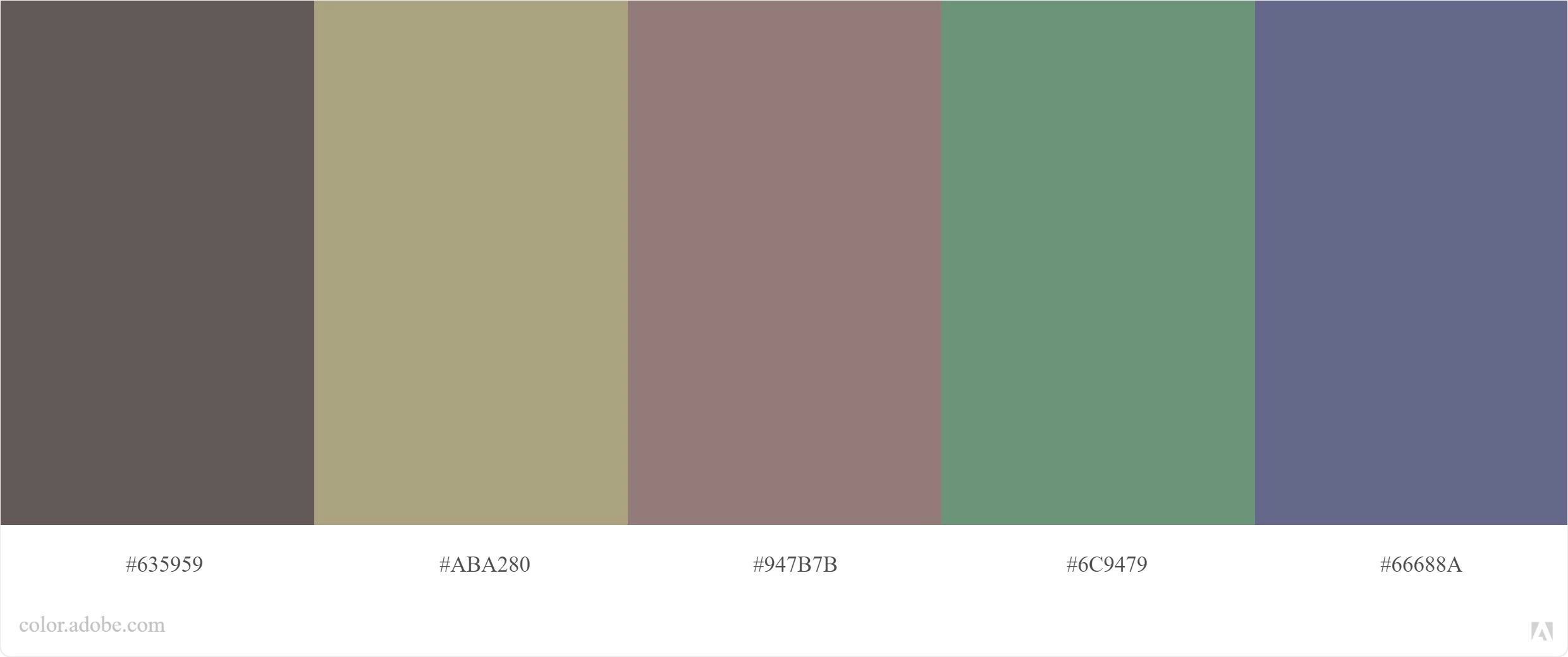
It very much depends on where they are supposed to be applied. The first set has an autumn/winter mood to it, it would work well on a fashion collection.
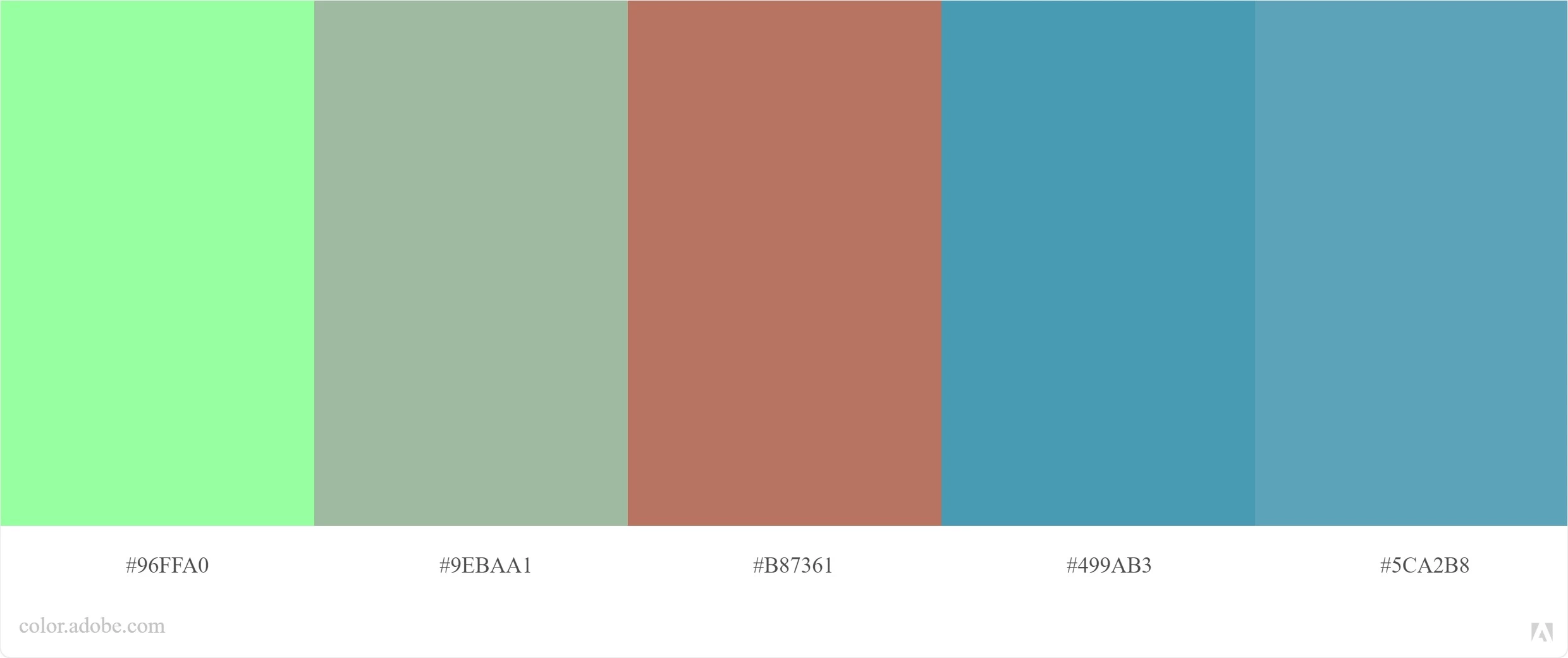
Looking at the second set, I find it hard to justify the first very bright green. Context, though, is everything. If you tell us what these colors are chosen for, we can help you better.
I think they are colours. I can't say anything about whether it is a good or bad selection because colour selection is all about the intended use and audience. A funeral home brochure wants different colours than a sports car brochure. And that is different colours from a game for children. Which is different from an annual report.