Participant
October 27, 2021
Answered

Bug in Font Kerning

  • October 27, 2021
  • 2 replies
  • 475 views

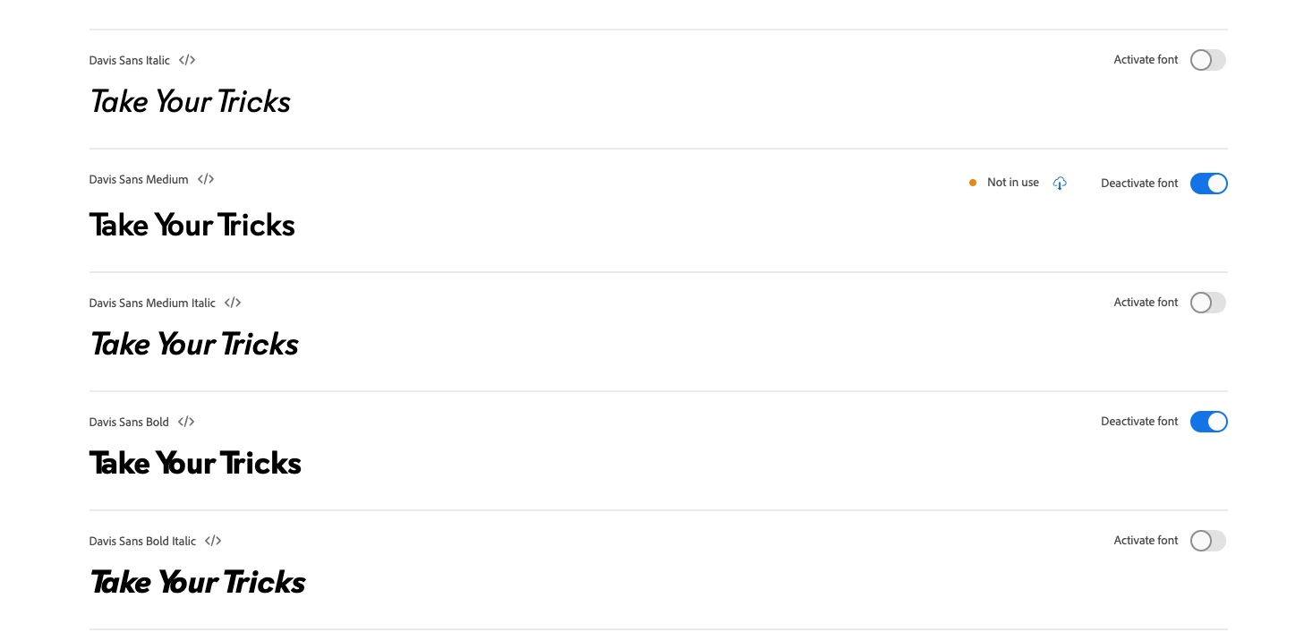
We are using Davis Sans on a website and found a bug in the kerning for some characters in heavier weights. I reached out to the font creator who said (and showed in Photoshop) that the issue isn't in the font but Adobe's conversion.


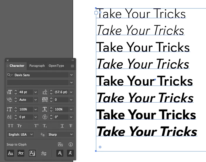
Below is a screenshot of Adobe's on preview tool displaying the issue:

The kerning between the capital "T" and "Y" and the following vowels is too tight.


Below is an example ("You") of how it's being seen on our website as well:


Below is a version from the font creator as they built it:


The issue is obviously not in the base font but with the version after Adobe "optimized" it. Does anyone know of the best course to get Adobe to fix the font on their side? I've been unsuccessful trying to get hold of support?

This topic has been closed for replies.
Correct answer Molly Doane

Hello! This issue should now be resolved. Please have a look and let us know if you're still having trouble.


Best regards,

Molly + Adobe Fonts

2 replies

Molly Doane
Molly DoaneCorrect answer
Participating Frequently
November 4, 2021

Hello! This issue should now be resolved. Please have a look and let us know if you're still having trouble.


Best regards,

Molly + Adobe Fonts

HARSHIKA_VERMA
Community Manager
Community Manager
November 1, 2021

Hi davec38578094,


We are sorry for the delay in response. I have escalated this to the team and they are checking this at their end. I will share the updates with you as soon as I hear back from them.


Thanks,

Harshika