

tlmurray23
Inspiring
September 1, 2026
Answered

Looking for a monospace typeface with a smaller (regular?) x-height

  • September 1, 2026
  • 5 replies
  • 39 views

In the monospace typefaces I have, except for Courier, the ones I've tested seem to have an x-height taller than the surrounding characters at the same point size.
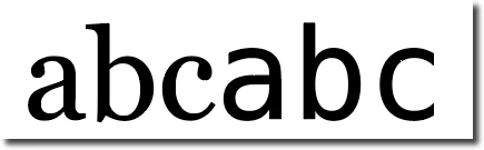
Georgia and Menlo

I guess I just don't want to use Courier because it is so overused. A zero with a line through it would be nice as well, but no big deal.

Suggestions?
Thanks.

    Correct answer Bobby Henderson

    Different type families are going to have different x-height size relationships with the capital letter height. There is no such thing as a hard standard for that. Type designers will make their own choices on how their glyphs will fit within an Em square. The person who designed the Georgia typeface (Matthew Carter) made different choices than Howard "Bud" Kettler, the guy who designed Courier.

    If you dig deeper and open these fonts in type design apps, such as FontLab Studio, the physical cap heights and x-heights of letters are often different from the boundaries set in the font’s dimensions (it’s a really common feature with script typefaces). That’s one of the things that makes it really tricky to size and position letters according to their physical cap letter size -something I often do with sign design. It’s not enough to tell an app like Adobe Illustrator to use the distance from baseline to a font’s defined cap height line. The treatment might work for Helvetica Now, but it won’t work for many other typefaces. The same thing goes for the font’s defined x-height line.

    5 replies

    tlmurray23
    Inspiring
    September 2, 2026

    I understand quite a bit about typeface design as I've been in the publishing industry for over 40 years. I was hoping someone knew of a monospace face that has a short x-height. It seems all that I try have a tall x-height when compared to the faces I used every day (Georgia, Times, Schoolbook, Myriad, Minion).  I also don't want to mess around with the variables. Thanks.

    Community Expert
    September 1, 2026

    If you visit the Adobe Fonts website and use "monospace" as a search term you'll see around a dozen or so different type families with monospaced fonts. Some of the typefaces evoke an old typewriter style. I couldn't tell which fonts might have a slashed zero glyph without adding/installing them. I wish the Adobe Fonts website had glyphs tables for all the fonts carried there.

    tlmurray23
    Inspiring
    September 1, 2026

    Thanks for the reply, but it doesn't address the x-height.

    Bobby HendersonCommunity ExpertCorrect answer
    Community Expert
    September 2, 2026

    Different type families are going to have different x-height size relationships with the capital letter height. There is no such thing as a hard standard for that. Type designers will make their own choices on how their glyphs will fit within an Em square. The person who designed the Georgia typeface (Matthew Carter) made different choices than Howard "Bud" Kettler, the guy who designed Courier.

    If you dig deeper and open these fonts in type design apps, such as FontLab Studio, the physical cap heights and x-heights of letters are often different from the boundaries set in the font’s dimensions (it’s a really common feature with script typefaces). That’s one of the things that makes it really tricky to size and position letters according to their physical cap letter size -something I often do with sign design. It’s not enough to tell an app like Adobe Illustrator to use the distance from baseline to a font’s defined cap height line. The treatment might work for Helvetica Now, but it won’t work for many other typefaces. The same thing goes for the font’s defined x-height line.