
Question
Strange (?) spacing in polytonic greek
Hello, I wanted to inquire about a seemingly weird behavior of Minion 3 / Minion Pro when they are used to typeset polytonic Greek. Please look at the image attached below.
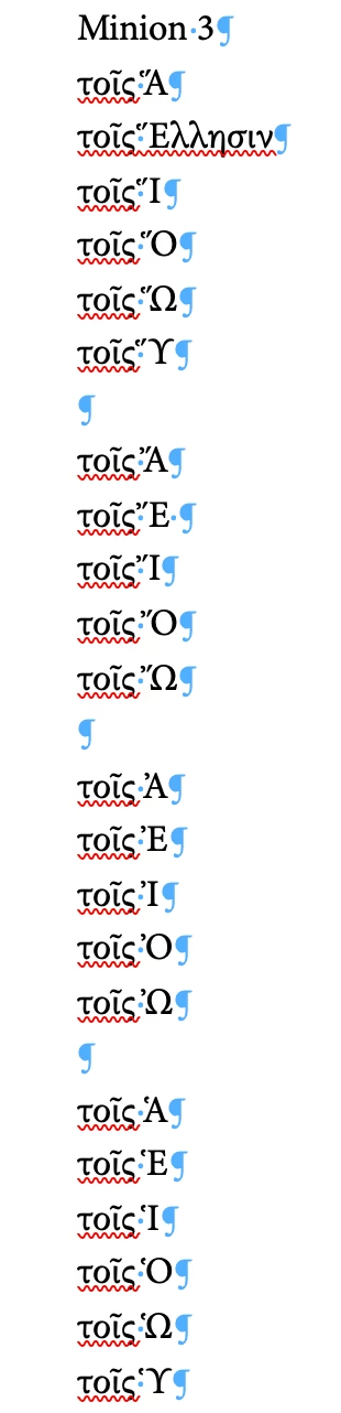
Clearly, the space before Ἕ, Ἵ, Ὕ, Ἔ, Ἴ, and Ὑ appears too narrow. Please compare it with the results from Garamond Premier Pro:
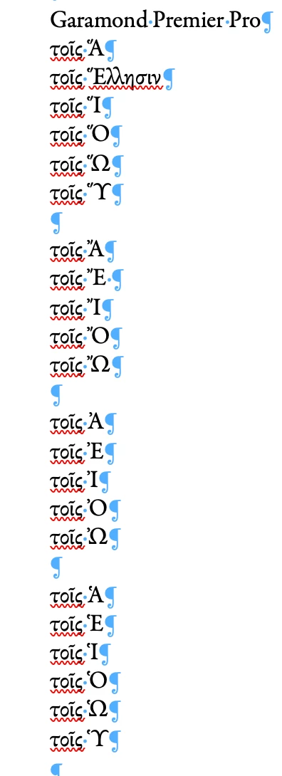
The results from Arno Pro are satisfactory, but Minion Pro also exhibits the same narrow spacing. Is this narrow spacing intentional by the designer of Minion 3 / Minion Pro, or is it an error? Thank you.
