Participant
October 12, 2020
Question

[Bug] Development Share component background blur CSS mismatch

  • October 12, 2020
  • 1 reply
  • 1104 views

While development share enables developers to view css properties, in some cases an object in Adobe XD will not look the same if a developer chooses to use provided css snippets.


Simple example demonstrating the issue:

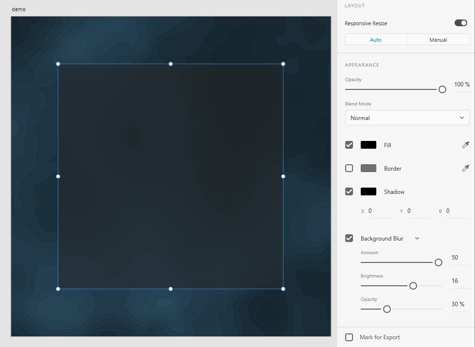
 Artboard containing a background image with a blurred rectangle on top (expected result)


Adobe XD generates following css snippet:

top: 160px;
left: 160px;
width: 760px;
height: 760px;
background: #000000 0% 0% no-repeat padding-box;
box-shadow: 0px 0px 0px #000000;
opacity: 1;
backdrop-filter: blur(50px);
-webkit-backdrop-filter: blur(50px);


Actual result using above snippet:


However this can be fixed when


background: #000000 0% 0% no-repeat padding-box;

is replaced with

background: rgba(18, 18, 18, 0.4);


Finding the corresponding color values does take time unfortunately, it would be great if the team behind Adobe XD could fix this issue for faster, more seamless workflows.

This topic has been closed for replies.

1 reply

Harshika Verma
Community Manager
Community Manager
October 12, 2020

Hi there,


Thank you for reaching out. Would you mind checking this post: https://community.adobe.com/t5/adobe-xd/hsla-color-format-values-are-incorrect-in-prototype-specs-view/m-p/11371531#M35360 and see if this is similar to the issue you're facing?


If so, then the team is aware of the issue and is working on it to fix the problem. 


Thanks,

Harshika

XATEVAuthor
Participant
October 13, 2020

Hi Harshika,


The referred post mentions HLSA value inaccuracies, whereas the generated snippets in this post doesn't seem to contain any HLSA values.

After taking a closer look today, it seems like the generated css snippets only apply the fill color but not the background blur:


Generated css snippet:

top: 160px;
left: 160px;
width: 760px;
height: 760px;
background: #FF3737 0% 0% no-repeat padding-box;
box-shadow: 0px 0px 0px #000000;
opacity: 1;
backdrop-filter: blur(50px);
-webkit-backdrop-filter: blur(50px);


Result using above snippet:


It looks like this is not an issue related to rounding color values since the differences seem more significant.