Participating Frequently
November 27, 2018
Question

Collision detection / responsive grid on the responsive feature?

  • November 27, 2018
  • 1 reply
  • 951 views

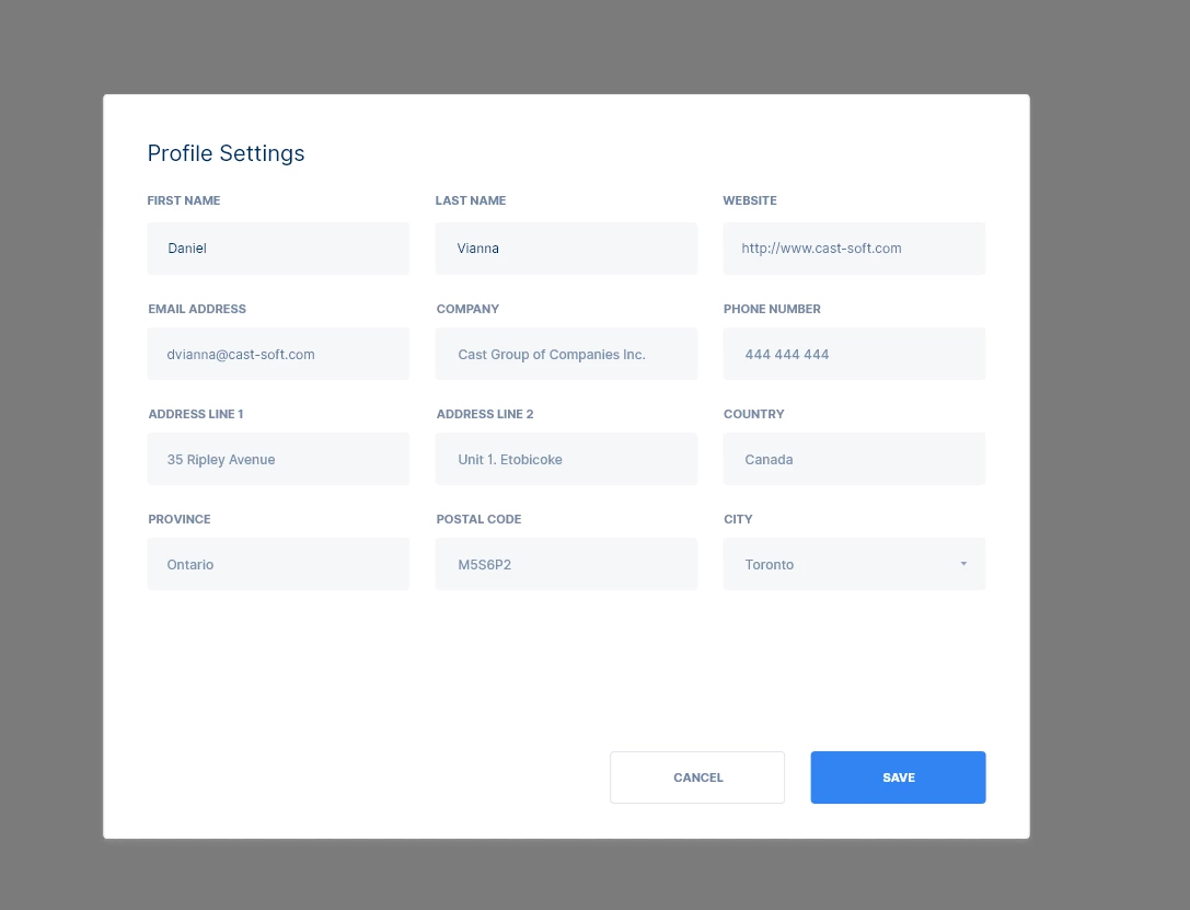
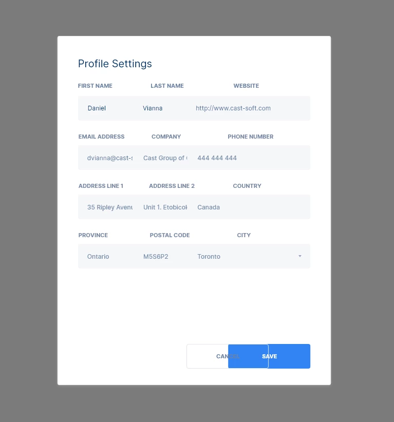
I have a question. Is this something that lacks in the responsive feature or is it something I don't know? I have this challenge. When designing multi-column layouts such as this gif, the elements collide with each other instead of stacking up

This topic has been closed for replies.

1 reply

Randy Edmunds
Adobe Employee
Adobe Employee
November 27, 2018

When you start to resize a group of elements, XD tries to determine how to automatically constrain the elements based on a set of heuristics. As you discovered, the "Auto" constraints are not always what you want.

To handle this, switch to "Manual" constraints in the PI, and then select each element that is not behaving like you want and manually adjust the constraints (that appear when you switch to "Manual"). Just guessing here, but it looks like you want to turn off the width constraint for text fields so the width decreases proportionally with group. Also might want to turn on right constraint for Cancel button so stays a fixed distance from Save button.

Let us know if you have any further question,

Randy

Participating Frequently
November 27, 2018

Hello Randy.

So I'm still not sure how to do something like this:

This is how responsive works in Browser when you are using some sort of column grid, the units stack on top of each other as default, instead of colliding. Any layout engine in desktop frameworks such as QT Widgets or Windows MFC also doe that and I'm not sure which framework is used for XD, but even XD assets panel work like that.

Preran
Legend
November 27, 2018

If I understood you correctly, I think you kind of missed the point there.

There isn't a way to create a responsive design in XD in the way you would do it in a web application by creating just one design and then resizing the browser to check if the design scales. In XD, you create separate artboards for each layout. The way responsive design works is that when you copy and resize an artboard (after enabling the Responsive option in XD), Adobe XD takes a guess about how the elements should be spaced in the resized layout and spaces them accordingly. You will still have to manually move around a few elements until you get it right. I suggest going through this video NEW! Responsive Resize In Adobe XD - YouTube

Based on what you said, and in my opinion, it would be easier for you to create an artboard for your mobile design first. You then copy and enlarge that artboard for a tablet. After you do that, reposition elements for the tablet layout.

Thanks,

Preran