Answered
Component states mini-window: More usability issues...
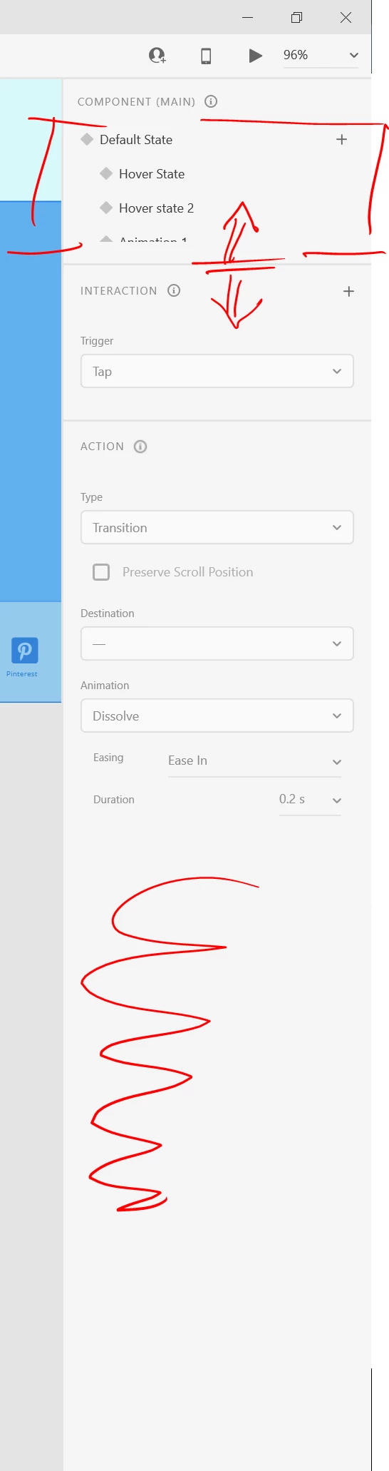
Simply, XD interface isn't anything as similar as an "user friendly" thing. When you have to deal with more than 2 states in a component, you have to constantly scroll up and down. Hidding the whole picture of the component interactions in an only one eyesight, makes impossible to build an useful mind visualization of the component to manage it's possibilities. I always have tro draw it in a piece of paper to remember its parts.
The funny thing, is that with a draggable edge to make window bigger would suffice. In an usual big screen, the bottom rignt of the tabs remains empty of any kind of useful stuff.