

Create a toggle button using States
- Create a rounded rectangle using the value 45 for the corner radius.

- Create a circle, use a fill color, and move the circle into one of the corners of the rectangle.
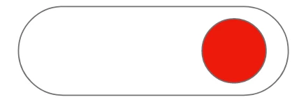
- Select both the circle and the rectangle, and press Cmd+K (Mac OS), or Ctrl+K to convert the selection into a component.
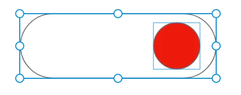
4. This is the default state of your component, as indicated in the Properties panel. 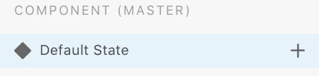
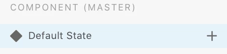
5. Click "+" to add a new State. Let's call this state, "Disabled" 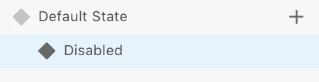
6. With the "Disabled" state selected, double-click the rounded rectangle to select it, and fill it with gray.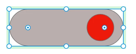
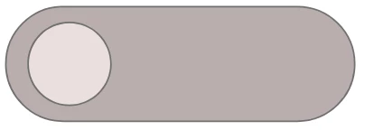
7. Similarly, double-click the circle, fill it with a lighter shade of gray, and move it to the other corner of the rectangle.
8. Move to the Prototype mode, select the component, and click Default State in the Properties panel. Click the arrow icon.
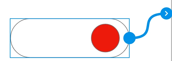
9. In the Properties tab, select the Trigger to Tap, Action to Auto Animate, and Destination to Disabled. 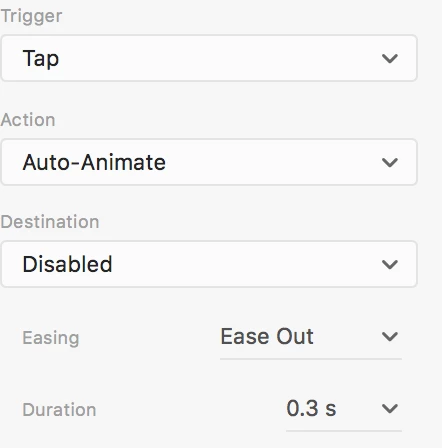
10. Similarly, click Disabled state, and set the Trigger to Tap, Action to Auto Animate, and Destination to Default State.
11. Preview the toggle button and check if the toggle is working as intended.
Reply to this post if you are having issues recreating the toggle button.
 AdChoices