
[Design]-How to create a responsive web design grid in XD?
Dear Designers and Developers out there,
I want to start creating my own responsive portfolio website with XD to hand it over directly to a web developer. It should be a wide website, something like this here with a main focus on Full HD (target group is designers with hopefully good screens 🙂 😞
https://www.behance.net/gallery/62543551/FREE-PSD-XD-DESIGNER-PORTFOLIO-TEMPLATE
After reading lots of blogs, articles etc., I still don't get what's the best grid for the biggest viewport. I want to start with the desktop website in 1920x1080px because it's the most important one I need to get out at the moment. I've read a lot about bootstrap grids that have a maximum width of round about 1366px. XD suggests that default settings:
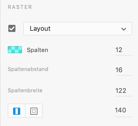
Is there any standard, recommandation or anything what the best settings are for my case (responsive, "desktop first", wide view)?
Thanks for your support and best regards,
Michael
<The Title was renamed by moderator>


 AdChoices