
Answered
Feature Request for Dark Theme: Low visibility on selected layers/components/objetcs
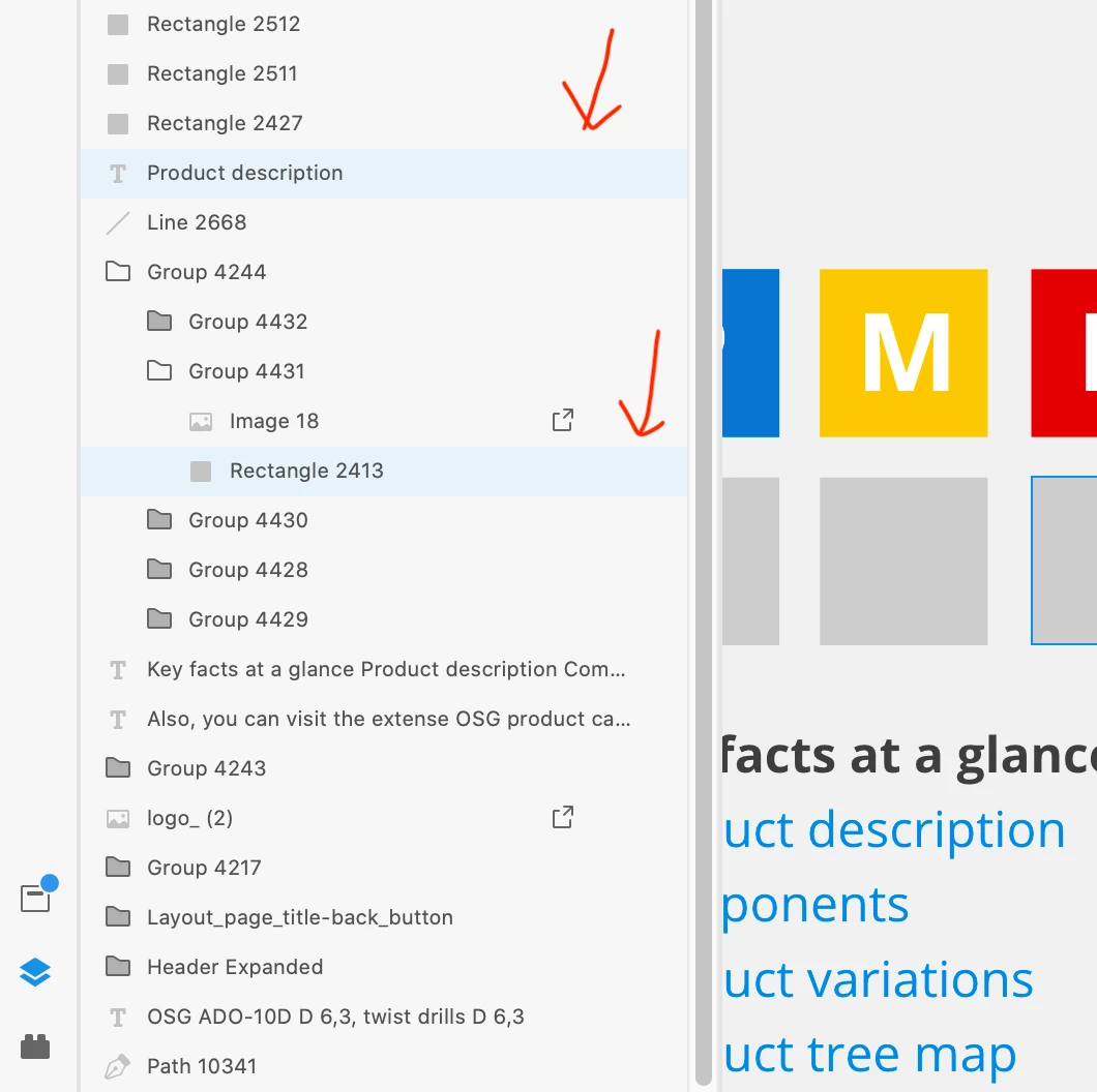
Yet another of these terrible bad usability from an app supposed to design User Experiences. Simply, not being enough this hurting white interface for those working at night, selected items highlighted on panels, both on layers and components, are so low contrasted, that it can be a real headache to find it.
The cognitive effort and friction scanning vertically through these diminutive list of items, makes big projects a real pain and a source of stress and fatigue.
Below you can see the extra pale blue barelly recognisable from the peripheral view, specially in very big screens and sorrounded by layouts full of bright colors.
{Renamed By MOD}
