
Responsive menu dashboard design without multiple duplicate screens
Hi all,
I'm trying to figure out if there's a more efficient way to create responsive (collapsing) menus without having to reorganize screen content to accommodate for extra space every time?
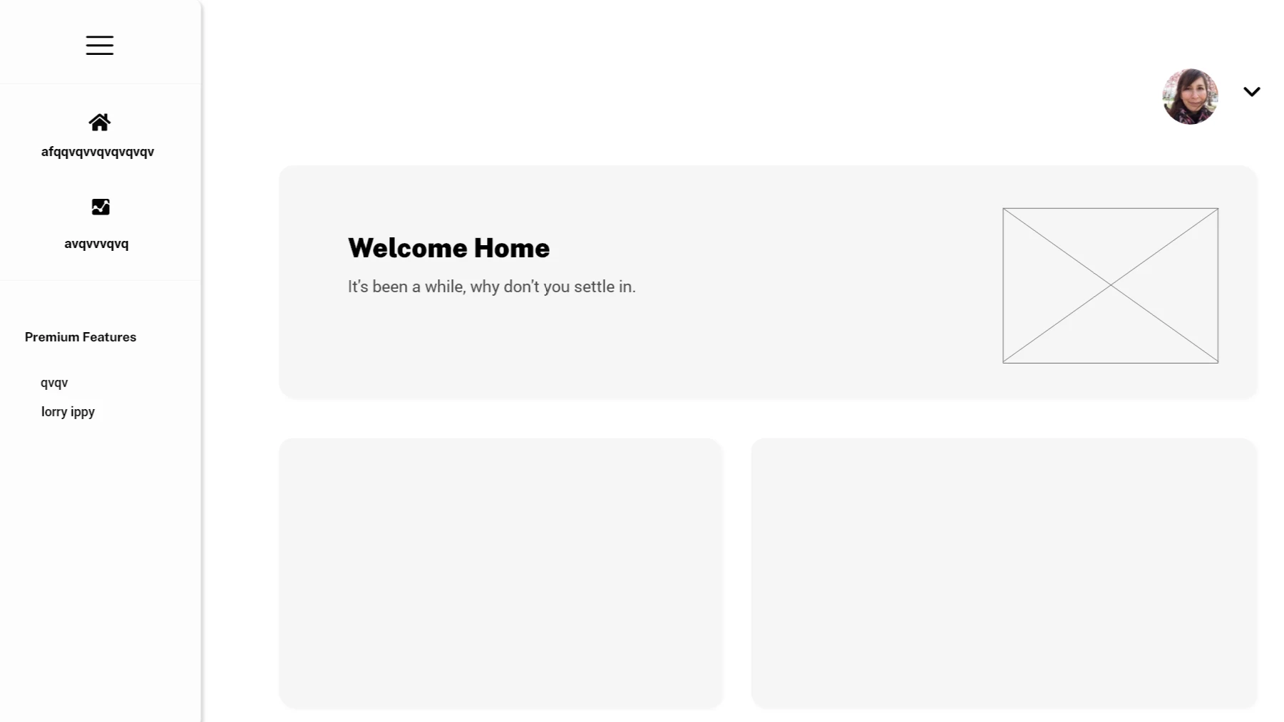
Ex. This is the default state with the menu open
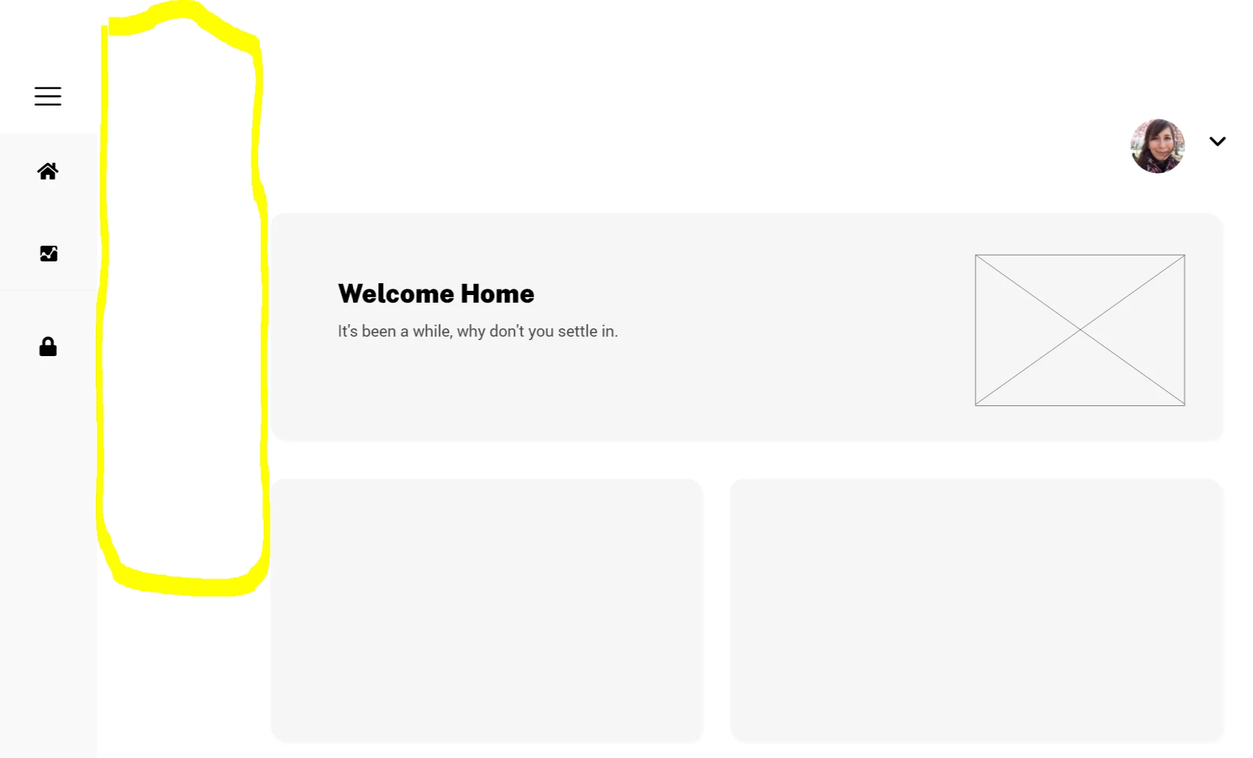
When the menu is collapsed it leaves this chunk of whitespace that makes the layout feel uncentered.
To solve for this I've been manually duplicating all screens and redesigning the content to fill the space. So essentially every screen has an open menu version and collapsed menu version. I'm wondering if there's a more efficient way to do this? I've been using auto-animate to do all the transitions between open/collapsed states because with components I can't emulate the content expanding with the menu.
Thanks in advance!
 AdChoices