
Question
Why Adobe Typekits fonts are thicker when used in Adobe XD but not in website?
I used fonts like Nimbus Sans for my site project, on the website it looks much more normal. However when I doing a concept design with Adobe XD using Nimbus Sans Regular the fonts looks more thick ( bold ). This is annoying because it will makes a false-assumptions and potentially could lead to something bad.
Is there any solutions to this? This is the comparison.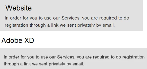


 AdChoices