Question
Breaking Apart Symbols With Curves Ruins Linework??
Hello,
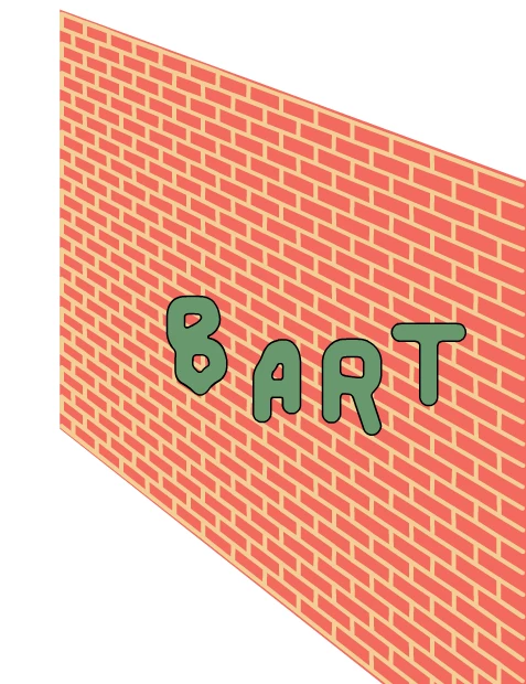
I made a font (nested symbols) in Animate that's an organic shape. Here's an example:
When I try to distort it in perspective, it picks up all these weird artifacts and makes my smooth curves all wobbly:
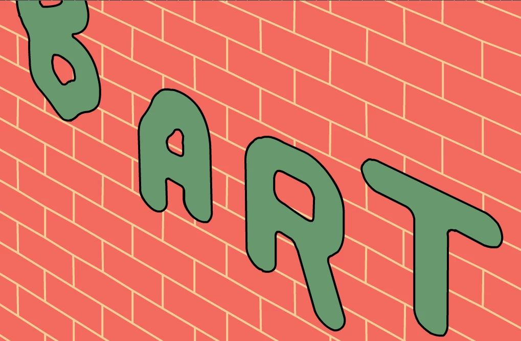
I tried to make the letter forms precise, so this is driving me crazy. Similarly, I notice breaking apart any symbol with lots of curves results in slightly scrambled artwork. Please let me know if anyone has any ideas!