ACR since 12.2.1
Since Adobe forced the new design of ACR onto users, I've been doing all I can to avoid using the software but with a new camera, I've just returned to download the latest version, hoping that some of the issues have been addressed. I can't believe how badly you've messed up a perfectly good UI.
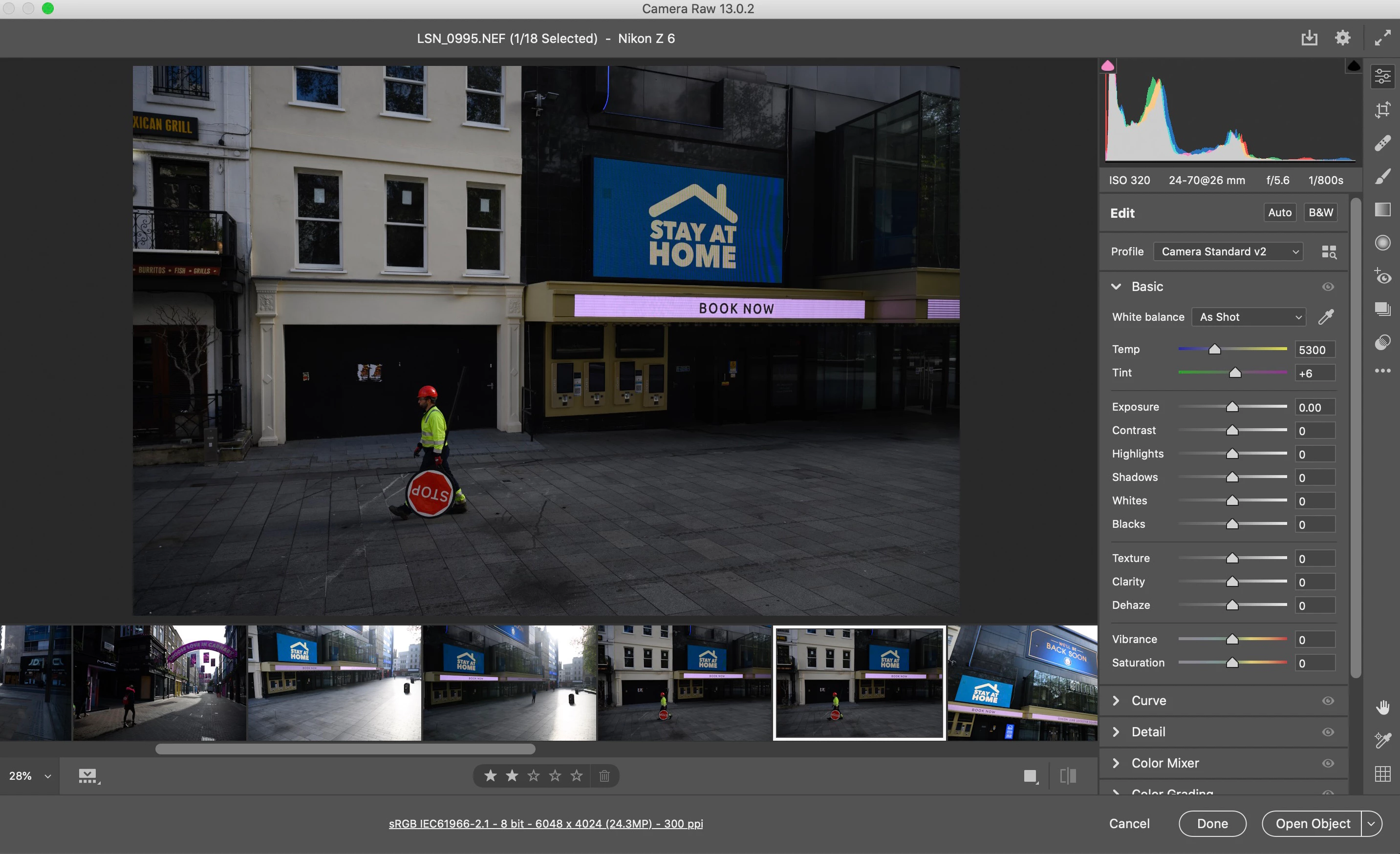
Here's an example screen. Do I really have to point out to Adobe how much wasted screen space there is with this current layout? Working on a Macbook Pro with a 13" screen, to see the full image, it's barely bigger than my mobile phone screen. Why is there OVER an inch of screen space dedicated to the RAW options, that I can also access via the cogwheel at top right? Why is there half an inch of lower screen space dedicated to the ranking option bar? Look at the enormous amount of options on the right that I don't need to see. The software is supposed to be for editing images and yet the image is forced into a tiny box due to poor design. Look at all the wasted space to the left and right of the image, purely because the team behind this design appear to have disregarded all of the knowledge that had previously been amassed through many versions of the pre-12.3 ACR.
What used to be a really slim, really slick bit of software that adapted well to a small screen looks like a bit of freeware by a start-up software company.
I'm sure this will get overlooked and ignored but please please reconsider this design. It's slow, wasteful, unintuitive and an enormous step backwards.