
Question
Adobe CMYK versus Pantone CMYK
Hi,
I've used the Adobe Color App to select a brand palette with a new client; usually I use my Pantone Color Bridge swatch book.
Logo development and supporting core elements all fine, however ...
setting the right CMYK conversions has been a nightmare.
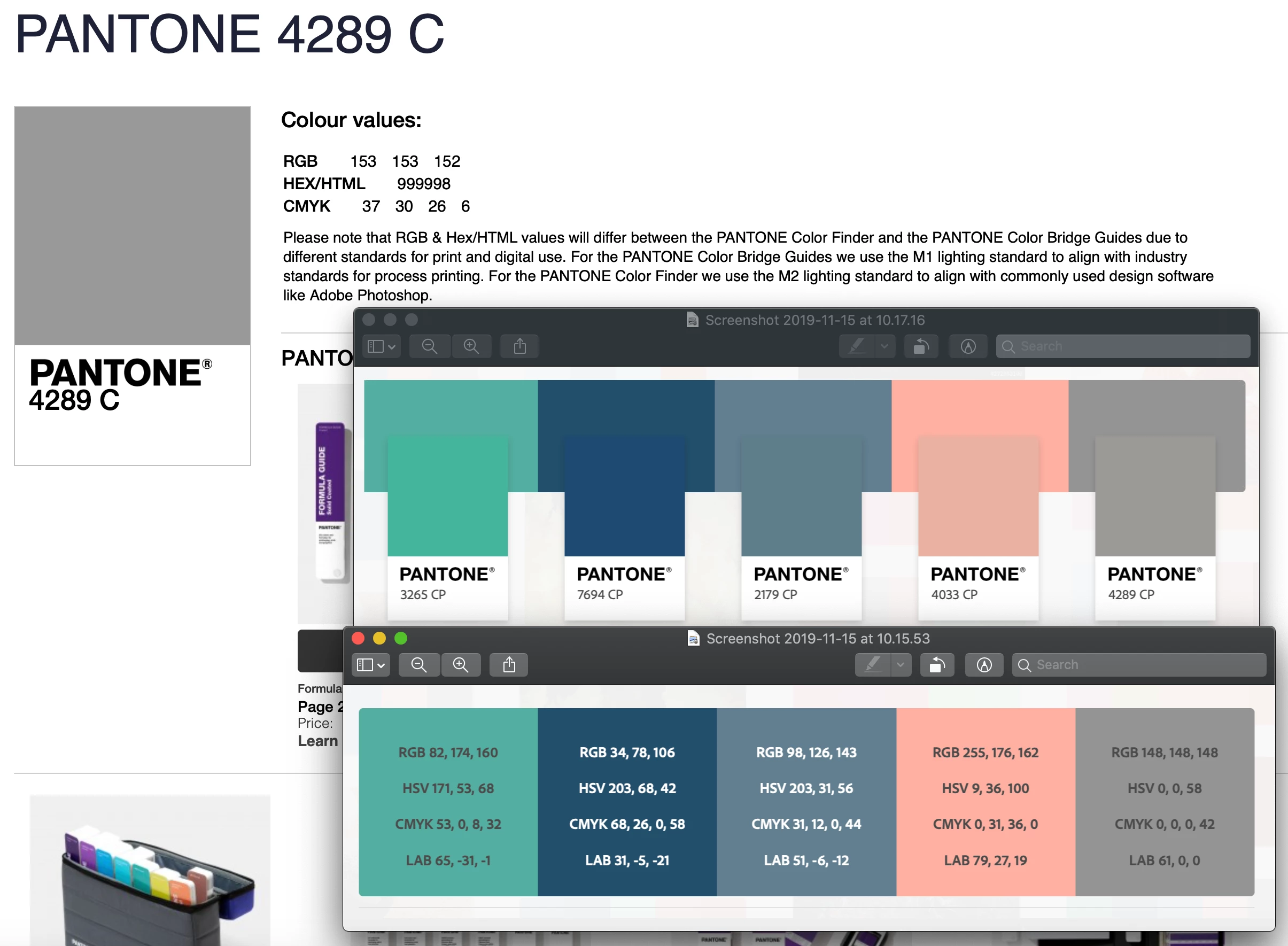
Simply, the Adobe Color App CMYK specs for coated stock are totally different to both the hard copy Pantone Color Bridge Book and the Pantone website.
Example here (Pantone site top left, Adobe Color bottom right screen grabs)..
So, what's going on here?
Which source to trust?
