Bildgigant
Participant
May 16, 2018
Answered

(Color Management) Colors change in every program?

  • May 16, 2018
  • 5 replies
  • 6503 views

Dear Forum,

My Hardware:

Computer: Windows 10 (with newest updates), i7-6700K, AMD Radeon R9 390

monitor: Eizo CS270

calibration device: datacolor Spyder5Pro

calibration software: Color Navigator 6 (newest Version from eizo)

My Problem
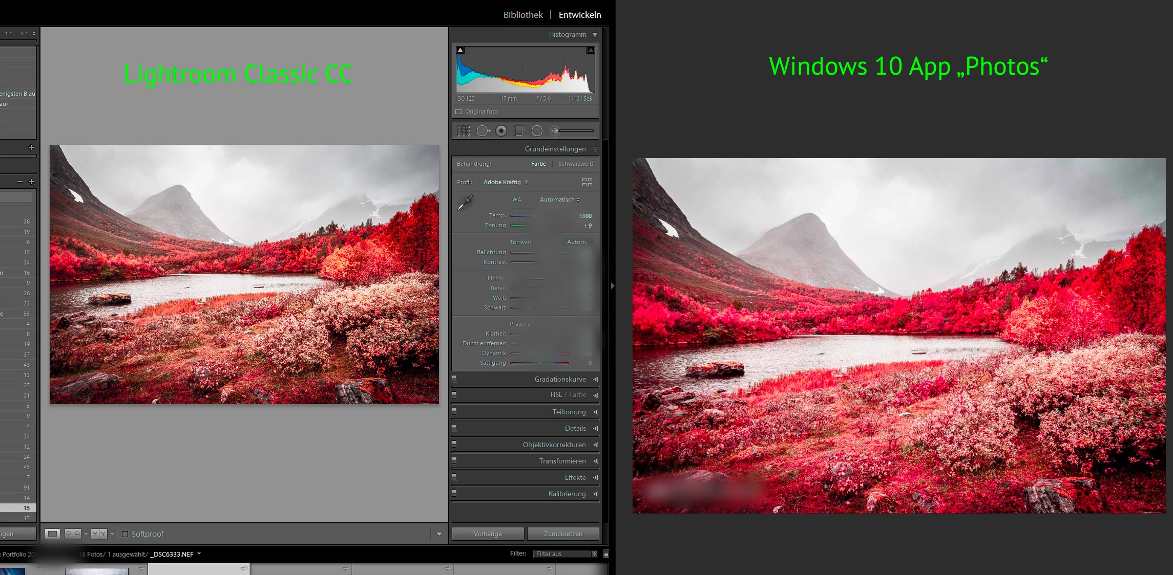
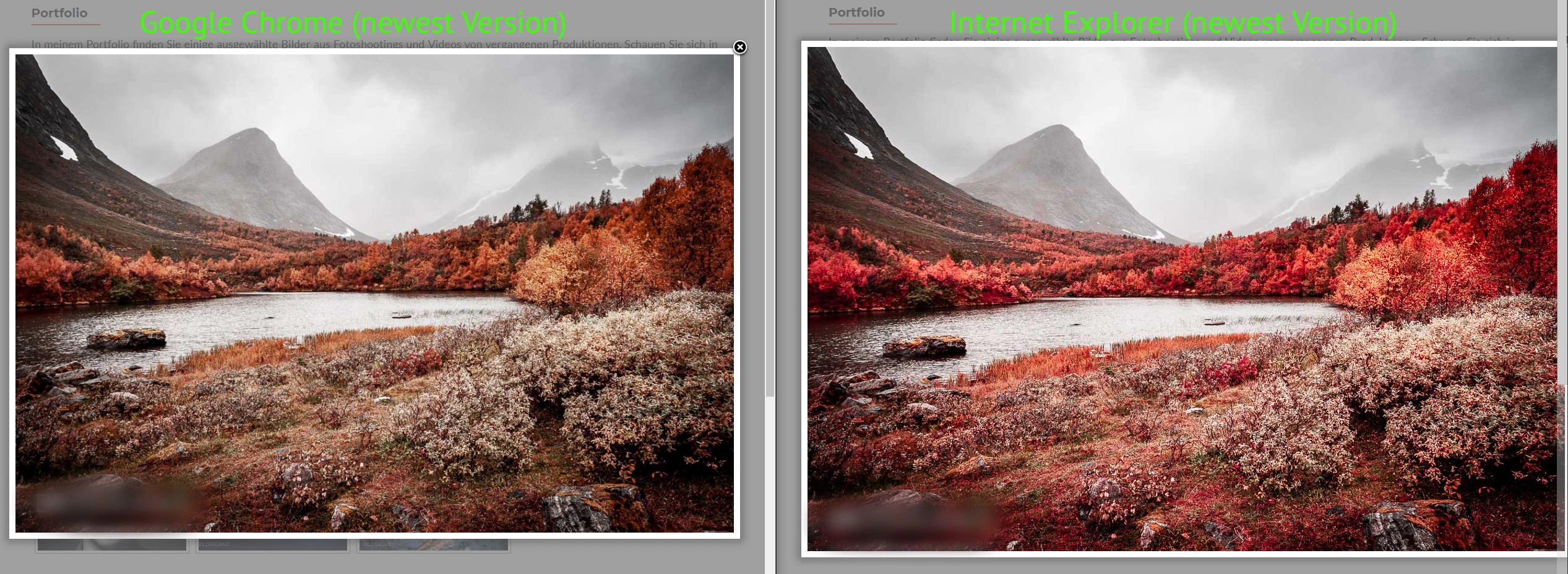
For example I edit a photo in Adobe Lightroom classic CC (newest Version) and make the colors look perfect for my taste and afterwards I export the image for uploading it to a website (I export with sRGB profile). After when i open the picture for example in Windows 10 App "photos" the before orange looking picture gets extremely red.. if i upload it to instagram on my phone the picture looks also more saturated and red than before in lightroom (where it was more unsaturated and more orange) .. if i upload it to my website the picture seems to look like in lightroom in google Chrome browser.. in EDGE or Internet Explorer or Firefox (all the newest versions) it looks like grap ... extrem saturated and red ... now I'm totally confused and not sure how the picture really looks like.. Isn't it possible to have the same colors at least on my computer in each program? 

Some example pictures (its the same problem with every picture and also with some more applications.. for example also on my phone specially in instagram where i want to share my pictures the picture looks damn saturated and red again...):

What could I do to get similar colors in every program that i know what I'm editing or what the viewer of my website will see at the end?!

This topic has been closed for replies.
Correct answer NB, colourmanagement

Hi

I believe that your issue is due to the way that non color managed application programs interface with high gamut monitor screens.

Some application developers still have not implemented color management (so the application has no way of adapting the data it send to your screen to provide correct appearance, it seems the W10 image viewer and IE are the ones affecting you adversely.)

It's already been suggested that you stop using the applications that cause you problems but that may not be an answer that you are willing to implement.

If you don't mind ceasing to use those applications when accuracy of appearance is important, great, but if not why not try this and see if you can work that way*:

I presume you are using Eizo's own Color navigator calibration software?

In your Color navigator calibration software, let's see how you are working right now -

check the first screen that comes up and make a list or screenshot of your current settings for:

Brightness,

Black Level,

White Point,

Gamma,

Priority

if you are happy with the accuracy of your screen in a color managed application these do not need to be altered.

Now go to "create new target", select enter manually, then in the next screen "monitor gamut" select sRGB

this step reduces the gamut of the screen and will stop the oversaturation you're seeing in non color savvy applications.

Set brightness, white point & black level then the tone curve as per your notes

I suggest setting Priority to "standard"

save the setting with an informative name then run a calibration.

That should largely solve the issues you are seeing

*theres a "catch", you are reducing the gamut of your expensive screen to that of sRGB. It's not a ridiculous thing to do but you do need to bear that in mind.

I hope this helps

if so, please do mark my reply as "helpful" and if you're OK now, please mark it as "correct" below, so others who have similar issues can see the solution

thanks

neil barstow, colourmanagement

5 replies

Legend
November 13, 2018

Sparwklz, I'm guessing your main monitor is a wide gamut monitor. If so, read on... this is what wide gamut monitors do, by design. It's what you paid extra for it to do! Only colour managed apps will look right: ALL OTHER APPS (such as Windows 10 default photo app) will be wrong, by design.

Legend
October 15, 2018

I have a thought/question, in these days where screen viewing is the norm and clients are often uncalibrated. Is it the norm to exchange sample pictures at the start of a client relationship, to establish that their viewing conditions are acceptable to you both?

NB, colourmanagement
Community Expert
Community Expert
October 17, 2018

Hi,

You've received some good recommendations and yes, sending files in sRGB is pretty much the best you can do.

You asked about exchanging a sample picture - yes - I have recommended clients to do that in the past.

But, I believe that to do that properly, you need some kind of reference for them to view as a "master".

For that I use a combination of composite test image as a digital file and a proof of the same image.

The one I use is available here for free download: https://www.colourmanagement.net/downloads_listing/

I hope this helps

if so, please do mark my reply as "helpful", so others who have similar issues can see the solution

thanks

neil barstow, colourmanagement

spawklz
Known Participant
November 13, 2018

Hi.

Just a follow-up to a topic that continues to confuse me.

When I share a photo digitally, I always convert to srgb and embed the profile when I export to jpg, but when I open the image in the Windows default photo app, I'm freaked out every time, because shadow detail is almost non-existent and colours are over-saturated. If I move the app window to my second monitor, which is not calibrated, they look more like I intended. I find the whole thing kind of hard to come to terms with, but should I assume that whoever sees the photo on an uncalibrated monitor (or in a colour-managed app on a calibrated monitor) will see more or less what I intended? (Of course with the potentially huge variation between monitors and display settings - I just don't want my photo to stick out in a negative way.)

I've always compared photo editing to mixing music on studio speakers, where the goal is to make the music sound good on all systems - but maybe this is a bad analogy? Should we use monitor calibration more for specific goals/targets? (print vs. web use, etc.?) Would it even be better to not calibrate the monitor if you want to get more of an approximation of what other viewers will see on their monitors?

Legend
October 15, 2018

What do you see when YOU view it on a standard PC, with normal monitor, colour calibrated? Your client shouldn't be the first one to discover an issue! It could be the client's setup (or lack of it) but possibly something has gone awry with your settings, workflow, or the monitor calibration you use as a visual target.

NB, colourmanagement
Community Expert
NB, colourmanagementCommunity ExpertCorrect answer
Community Expert
May 17, 2018

Hi

I believe that your issue is due to the way that non color managed application programs interface with high gamut monitor screens.

Some application developers still have not implemented color management (so the application has no way of adapting the data it send to your screen to provide correct appearance, it seems the W10 image viewer and IE are the ones affecting you adversely.)

It's already been suggested that you stop using the applications that cause you problems but that may not be an answer that you are willing to implement.

If you don't mind ceasing to use those applications when accuracy of appearance is important, great, but if not why not try this and see if you can work that way*:

I presume you are using Eizo's own Color navigator calibration software?

In your Color navigator calibration software, let's see how you are working right now -

check the first screen that comes up and make a list or screenshot of your current settings for:

Brightness,

Black Level,

White Point,

Gamma,

Priority

if you are happy with the accuracy of your screen in a color managed application these do not need to be altered.

Now go to "create new target", select enter manually, then in the next screen "monitor gamut" select sRGB

this step reduces the gamut of the screen and will stop the oversaturation you're seeing in non color savvy applications.

Set brightness, white point & black level then the tone curve as per your notes

I suggest setting Priority to "standard"

save the setting with an informative name then run a calibration.

That should largely solve the issues you are seeing

*theres a "catch", you are reducing the gamut of your expensive screen to that of sRGB. It's not a ridiculous thing to do but you do need to bear that in mind.

I hope this helps

if so, please do mark my reply as "helpful" and if you're OK now, please mark it as "correct" below, so others who have similar issues can see the solution

thanks

neil barstow, colourmanagement

Bildgigant
Participant
October 15, 2018

Hey its me again.. Thank you for all your answers the same problem appeared again.. i made a photoshooting and i sent the customers the pictures and she complained that the pictures look very high contrast and damn red.. and shes not satisfied. but on my monitor (this pictue above was taken my a camera so its not accurate but gives an idea whats the difference) soo my monitor shows a professional more yellow lookin picture (in my opinion) and next to it there is my phone with the same picture on it.. and there its damn damn red and saturated.

i know my phone is not calibrated.. but my monitor is .. i calibrated it again yesterday and I exported the pictures out of lightroom cc classic with sRGB for the customer. when I view the same picture on my phone it appeares as shown above..

Because of the big big difference I never know what the customer sees at the end because its completely different from my monitor.. so whats the point then of having a wide gammut calibrated monitor if the result is at the end whats shown on the left? Can anyone help me to fix that? would save me a lot of trouble with future customers :S

I know it will never be 100% the same but such a big difference.. i never had that before... is there maybe some settings wrong with the export in lightroom? but.. hmm on my desktop the jpgs look the same too like in lightroom.. just if I view it in another monitor its like a different picture.. worse..but I always add the sRGB profile like i should.

Thank you in advance!

- Lighroom CC classic (newest version)
- Photos taken with nikon D7200 as camera raw
- Mintor fresh calibrated with spyder5pro and color navigator 6 (newest version)

- eizo cs270 monitor

Per Berntsen
Community Expert
Community Expert
October 15, 2018
I never know what the customer sees at the end because its completely different from my monitor.. so whats the point then of having a wide gammut calibrated monitor if the result is at the end whats shown on the left? Can anyone help me to fix that? would save me a lot of trouble with future customers

The fact that the customer sees an over saturated image on their monitor has nothing to do with the fact that you have a wide gamut monitor. You are working with a calibrated monitor, and have exported the image with the sRGB profile embedded – that's the best you can do. The over saturation seen by the customer is most likely caused by (the customer) using a wide gamut monitor, and viewing the image in an application without color management.

You have no control whatsoever over how images display on other people's monitors. If they have a standard gamut monitor, the image will probably display more or less correctly, or hopefully within "acceptable". If they have a wide gamut monitor, and are using an application without color management, it will be over saturated – it's inevitable.

What you can do is to tell your clients to only use color managed applications to view your work. Most image viewers are unfortunately not color managed, but the free Irfanview is, as long as color management is enabled under Settings.

Legend
May 16, 2018

Colour management works: you can expect the same colours IN EVERY COLOUR MANAGED APP, with careful use of settings. So Photoshop and Lightroom are colour managed. The others apps are not: the result will be random.

You have purchased a wide gamut monitor. You need to know that these are a specialist tool, made for particular narrow purposes, and you must use ONLY colour managed software (or accept wild colour variation). Don't use any of those apps you mention that are bad. If you need to use these apps get another monitor.

We all thought 15 years ago that all apps would be colour managed by now so it would just work. Unfortunately we are going backwards, not forward. The Windows 10 Photos app is NOT colour managed, even though the Windows 8 Photos app WAS.

Bildgigant
Participant
May 17, 2018

Thank you very much for your answer! This was helpful aswell for me because now I have the safety to know that lightroom and Photoshop show the right colors

NB, colourmanagement
Community Expert
Community Expert
May 17, 2018

Hi

a really good way to properly check display appearance is using something like this

Http://www.colourmanagement.net/prover.html

Once you have a certified proof to hand you can rely on it for correct appearance and  possibly adjust brightness and white target for calibration.

I seldom find a user who is 100% happy with the “standard” presets if display calibration software.

Nearly every time a reference based adjustment of calibration targets results in an improved match to print. 

neil barstow

colourmanagement