Participant
December 29, 2022
Answered

Color numbers changing moments after setting (Photoshop, Illustrator, Fresco)

  • December 29, 2022
  • 3 replies
  • 782 views

I'm doing a series of digital paintings in Adobe Fresco that will eventually be printed in a book. I'm working on choosing key colors for the project that will print well once they're converted from RGB to CMYK. I prefer working with the HSB model within the RGB color space. I would work directly in CMYK, but Fresco only does RGB, so I know the final conversion is on me and I'm paying attention to gamut warnings by selecting colors in Photoshop first.


Problem is, the colors I choose aren't "sticking!" For example, one of my desired key colors is Hue 189, Saturation 100, and Brightness 85, which is about as bright a teal as I can go before getting a gamut warning. I'll select those values in the color picker, paint, and then do something else, like erase or paint with a different color. When I again click on the teal swatch or sample the color I already laid down, I'll find the values in the color picker have changed! Again and again it will revert to something similar but just different enough, e.g. HSB 186-100-84. This happens in Fresco, Photoshop, and Illustrator. It happens with every hue I've tried. And it sometimes results in a color being out of gamut! I've worked with the Adobe suite for 15+ years and I've never seen this behavior. What is going on here?

    This topic has been closed for replies.
    Correct answer TheDigitalDog

    Thanks @TheDigitalDog! I downloaded your PDFs and watched the video and that was really helpful. Sounds like testing prints in CMYK Swop v2 is going to cause more problems for me than it solves and I shouldn't worry too much about picking out-of-gamut colors. Because I'm using Fresco to paint, I have to use the RGB space, but I don't necessarily have to use sRGB. Would it make more sense to work in a different RGB space, like Adobe 1998 or ProPhoto?


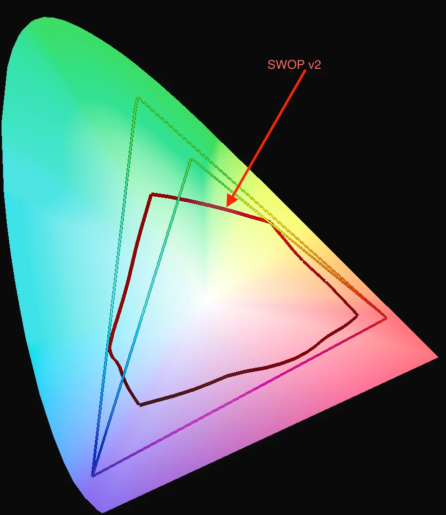
    If you've already created the artwork in sRGB, stick with that. In the future, if you can switch to Adobe RGB (1998), the advantage would be virtually no chance of clipping colors when converting to CMYK (and again, that depends on the flavor of CMYK). But to give you an idea, here is sRGB vs. Adobe RGB (1998) plotted (merely in 2D) over SWOP v2.

    3 replies

    NB, colourmanagement
    Community Expert
    Community Expert
    December 29, 2022

    Maybe it's some kind of rounding error,

    I suggest making a new document then setting the swatch as you like and filling the colour, now sample it, (immediately) - is it what you entered? 

    Try it a few minutes later, has it changed?

    Make the e sample 3x3 so you're not just getting a single pixel (that could be affecting sampling of your painted colours


    BTW, Digitaldog is right, Lab would be better numbers to use if working numerically


    I hope this helps
    neil barstow, colourmanagement net - adobe forum volunteer - co-author: 'getting colour right'
    google me "neil barstow colourmanagement" for lots of free articles on colour management

    Participant
    December 30, 2022

    It happens with both old and new documents. Once it's changed from say, H 189 to H 186, if I set the swatch back to 189, it will immediately revert to 186. It happens when I sample the color with the eyedropper in a raster program like Fresco, but it also happens in Illustrator, where I use a solid-color vector shape for my swatch. It happens even when I input the values I want, save the swatch to my library, and reuse it. I know Lab is more accurate, but using HSB helps me because I can translate those numbers visually very easily and it helps me select colors of similar brightness or saturation for an area.


    I should add that prior to this project, I worked mainly in greyscale comics and art for the web and very rarely printed my work, so although I know the basics of color space and the limitations of printing, I lack experience with the finer points. I'm still learning how to choose colors harmoniously and the profile thing feels like a Catch-22: I can't convince a publisher to take the project without having a substantial amount to show and I can't tailor my colors for the right profile without knowing which publisher we're going to use. Advice for getting around this?

    NB, colourmanagement
    Community Expert
    Community Expert
    January 4, 2023

    IF you are compelled to aim for unknown CMYK and optimise images for the conversion - then I'd definitely work on a copy of the original (keep [archive] that in RGB as a tif or PSD, keep away from Jpeg)

    - now I'd choose a FOGRA 39L based CMYK profile, Adobe install one - but I prefer ISOcoated_v2_eci* (you can download that at ECI.org) -

    *why" I prefer the black generation in the ECI version, that's actually the "original" FOGRA 39L based CMYK profile. 


    I hope this helps
    neil barstow, colourmanagement net - adobe forum volunteer - co-author: 'getting colour right'
    google me "neil barstow colourmanagement" for lots of free articles on colour management

    TheDigitalDog
    Inspiring
    December 29, 2022

    Wow, first off, you can kind of ignore the gamut warning:

    The Out Of Gamut Overlay in Photoshop and Lightroom

    In this 25 minute video, I'll cover everything you need to know about the Out Of Gamut (OOG) overlay in Photoshop and Lightroom. You'll see why, with a rare exception, you can ignore this very old feature and still deal with out of gamut colors using modern color management tools. 

    YouTube: https://www.youtube.com/watch?v=00O-GTDyL0w

    High resolution: http://digitaldog.net/files/OOG_Video.mp4

    Next, the warning is based on some profile; what are you using? Are you asking for a gamut warning for some flavor of CMYK of which you don't yet know? That's a recipe for disaster**! 

    What is the color space of the RGB data you're working in? 

    If you really must work in numbers, do so using Lab (it is device independent). 


    ** http://digitaldog.net/files/CMYKPart1.pdf and http://digitaldog.net/files/CMYKPart2.pdf

    Author “Color Management for Photographers" & "Photoshop CC Color Management/pluralsight"
    Participant
    December 30, 2022

    Thank you! I didn't realize the gamut warning was outdated and that's a relief to know a number off here or there doesn't make much difference! I'll look into this further. As far as profiles go, I use sRGB when working in Fresco because that's pretty much what's available. I converted to the generic working CMYK U.S. Web Coated (SWOP) v2 profile. Part of the challenge is that we don't know what the final CMYK profile will be. If we get a publisher for the book, I'll ask them for their printer profile and work with them to get good color. But it's far more likely that this will be a self-published passion project, in which case we have to pick a POD service. It'll be at least a year before the book is ready for shopping around to publishers.

    TheDigitalDog
    Inspiring
    December 30, 2022

    Let's start here: if you don't know the exact and specific recipe of CMYK, do not convert to CMYK!
    As for color gamut, about the poorest color spaces to be starting from is sRGB. But compared to the CMYK blind conversion, relatively minor in comparison.

    Author “Color Management for Photographers" & "Photoshop CC Color Management/pluralsight"
    kglad
    Community Expert
    Community Expert
    December 29, 2022

    <moved from using the community >