Participant
May 14, 2019
Question

Colour difference dilemma
  • May 14, 2019
  • 4 replies
  • 6100 views

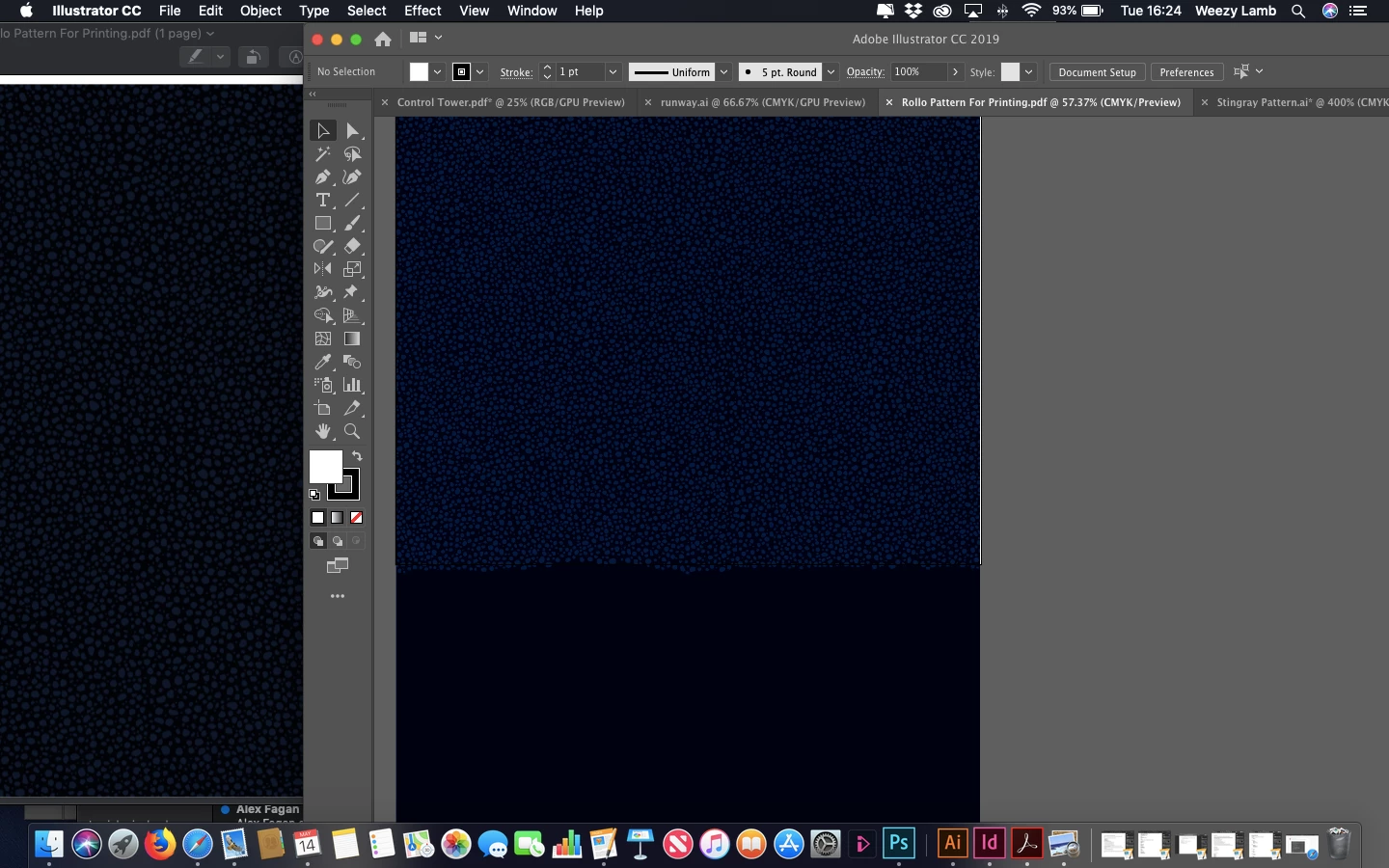
Hoping someone has a quick fix for me - On the left you see the PDF I have created opened with Preview, this is also the colour which the document prints in and matches the RGB/CMKY/Pantone colour codes correctly.  On the right you see how I see the colours in Illustrator (Photoshop is the same) which is way off  - I obviously need to be working with the correct output colours displaying and nothing I do seems to rectify this issue...


Thanks in advance!

PS - working on a MacBook Air

    This topic has been closed for replies.

    4 replies

    NB, colourmanagement
    Community Expert
    Community Expert
    August 1, 2019

    As Rob has mentioned, all documents should have embedded profiles, this allows applications to "know" the originators intent for colour and tone..

    Bob,

    Although I believe that It's right that ICC profiles should be embedded I don't believe that they must all match, in my understanding, the beauty of device independent colourmanagement is that images, or any "documents" with embedded ICC profiles are interpreted correctly within the colourmanagement process.

    It's not bad practice, though, to make sure ICC profiles match during the production process - as long as the conversion from one colourspace to another is handled with care.

    It's worth pointing out that [although offered] there is no "Perceptual" rendering when converting between working spaces (unlike when converting from working space to a CMYK ICC). Some users rely heavily on Perceptual rendering's (much misunderstood, but that’s for another post) characteristics - not realising they are not available in this scenario.

    Example:

    If you have a Pro Photo RGB file to place it may be better strategy to place it 'as is' and allow the later CMYK conversion to deal with the compression rather than to convert in advance, to, say, Adobe RGB. That conversion can be damaging unless some care is taken to avoid the almost inevitable clipping in that conversion.

    All conversions working space to working space are relative colorimetric with the inevitable clipping if the original had colours close to gamut boundary - that’s why those conversions need a lot of care. Maybe some manual de-saturation so that detail in edge of gamut areas is not destroyed.

    Or even approach this by using Joseph Holmes special "nested" workingspaces https://www.josephholmes.com/profiles/rgb-working-spaces but again that’s another subject

    I hope this helps

    if so, please do mark my reply as "helpful"

    thanks

    neil barstow, colourmanagement

    rob day
    Community Expert
    Community Expert
    August 1, 2019

    Although I believe that It's right that ICC profiles should be embedded I don't believe that they must all match, in my understanding, the beauty of device independent colourmanagement is that images, or any "documents" with embedded ICC profiles are interpreted correctly within the colourmanagement process.

    That may be the case with RGB objects, but mixing CMYK profiles would likely cause problems in a separated offset workflow. There can only be one final CMYK destination space, so if a page layout document had a mix of CMYK objects with different profile assignments there would have to be at least some CMYK-to-CMYK conversions at export or output to the single output destination. There are a number of problems with CMYK-to-CMYK conversions when the output is to offset, that's why illustrator and InDesign offer the Preserve Numbers (Ignore Embedded Profiles) policy.

    With conflicting CMYK profiles black only text and grays would get converted to 4-color causing registration problems on press, custom CMYK builds would be lost, and primary CMYK colors like 100% cyan, or yellow would likely get contaminated.

    Mixing RGB profiles would be less of a problem because in the end the profiled objects would all be converted directly into the final CMYK destination without additional conversions. But still, if you have control over the editing, there would be no benefit to mixing RGB spaces. The advantage of Prophoto is almost all CMYK spaces are inside of it, so it doesn't clip parts of the CMYK gamut the way sRGB does—sRGB clips a large chunk of the cyan green gamut.

    All conversions working space to working space are relative colorimetric

    When you make a conversion to CMYK you can control the Intent from the Photoshop Convert to Profile dialog. If you use the Image>Mode menu, the current Color Settings Intent is used. With InDesign its Color Settings Intent is used on export, or you can set individual images’ Intents via Image Color Settings:

    rob day
    Community Expert
    Community Expert
    May 18, 2019

    What preset did you use to make the PDF?

    The common PDF/X-4 and PDF/X-1a press presets export CMYK objects that use the document’s CMYK profile as DeviceCMYK—the CMYK objects have no profile assigned in the exported PDF. If you view in AcrobatPro, or Acrobat Reader, the PDF/X Output Intent profile (which is the same as the original document's CMYK profile) is used to color manage the soft proof display of DeviceCMYK objects.

    Preview does color manage, but does not read Output Intent profiles, so DeviceCMYK objects will not necessarily soft proof correctly in the Preview app even though the output numbers are correct.

    Inspiring
    May 16, 2019

    You mean the dark blue R1 G1 B5 in the left side

    i don't see how any printed media could reproduce 1/1/5 as anything other than black to the naked eye

    even the right side RGB 0/1/14

    but whatever color you are trying troubleshoot, a solid fill may simplify

    but to the visual mismatch on the screen

    you must get your source profile and color settings in order

    and nothing in color-managed Adobe apps will match until you:

    1. use (apply) the same correct source profile
    2. ensure your color settings are not changing your source document

    at that point Adobe apps should use the embedded profile and make consistent color translations/conversions/corrections to the monitor profile

    lastly, if you are using pantone spot colors in Adobe, i would expect room for error on the monitor between apps - it seems more of an art than a science to most users and not too many people know how Preview.app deals with pantone and spot colors in PDF, but if it's correct (what you want) that's a huge clue...

    Inspiring
    May 19, 2019

    further, if your PDF is un-tagged (it does not contain an embedded ICC profile) - or objects within it have been mis-tagged or mis-converted

    it will most likely not display correctly in Acrobat UNLESS Acrobat's working RGB/CMYK profile matches the document's correct color space

    UNTAGGED DOCUMENTS: Acrobat will apply/assign/use its working RGB/CMYK profile for its conversion/translation/correction to the monitor space just like photoshop

    i am not positive about all the Acrobat export presets, but that has been my experience

    Inspiring
    May 19, 2019

    likewise, if your PDF is untagged - and you set up your printer to Convert to a print space ICC profile - you want to be aware of the same issue (the Source profile you are using for the conversion must be correctly assumed)

    D Fosse
    Community Expert
    Community Expert
    May 15, 2019

    What you're showing here is missing color management. If you need colors to be reasonably accurate, you need to have a basic understanding of color management and color profiles.

    It's not difficult. You just need to make sure that a) there is a color profile embedded in the file, b) it's an appropriate one for the intended use, and c) the color profile is correctly interpreted by the application.

    In Photoshop and Illustrator you go to Color Settings, and under Policies make sure it's set to "Preserve Embedded Profiles". Then everything will be correctly handled.

    If you want to see things correctly on screen, you also need a profile for that. A calibrator will make that for you.

    Generic RGB/CMYK color codes are completely worthless, made by people who have absolutely no idea what they're doing. Numbers are relative to whatever color space is used! They mean nothing if color spaces aren't specified. RGB isn't a color space, but sRGB, Adobe RGB and ProPhoto RGB are. A set of numbers in one color space yields a completely different color in another - and a certain color has very different numbers in different color spaces.

    The default working spaces for Photoshop and Illustrator are sRGB for RGB, and US Web Coated (SWOP) for CMYK. They don't have any particular significance, but there has to be some defaults, and these are it. So people who don't know anything about this, tend to just take these for granted, and "color codes" therefore tend to refer to sRGB and US Web Coated (SWOP).

    ---

    The basic principle of color management is very simple. A source color space is converted/remapped into a destination color space. This recalculates the numbers in order to preserve appearance, using icc profiles to do the math. A profile is a description of a color space.

    The source is usually the document, so you have a document profile, which is normally embedded in the file. The destination can be your monitor, having a monitor profile, or a printer, using a print profile that describes printer/paper/ink. All color management requires at least two profiles, one converted into the next in the pipeline.

    Excel International, Inc
    Participant
    July 23, 2019

    Tried what you mentioned but still colors are different in illustrator and photoshop, and goes through the PDF and other programs.

    kindly can you go item by item in the color setting manu to make sure I cover all the different options right.

    thanks

    Bob_Hallam
    Legend
    July 23, 2019

    The easy way to make sure color settings are the same across all Adobe softwares is to open Photoshop and set the color settings correctly in this one software and save those settings. 

    Then open Bridge and sync those settings in the color settings menu in that software. 

    Example:

    Here are saved settings in Photoshop

    In Bridge / Edit /Color Settings, just click those settings and hit Apply

    ICC programmer and developer, Photographer, artist and color management expert, Print standards and process expert.