
Colours different in ACR from Bridge & PS
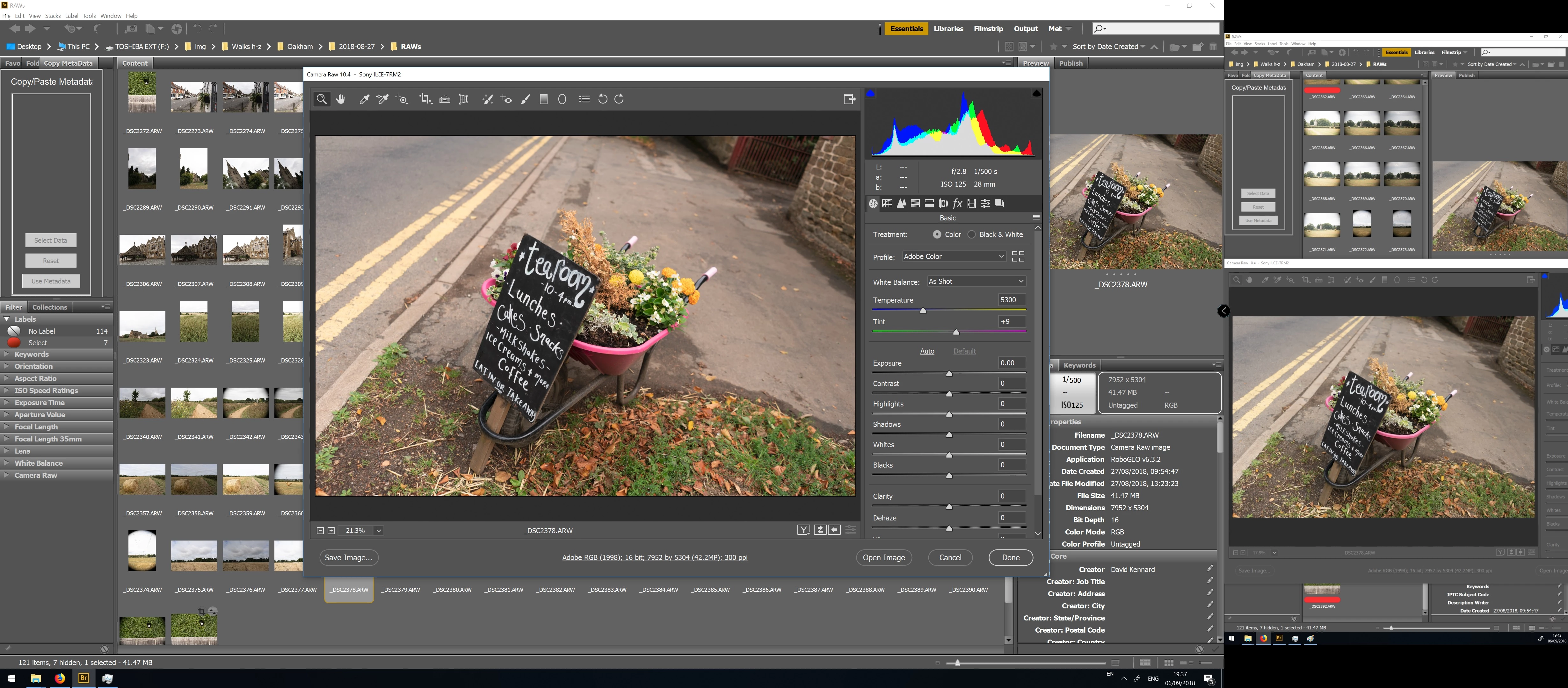
My question is slightly different from previous ones. Colours show the same in Bridge previews and Photoshop, but are much more vibrant in ACR. I have two monitors, the main one is a 10bit wide(ish) gamut, the other a standard sRGB. I only see the strong colours in ACR on the main monitor, on the sRGB one ACR, Bridge and PS all display the same. Both screens have been calibrated with an i1 Pro.
In the image below the wide-ish gamut monitor is on the left, the sRGB on the right:
My Colour settings in PS are set to monitor colour, so PS always asks me whether to use the current working space or the image profile (aRGB) when opening images. I always choose to use the image profile, but have also tried discarding the profile and converting it, which makes no noticeable difference.
In ACR, if I change the output profile to the monitor profile then open in PS, it doesn't make any difference - the image in PS appears the same (i.e. less saturated than in ACR).
So I am not quite sure where my issue is - if ACR is displaying images with the wrong profile or PS and Bridge are? And what to do about it?
