saurabhp5927337
Participant
September 1, 2018
Answered

Photos look different on my phone compared to photos on the computer.

  • September 1, 2018
  • 12 replies
  • 138460 views

Hi Guys,

I edit my photos in either Lightroom or Photoshop. The photos look vibrant and colourful on my PC, as per the editing I had done. But when I save these photos in my S9-Plus, they look colourless and weird.

Can someone please help me here? Do I have to save the files differently once I edit the photo in Photoshop or Lightroom?

Example 1 -

The photo on PC -

Photo/Screenshot from my Samsung S9Plus -
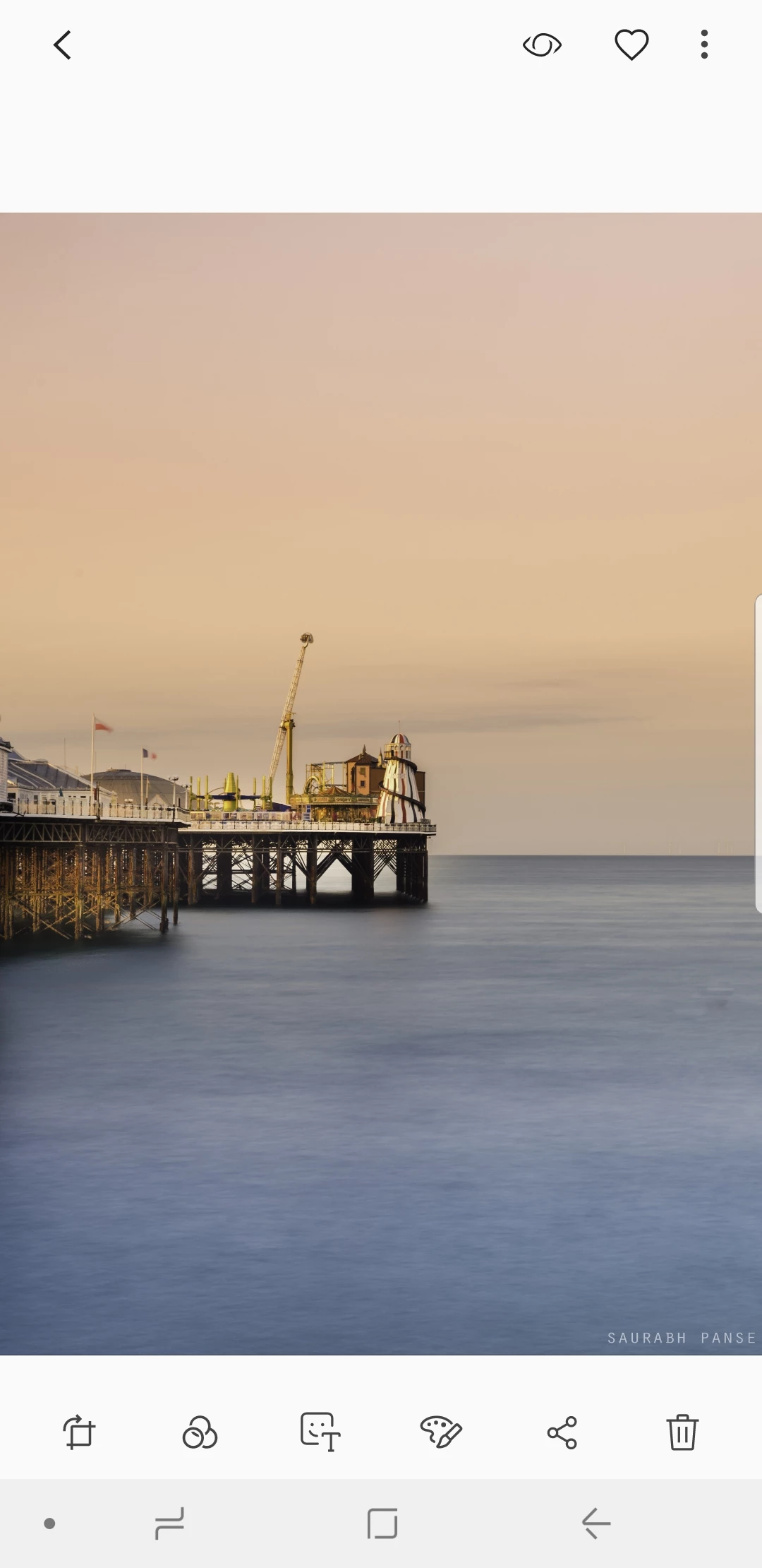
---------------------------------------------------------------------------------------------------------------------------------------------------------------------------

Example 2 -

The photo on my PC -
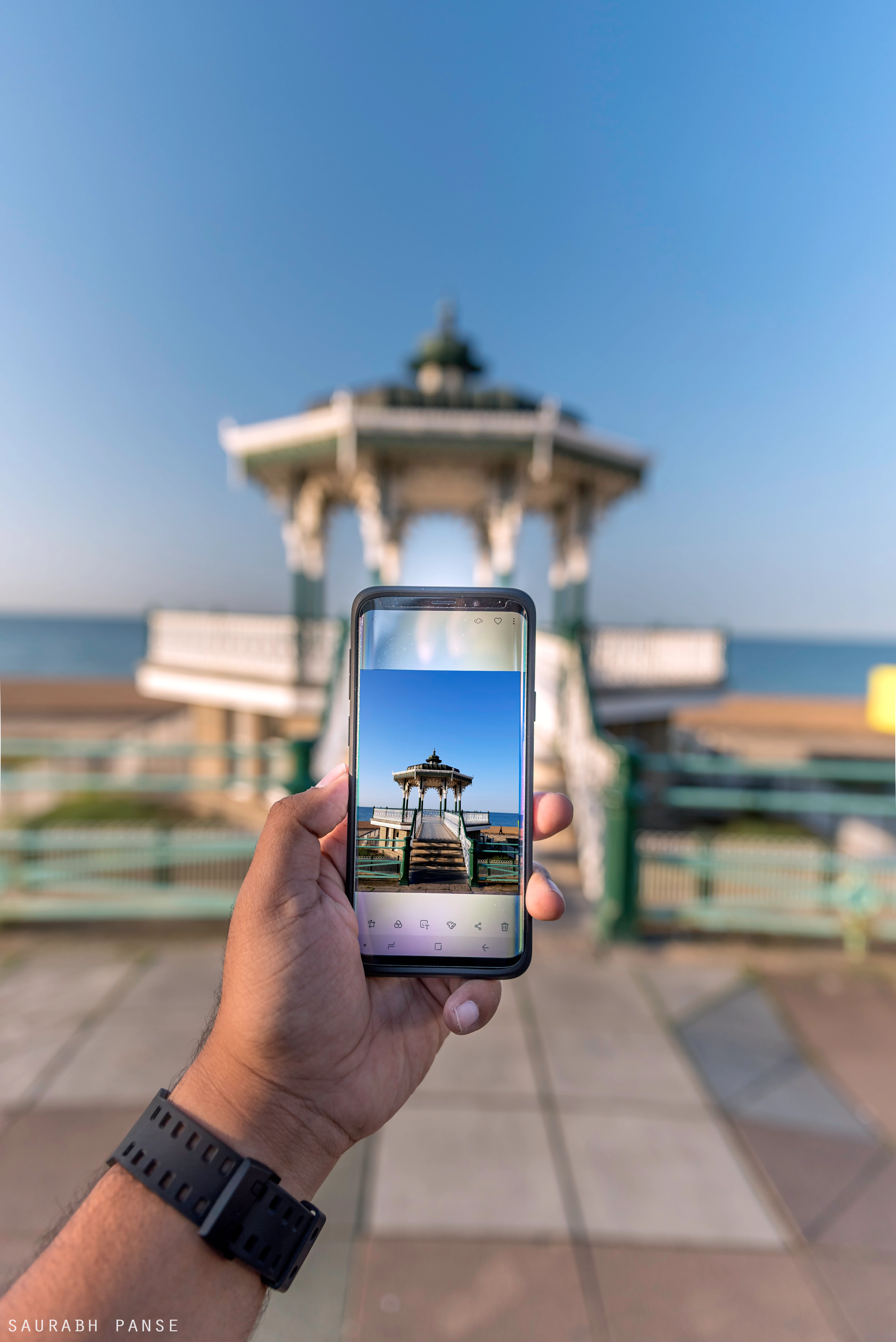
Screenshot from my Samsung S9Plus-
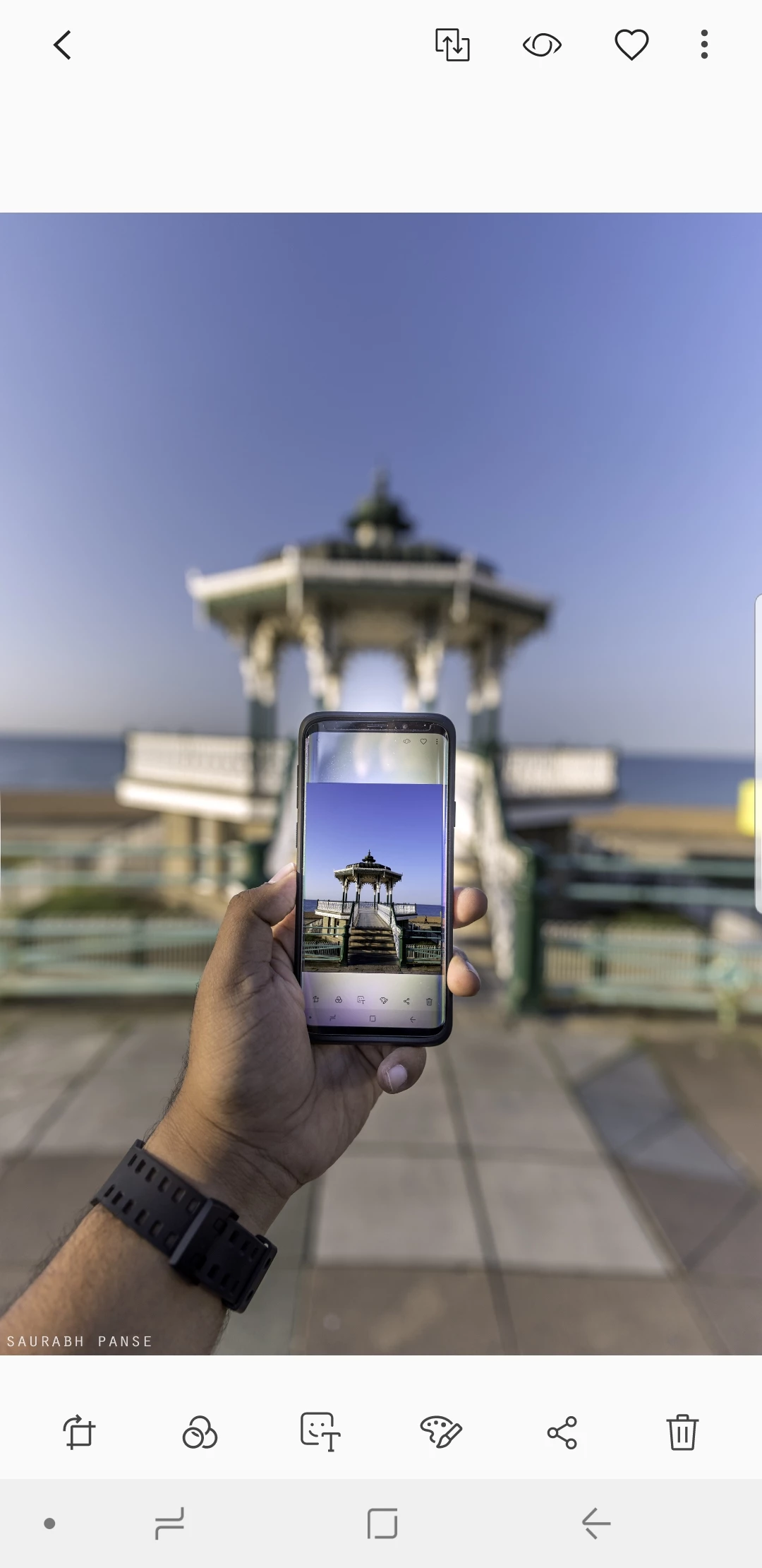
This topic has been closed for replies.
Correct answer davescm

Hi

The explanation is in the way colours are stored in the image. Each pixel stores the colour as three numbers representing Red, Blue and Green. However what actual colour is represented by each number depends on the colour profile. Your original document is using a profile called ProPhoto.

Photoshop is colour managed. It uses the color profile embedded in the document to tell it how to use the RGB numbers that make up each pixel and correctly display it on your monitor (using the monitor color profile stored in your system).

Many applications (including phones) are not colour managed and just send the raw numbers to the display.

To be safe when sending an image to the web (or to an unknown device) , Export a copy of your image using "Save for Web (Legacy)" and ensure that both  "Convert to sRGB" and "Embed Color Profile" are checked. That way if the other device is colour managed it will use the profile. If it is not , then sRGB will display close to correct on many devices.

Dave

12 replies

Participant
October 28, 2023

I'm new to this in lightroom but a quick temporary fix I did was, if you have an nvidia graphics card, go to the nvidia graphics settings and change the vibrancy way down to match your phones colors. I did a side by side with an image within the creative cloud and it worked out fine. If you don't have a nvidia graphics card, and only have an Intel intergrated graphics one, just go to its graphics settings and lower the saturation. There's no vibrancy. I haven't found a good real simple answer that can quickly change this as I found out the hard way that the images are different coloring from monitor and phone.

Monika Gause
Community Expert
Community Expert
October 28, 2023

@Martin33078556j871  schrieb:

go to the nvidia graphics settings and change the vibrancy way down to match your phones colors. I did a side by side with an image within the creative cloud and it worked out fine. 


If you won't ever send anything for professional print and only do work for you and your family for private use, then you can totally go ahead with this. But paying clients might not like the idea that you cannot have any idea about how colors really look after doing what you described.

Bob_Hallam
Legend
December 14, 2022

Neil brings up an important point in that luminance or display brightness varies between devices.  The display type will also affect the devices ability to match one to another.  The important point about display brightness is that Color Gamut is directly affected by display brightness.  If all other variables are the same a device at high brightness will appear more colorful.  

ICC programmer and developer, Photographer, artist and color management expert, Print standards and process expert.
Participant
December 9, 2022

Hi,


I do the same while exporting the photo from Photoshop. I always select convert to sRGB and embedded profile option but still my photos look warmer and oversaturated on the phone. 

Bob_Hallam
Legend
December 9, 2022

Your phone may not be calibrated and your computer monitor may also not be calibrated so that is to be expected.   

ICC programmer and developer, Photographer, artist and color management expert, Print standards and process expert.
Participant
March 5, 2022

I found your issue is you didn't Color Space from Adobe RGB to SRGB in export setting that's y your photo's color changes and less vibrant. Never forget change Color space and every phone or computer only capable for  sRGB. 

TheDigitalDog
Inspiring
March 5, 2022

There are many millions of phones (and displays) with wider color gamuts and not sRGB color gamuts; like every iPhone from the 6 on.

Author “Color Management for Photographers" & "Photoshop CC Color Management/pluralsight"
NB, colourmanagement
Community Expert
Community Expert
October 30, 2022

True, and one day we'll maybe be able to place P3 images online (profile embedded of course) this P3 image works pretty well on mu iOS devices, matching to my calibrated Eizo quite successfully. Mind you an sRGB version does too.


I hope this helps
neil barstow, colourmanagement net :: adobe forum volunteer:: co-author: 'getting colour right'
google me "neil barstow colourmanagement" for lots of free articles on colour management


Damian C
Participant
February 5, 2021

Whatever I do my "blacks" always look washout when I move them to my galaxy 9, and they don't look that good on Instagram. Any way to fix it? 

Legend
February 5, 2021

"Whatever I do" ... What is the whatever? Please list in detail the things you tried to do, including the settings chosen.

Damian C
Participant
February 5, 2021

All possible color output settings available in the lightroom. 

Exportin to cloud in Lightroom desktop, so I can import on mobile. 

Always the same, looks really bad when I preview it on mobile. I guess something is wrong with the phone if I view it on Instagram on phone looks worst than when I preview it on a desktop. 

Participant
October 17, 2020

Hi!

I have same problem whit colors what Dave but I can see the diffrent at the stage of saving the photo in Photoshop. Mayby somone can help me here. I use first LR and aftre edit photo in PS. Everythink work good untill the photo is saved. I can see a big difference on my computer especially color on skin is more gray and this is big problm for me! I dont know what to do or change. I seve photo by using save as web(legacy) i have selected convert to sRGB. In LR also my settings are sRGB. Please help me!

davescm
Community Expert
Community Expert
October 17, 2020

What application are you viewing your saved image in? Some applications are not color managed so will display differently.

Dave

Bob_Hallam
Legend
May 23, 2020

Display in a different light will appear differently most of that is due to the viewer's environment.  How bright, and what color the light is and the viewing angle.   So no one's phones will display color properly, even if the display was somehow profiled and the software supported color management, if the environment is different the colors will not appear the same.  IOS has an automatic color temperature adjustment that compares the color of the ambient light and makes an attempt to adjust the display on the user's phone, but it’s not very good yet.  

 
Probably not a good idea to use any phone as a color benchmark.  I'd recommend a calibrated display in a controlled neutral dim environment as a benchmark.   

Bob Hallam
ICC programmer and developer, Photographer, artist and color management expert, Print standards and process expert.
gener7
Community Expert
Community Expert
May 21, 2020

Thanks, Dave. 8 vs 16 used be quite the religious arguement years ago.

gener7
Community Expert
Community Expert
May 18, 2020

I should ask if 8 bit or 16 bit is best for external editing and do all apps recognize it?


(Not a frequent Lr user, but I should know what's best practice.)

davescm
Community Expert
Community Expert
May 18, 2020

For editing, I would always recommend 16 bit over 8 bit. There is far less chance of visible banding being introduced. As for whether all apps support it, I don't know.


Dave

NB, colourmanagement
Community Expert
Community Expert
December 16, 2019

Hi,

it's safe to assume that mobile devices are close to the sRGB colorspace.

So that’s what we need to give them - they do not have the facility to read the embedded profile so it's important to bear that in mind.

EDIT

quailty handhelds e.g. iPhone since 7 and many recent Android devices are now capable of showing DISPLAY P3 data - that’s quite a large colourspace. 


neil


John344785627jva
Participant
January 7, 2024

Hi Neil,

Absolutely, it's a reasonable assumption that mobile devices generally align closely with the sRGB color space. Considering that these devices often lack the capability to interpret embedded profiles, it becomes crucial to deliver content in the sRGB colorspace for optimal display accuracy.

It's worth noting that high-quality handhelds like the iPhone since the 7 and numerous recent Android devices have advanced capabilities, such as showcasing DISPLAY P3 data, which encompasses a considerably larger color space. This expanded capability is a significant development in the mobile device landscape.

Best regards

John