Participating Frequently
September 10, 2014
Question

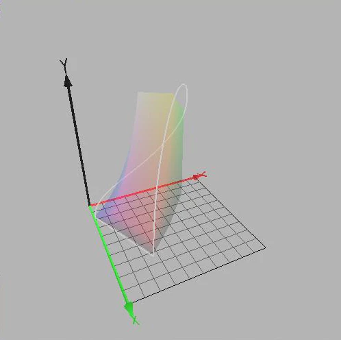
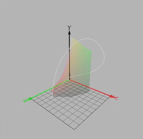
Visual representations of color spaces

  • September 10, 2014
  • 1 reply
  • 27707 views

I copied these diagrams from the program called Color Space ...

Can be downloaded from here: COULEUR.ORG

I think that it draws spectral locus on xyY by just plotting matching x, y and Y values for every interval of monochromatic lights on the spectrum ... just like we draw the locus line in XYZ by plotting matching tristimulus values X, Y and Z.

Because the underlying data for the most saturated colors human can see is CIE XYZ color matching functions, I think that we can draw the line of spectral locus in every model originated from CIE XYZ by just making necessary transformations to the XYZ tristimulus values for the intended model.

3D representation of the entire human gamut is more tricky, I think. I will ask about it, after getting your confirmation about the spectrum locus.

    This topic has been closed for replies.

    1 reply

    Inspiring
    September 11, 2014

    Without further explanations these graphics are rather dubious, in my humble opinion.

    http://docs-hoffmann.de/ciexyz29082000.pdf

    On p.8 we can see, how XYZ is mapped onto the plane X+Y+Z=1 as coordinate system xy
    by a perspective projection:

    The original Y-axis is not orthogonal to the plane xy, therefore the quoted diagrams
    are not correct. It's of course possible to construct a kind of substitution Y* orthogonally
    to xy.

    As long as we are talking about unrelated colors, like an arbitrary set of spectral light
    sources with arbitrary radiant powers, the human gamut in XYZ is indeed a cone,
    which has its vertex at X=Y=Z=0 and which intersects the plane X+Y+Z=1 by this
    horseshoe curve (plus purple line for mixtures of extreme spectral red and blue).

    About power:

    http://en.wikipedia.org/wiki/Radiant_flux
    "radiometric power", correctly: radiant power or radiant flux

    The situation becomes different under certain circumstances where the unlimited cone is
    replaced by a finite volume or by finite curves on this cone:

    1) The radiant power of the spectral light sources is limited and equal, e.g. 1 Watt.
        The curve on the cone shows the spectral loci. In Wyszecki&Stiles in chapter 3.3.3
        in Fig. 4(3.3.3) exactly this situation is illustrated: we can see the cone, the horseshoe and

        the spectral locus on the cone.
        As already mentioned, this issue has been further evaluated by Jim Worthey ("amplitude
        not left out" and illustrated by me and of course by himself  (see references):
        http://docs-hoffmann.de/jimcolor12062004.pdf

    2) The volume of Optimal surface colors, concept by Roesch, as already explained.
        Fig. 5(3.7) in W&S shows Y orthogonally over xy, which is not correct, but we understand
        the meaning. This 'wet sack' has on top Y=100, which is the luminance of the illuminant.

    3) A color space is a subset of a finite gamut volume in XYZ. There is always a white point and
       nothing can become brighter than the white point. An RGB space is represented in XYZ by an
       affine distorted cube. Mapping to xy delivers a triangle, but here we can see, what happens

       if the "amplitude is not left out":
       http://docs-hoffmann.de/ciegamut16012003.pdf
       The sections Y=const. with the dark sides of the cube appear still as triangles, but the sections

       with the bright sides by other polygons (p.12 for sRGB).

       A threedimensional graphic would be possible, Y over xy.

    Best regards --Gernot Hoffmann

    Participating Frequently
    September 13, 2014

    I would like to ask some basic questions.

    The following diagram is the Adobe RGB appearance in xyY (Color Think Pro):

    1. Does any white point conversion visually mean shifting the place of the top vertex in the graph ... and recalculating the other colors according to this shifting vertex?

    2. Is the white point normal to equi-energy stimulus ... I mean an orthogonal line from the white point to the xy plane intersects the xy plane on the equi-energy point?

    3. Is it possible to show the Planckian locus in xyY space? 

    Participating Frequently
    September 25, 2014

    A set of three numbers in xyY or XYZ defines a color. 

    How does it look? How can it be reproduced?

    A good occasion to go back to the roots.

    The CIE color system is essentially based on the work of Hermann Graßmann,
    one of the greatest scientists in the 19th century [1].
    Mostly his four laws are quoted [2], but it boils down to this [3]:
    "The whole set of color stimuli constitutes a linear vector space,
    named tristimulus space."

    Colors behave like vectors in a three-dimensional space. A color is
    characterized by three numbers. A fourth number would be redundant
    (linearly dependent). A color is not characterized by just one spectrum. For
    one color exists an arbitrary number of different spectra, called metamers.
    The explanation of Graßmann's laws via spectra [4] is wrong.

    Nobody knows what a color 'really' is. Acccording to the philosopher Kant,
    we don't know what any object in the space 'really' is. We have just an
    impression by our senses, eventually enhanced by instruments.
    Colors are described by comparison with reference colors. For length and
    weight we need references as well: the meter, the kilogramm.
    Reference colors are (for instance) the three CIE primaries, spectral colors
    with well defined wavelengths (it's not important, that the first experiments
    were executed with a different set). Let's say R,G,B.
    According to Graßmann one needs exactly three 'primaries'. This should
    have ended a long dispute: three or four?, but it didn't.
    Now we can use these spectral colors as base vectors of a coordinate system.
    According to Kant, humans have an a-priori idea of space (without any proof),
    where we can position objects. By intuition the axes are orthogonal.
    Any other color can be described by a linear combination of the three primaries,
    according to Graßmann exactly in a vector space. Color matching means:
    find the three weights for the primaries to match a given (numerically unknown)
    color.
    Unfortunately, one needs for the matching of some colors negative weight factors,
    which is possible by the concept of vector space, but somewhat disturbing for
    real color mixing.
    In RGB we can describe a new vector space by base vectors X,Y,Z, which form
    a non-orthogonal coordinate system. All colors have non-negative coordinates X,Y,Z
    and this construct has the funny feature, that luminance is identical with Y,
    whereas the 'imaginary primaries' X and Z don't have luminance. Mathematically
    this is not a problem.
    The relation between the two spaces is given by a matrix Cxr and its Inverse:
    X=(X,Y,Z)'  (column vectors)
    R=(R,G,B)'
    X=Cxr R
    R=Crx X =Cxr^-1 X
    Conventionally we draw XYZ as a cartesian coordinate system (with orthogonal axes),
    and R,G,B is the set of non-orthogonal base vectors – the arrangement has been swapped.
    There is no natural law, which of the coordinate systems has to be shown as a cartesian.


    XYZ is universal. Other RGB-systems with new primaries can be added, either as
    working spaces like sRGB, aRGB or pRGB (ProPhotoRGB, which uses two non-physical
    primaries, which doesn't surprise, because we got used to entirely non-physical primaries
    X,Y,Z),  or device RGB systems like monitor spaces. Each RGB system is related to XYZ
    using a matrix, thus we can transform as well from one RGB-system to another.

    Now it's possible to render a threedimensional visualization of a color space by appropriate
    colors, for instance aRGB. But for a monitor these colors would be clipped almost at the

    sRGB boundary.
    Of course it's not possible to render pRGB correctly, because the blue and green primary
    are outside the human gamut, and the red primary would be too dark. Therefore it's wise,
    to use pRGB only for regions or real world colors.

    There might be still an objection: the reference system contains only spectral colors.
    How are the little saturated colors looking? This had been clarified by Graßmann: the vector
    addition of any two colors is valid mathematically and by appearance.

    These explanations may also help to end the dispute about the 'basic colors', especially
    for painting. Many artists have invented their own system. The answer is simple: basic
    colors are like primaries. Their location in the XYZ-space defines, which colors can be
    created with positive weight factors or mixing ratios. By the way: one shouldn't worry here
    about the difference between additive and subtractive color mixing.

    One may have serious doubts, whether Graßmann's laws and the whole CIE colorimetry
    is really valid, especially considering numerous optical illusions [5] and all these special
    effects in color appearance, like Helmholtz-Kohlrausch and other nonlinearities.

    It's perhaps surprising, that CIE colorimetry works so very well for image processing and
    device calibration for monitors, printers and cameras.

    Finally I would like to mention another scientist, which is not as popular as others,
    probably because his work is mathematically difficult: Jozef B.Cohen [6].   
    His work has been continued by William Thornton, Michael Brill and James Worthey
    (for a further search).

    Best regards --Gernot Hoffmann


    [1] Hermann Günther Graßmann (Grassmann)
    http://en.wikipedia.org/wiki/Hermann_Grassmann

    [2]
    http://de.wikipedia.org/wiki/Gra%C3%9Fmannsche_Gesetze

    [3] Claudio Oleari
    http://www.slidefinder.net/o/oleari10/32197498/p3
    (6th slide).

    [4]
    http://en.wikipedia.org/wiki/Grassmann%27s_law_%28optics%29
    .
    [5]
    http://www.michaelbach.de/ot/index.html

    [6]
    Jozef B.Cohen
    Visual Color and Color Mixture
    http://books.google.de/books?id=W8QeI5di7t4C&pg=PR13&lpg=PR13&dq=cohen+color&source=bl&ots=aYGoI0I99g&sig=IJEgdJjk3yDhi-1NvTD4GdyUIXk&hl=de&sa=X&ei=614hVM_dFsrMyAPbzoDwCA&ved=0CGsQ6AEwCA#v=onepage&q=cohen%20color&f=false


    Thank you so much ... I will reread your post later.

    By the way, I have had some time for taking a glance at your last reference, "Visual Color and Color Mixture" by Cohen ...

    It provides historical perspectives about some questions in my mind ... and it is available as a full text.

    Thanks a lot for the link.