
A problem with adaptive styles on different mobile devices.
I have a style sheet that contains the following values...
min-width: 1000px
max-width:1000px
Beneath each one, I've specified code for the resolutions of desktop—being above 1000px—and mobile—being below 1000px—so that they will change the layout.
In my previous topic, chrome stopped scaling adaptively, but on an actual phone, it worked.
The problem now...
On my older LG phone, the website works almost perfectly.
On my somewhat newer Samsung Galaxy S5 there are several problems that are showing up that don't exist on the other phone.
Here is a link to test the website...
Pokémon - English dubbed episode 0001
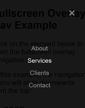
on the LG, the social media buttons float to the top left with the screen and the navigation menu comes down as a list, like this.
Demonstration number 1
Demonstration number 2
Demonstration number 3
Demonstration number 4
Demonstration number 5
On the S5, they list out like this...
Demonstration number 1 Demonstration number 2 Demonstration number 3 Demonstration number 4 Demonstration number 5
...which is identical to chrome, firefox, and IE11.
Other than that, the text toward the top is extremely tiny on the S5, which, again, is not the case on the LG. I don't know why they would be so different? I don't believe the resolution is significantly different?
The S5 is probably an inch and a half bigger than the LG.
I would like them to have the same effects as the LG on all different mobile devices.
This is my current CSS...
[Excess code removed by moderator. CSS is in the online page so no need to post it twice.]

 AdChoices