


Inspiring
August 6, 2017
Answered

box with border underneath a responsive image

  • August 6, 2017
  • 2 replies
  • 407 views

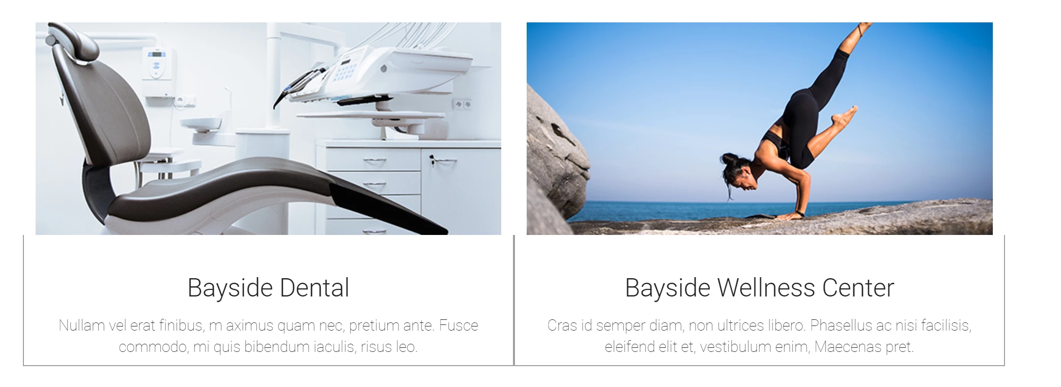
I'll try to word this question as best I can. I have a responsive image and directly underneath it (no gaps) is another box that text goes in. I want a border around that box. I've figured out the border part but the border doesn't line up with the image, it is larger. I think it's something simple but I've looked at all the max-width etc... and tried them to no avail. If you need further explanation feel free to ask. Thank you.

<div class="container">

   <div class="row">

     <div class="col-lg-6">

       <div class="row">

         <div class="col-lg-12"><img src="images/drpocket.jpg" alt="" width="570" height="260" class="center-block img-responsive"/></div>

         <div class="col-lg-12 border-top-0">


           <p class="text-center text-title-box"> Bayside Community Hospital </p>

           <p class="text-center"> Lorem ipsum dolor sit amet, consectetur adipisicing elit, sed do eiusmod tempor incididunt ut labore et dolore magna aliqua. </p>

         </div>

       </div>

     </div>

     <div class="col-lg-6">

       <div class="row">

         <div class="col-lg-12"><img src="images/Stethoscope pic.jpg" alt="" width="570" height="260" class="center-block img-responsive"/></div>

         <div class="col-lg-12 border-top-0">

           <p class="text-center text-title-box">Medical Clinics </p>

           <p class="text-center"> Aenean sollicitudin velit ut ante placerat, eget sodales mauris dapibus. Curabitur pulvinar congue dolor, et vulputate arcu.</p>

         </div>

       </div>

     </div>

   </div>

</div>

____________

.border-top-0 {

border: 1px solid #9F9F9F;

border-top: #FFFFFF;

max-width: 100%;

display:block;

}
    This topic has been closed for replies.
    Correct answer osgood_

    You're not using Bootstrap correctly. You don't need 'rows' within your cols. Bootstrap by default also puts padding on various containers, which is the extra width that you are seeing. Either use the Bootstrap method of creating panels or just code your own, as the example code below shows, theres less <div></divs> and less classes to confuse you:

    CSS

    .info-box {

    border: 1px solid #000;

    border-top: none;

    padding: 20px 0;

    }

    .info-box h3 {

    margin: 0;

    padding: 0 0 15px 0;

    text-align: center;

    }

    HTML

    <div class="container">

    <div class="row">

    <div class="col-lg-6">

    <img src="images/drpocket.jpg" alt="" class="center-block img-responsive">

    <div class="info-box">

    <h3>Bayside Community Hospital</h3>

    <p class="text-center"> Lorem ipsum dolor sit amet, consectetur adipisicing elit, sed do eiusmod tempor incididunt ut labore et dolore magna aliqua. </p>

    </div>

    <!-- end info-box -->

    </div>

    <!-- end col-lg-6 -->

    <div class="col-lg-6">

    <img src="images/Stethoscope pic.jpg" alt="" class="center-block img-responsive">

    <div class="info-box">

    <h3>Medical Clinics</h3>

    <p class="text-center"> Aenean sollicitudin velit ut ante placerat, eget sodales mauris dapibus. Curabitur pulvinar congue dolor, et vulputate arcu.</p>

    </div>

    <!-- end info-box -->

    </div>

    <!-- end col-lg-6 -->

       </div>

    <!-- end row -->

    </div>

    <!-- end container -->

    2 replies

    osgood_Correct answer
    Legend
    August 7, 2017

    You're not using Bootstrap correctly. You don't need 'rows' within your cols. Bootstrap by default also puts padding on various containers, which is the extra width that you are seeing. Either use the Bootstrap method of creating panels or just code your own, as the example code below shows, theres less <div></divs> and less classes to confuse you:

    CSS

    .info-box {

    border: 1px solid #000;

    border-top: none;

    padding: 20px 0;

    }

    .info-box h3 {

    margin: 0;

    padding: 0 0 15px 0;

    text-align: center;

    }

    HTML

    <div class="container">

    <div class="row">

    <div class="col-lg-6">

    <img src="images/drpocket.jpg" alt="" class="center-block img-responsive">

    <div class="info-box">

    <h3>Bayside Community Hospital</h3>

    <p class="text-center"> Lorem ipsum dolor sit amet, consectetur adipisicing elit, sed do eiusmod tempor incididunt ut labore et dolore magna aliqua. </p>

    </div>

    <!-- end info-box -->

    </div>

    <!-- end col-lg-6 -->

    <div class="col-lg-6">

    <img src="images/Stethoscope pic.jpg" alt="" class="center-block img-responsive">

    <div class="info-box">

    <h3>Medical Clinics</h3>

    <p class="text-center"> Aenean sollicitudin velit ut ante placerat, eget sodales mauris dapibus. Curabitur pulvinar congue dolor, et vulputate arcu.</p>

    </div>

    <!-- end info-box -->

    </div>

    <!-- end col-lg-6 -->

       </div>

    <!-- end row -->

    </div>

    <!-- end container -->

    Inspiring
    August 7, 2017

    Thank you both for the great responses! I tried both methods and they worked great. I ended up getting the panels to work out. Every time I log in I learn something new which can be fun and challenging. I think I was relying too much on split view and not focusing on the code itself. Thank you again for the support! I'm sure I will have more questions in the future.

    Nancy OShea
    Community Expert
    Community Expert
    August 6, 2017

    You might want to use Bootstrap Panels with or without Contextual Classes.  See screenshots.

    http://alt-web.com/Images/BS-context-cyborg.png

    http://alt-web.com/Images/BS-context-default1.png

    Nancy O'Shea— Product User & Community Expert