
Can't center an image in the browser
Hi there
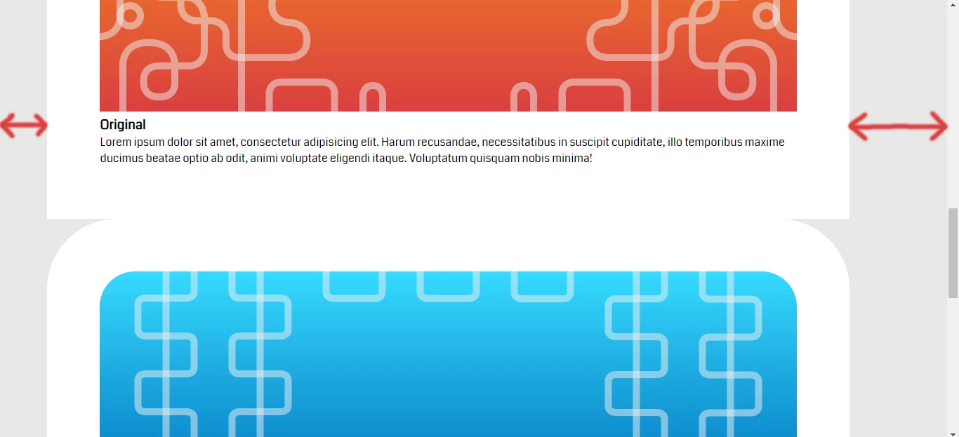
So it's been three days and i'm stuck trying to center an image with thick borders with a paragraph (View the 1st picture), i searched and watched tutorials but still when i try it out nothing changes...
Also i can't get it to work as a responsive element, the idea is to have a responsive website, but when shrink the browser's width, the image stays as it is, it doesn't shrink with it, i have a full width image in the top of the page that shrinks responsively, no problem, but this won't...
What am i doing wrong here? any suggestions? i'd appreciate some help!
HTML
<section id="showcase">
<div class="container">
<div class="box1">
<img src="img/Box1.jpg" alt="Original, Noimitation">
<h3>Original</h3>
<p>Lorem ipsum dolor sit amet, consectetur adipisicing elit. Harum recusandae, necessitatibus in suscipit cupiditate, illo temporibus maxime ducimus beatae optio ab odit, animi voluptate eligendi itaque. Voluptatum quisquam nobis minima!</p>
</div>
<div class="box2">
<img src="img/Box1.jpg" alt="Original, Noimitation">
<h3>Original</h3>
<p>Lorem ipsum dolor sit amet, consectetur adipisicing elit. Harum recusandae, necessitatibus in suscipit cupiditate, illo temporibus maxime ducimus beatae optio ab odit, animi voluptate eligendi itaque. Voluptatum quisquam nobis minima!</p>
</div>
</div>
</section>
CSS
#showcase{
justify-content:center;
}
#showcase .box1{
border-top-right-radius:100px;
border-top-left-radius:100px;
background-color:#FFFFFF;
padding:75px;
width:993px;
}
#showcase .box1 img{
border-top-right-radius:50px;
border-top-left-radius:50px;
width:100%;
height:100%;
}
#showcase .box1 p{
width:993px;

 AdChoices