If your layout is responsive for all devices, as it should be, vertically stacked would be expected on mobile devices. I don't understand the problem.
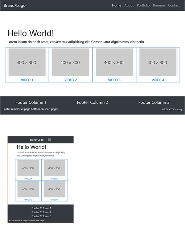
Below a Bootstrap 4 layout: 4 across on desktop, 2 across on tablet, vertically sacked on mobile.
<!doctype html>
<html lang="en">
<head>
<meta charset="utf-8">
<title>Bootstrap 4 with Flexbox</title>
<meta http-equiv="X-UA-Compatible" content="IE=edge">
<meta name="viewport" content="width=device-width, initial-scale=1">
<!--Bootstrap 4 CSS-->
<link href="https://maxcdn.bootstrapcdn.com/bootstrap/4.0.0-beta/css/bootstrap.min.css" rel="stylesheet" integrity="sha384-/Y6pD6FV/Vv2HJnA6t+vslU6fwYXjCFtcEpHbNJ0lyAFsXTsjBbfaDjzALeQsN6M" crossorigin="anonymous">
<style>
body { min-height: 100vh; padding-top:25vh;}
.flex-grow { flex: 1; }
</style>
</head>
<body class="d-flex flex-column">
<!--responsive navbar-->
<nav class="navbar navbar-dark navbar-expand-lg bg-dark justify-content-center fixed-top"> <a class="navbar-brand" href="#">Brand/Logo</a>
<button class="navbar-toggler" type="button" data-toggle="collapse" data-target="#navbarsExampleDefault" aria-controls="navbarsExampleDefault" aria-expanded="false" aria-label="Toggle navigation"> <span class="navbar-toggler-icon"></span> </button>
<div class="collapse navbar-collapse" id="navbarsExampleDefault">
<ul class="navbar-nav ml-auto">
<li class="nav-item active"> <a class="nav-link" href="#">Home <span class="sr-only">(current)</span></a> </li>
<li class="nav-item"><a class="nav-link" href="#">About</a></li>
<li class="nav-item"><a class="nav-link" href="#">Portfolio</a></li>
<li class="nav-item"><a class="nav-link" href="#">Resumé</a></li>
<li class="nav-item"><a class="nav-link" href="#">Contact</a></li>
</ul>
</div>
</nav>
<div class="container flex-grow">
<div class="row">
<div class="col">
<h1>Hello World!</h1>
<p>Lorem ipsum dolor sit amet, consectetur adipisicing elit. Consequatur dignissimos, distinctio.</p>
</div>
</div>
<div class="row text-center">
<div class="col-sm-6 col-md-3 border border-primary"><a href="#">
<img class="img-thumbnail" src="https://dummyimage.com/400x300">
VIDEO 1</a>
</div>
<div class="col-sm-6 col-md-3 border border-primary"><a href="#">
<img class="img-thumbnail" src="https://dummyimage.com/400x300">
VIDEO 2 </a>
</div>
<div class="col-sm-6 col-md-3 border border-primary"><a href="#">
<img class="img-thumbnail" src="https://dummyimage.com/400x300">
VIDEO 3 </a>
</div>
<div class="col-sm-6 col-md-3 border border-primary"><a href="#">
<img class="img-thumbnail" src="https://dummyimage.com/400x300">
VIDEO 4 </a>
</div>
</div>
</div>
<footer class="bg-dark text-white mt-4">
<div class="container-fluid py-3">
<div class="row">
<div class="col-md-4 text-center">
<h5>Footer Column 1</h5>
</div>
<div class="col-md-4 text-center">
<h5>Footer Column 2</h5>
</div>
<div class="col-md-4 text-center">
<h5>Footer Column 3</h5>
</div>
</div>
<div class="row">
<div class="col-md-6">
<small>Footer remains at page bottom on short pages.</small></div>
<div class="col-md-3"></div>
<div class="col-md-3 text-right small align-self-end"><small>©2018 XYZ Company</small></div>
</div>
</div>
</footer>
<!--latest jQuery Core-->
<script src="https://code.jquery.com/jquery-3.2.1.min.js" integrity="sha256-hwg4gsxgFZhOsEEamdOYGBf13FyQuiTwlAQgxVSNgt4=" crossorigin="anonymous"></script>
<!--Popper JS-->
<script src="https://cdnjs.cloudflare.com/ajax/libs/popper.js/1.11.0/umd/popper.min.js" integrity="sha384-b/U6ypiBEHpOf/4+1nzFpr53nxSS+GLCkfwBdFNTxtclqqenISfwAzpKaMNFNmj4" crossorigin="anonymous"></script>
<!--latest Bootstrap 4 JS-->
<script src="https://maxcdn.bootstrapcdn.com/bootstrap/4.0.0-beta/js/bootstrap.min.js" integrity="sha384-h0AbiXch4ZDo7tp9hKZ4TsHbi047NrKGLO3SEJAg45jXxnGIfYzk4Si90RDIqNm1" crossorigin="anonymous"></script>
</body>
</html>


 AdChoices