Measha06
Known Participant
June 9, 2017
Answered

Cannot associate color to background, the footer gets chopped off

  • June 9, 2017
  • 1 reply
  • 1830 views

I'm fairly new to Dreamweaver and have built an index page with bootstrap and have two issues.

  1. I cannot associate a colour to background - I have added an image but wanted to also add a colour so that on long pages it just goes on to colour rather than repeating image. No matter how I try I cannot get this to happen it just remains white once image passed.
  2. The bottom of the page the footer area gets chopped off short. There is a background image in a fixed container at the foot of the page and only the top tip of the image show when previewing yet I can see full image in split view in dreamweaver.

I would appreciate if somebody can direct me to resolve these issues as I don't whish to publish it until it is correct.

Thanks in advance

Liz

This topic has been closed for replies.
Correct answer Nancy OShea

Thanks for your help but I;m missing what you are saying and not understanding, I don't understand what you mean by HTML selector as the coding has been added to html index page document.  I dont have an html selector. Sorry I'm missing what you trying to tell me but I am very new to Bootstrap and quite new to Dreamweaver.

I have tried your trick on Chrome and the background is looking exactly as I wanted but when I zoom out the centre page holding the information shrinks too as I would assume it would


Looks to me like you're quite new to web design too because the html selector is nothing new.  It's at the very top of  every HTML page.   It's the parent of the <body> tag.

If you put the background on your html selector and not the body selector, it works.

Nancy

1 reply

BenPleysier
Community Expert
Community Expert
June 9, 2017

It is best to show your code, preferably by giving us the link to your site.

In its absence, have a look at this quick mock up. Paste the code in a new document and have a look at the result.

<!DOCTYPE html>

<html lang="en">

<head>

<meta charset="utf-8">

<meta http-equiv="X-UA-Compatible" content="IE=edge">

<meta name="viewport" content="width=device-width, initial-scale=1">

<title>Untitled Document</title>

<!-- Bootstrap -->

<link href="css/bootstrap.css" rel="stylesheet">

<!-- HTML5 shim and Respond.js for IE8 support of HTML5 elements and media queries -->

<!-- WARNING: Respond.js doesn't work if you view the page via file:// -->

<!--[if lt IE 9]>

   <script src="https://oss.maxcdn.com/html5shiv/3.7.2/html5shiv.min.js"></script>

   <script src="https://oss.maxcdn.com/respond/1.4.2/respond.min.js"></script>

  <![endif]-->

<style>

html {

  position: relative;

  min-height: 100%;

}

body {

  /* Margin bottom by footer height */

  margin-bottom: 60px;

  background: #807171 url('http://lorempixel.com/output/abstract-q-c-1920-530-6.jpg') top center no-repeat;

  color: white;

}

.footer {

  position: absolute;

  bottom: 0;

  width: 100%;

  /* Set the fixed height of the footer here */

  height: 60px;

  background-color: #f5f5f5;

}

/* Custom page CSS

-------------------------------------------------- */

/* Not required for template or sticky footer method. */

.container {

  width: auto;

  max-width: 680px;

  padding: 0 15px;

}

.container .text-muted {

  margin: 20px 0;

}

</style>

</head>

<body>

<div class="container">

  <h2>Some Heading</h2>

  <p>

  <span>Lorem ipsum dolor sit amet, consectetur adipisicing elit. Voluptatem asperiores saepe consequuntur sequi quo, tenetur reprehenderit. Temporibus tempore, perspiciatis quos obcaecati harum cum saepe in! Ullam error nemo, possimus recusandae!</span>

  <span>Ex, odio aperiam sed placeat, nam quaerat explicabo fuga sunt reprehenderit, enim optio itaque. Nobis at hic expedita debitis ad, suscipit sunt aperiam consectetur quod ut. Laborum a placeat nobis.</span>

  <span>Sapiente inventore odit obcaecati, odio, debitis rerum necessitatibus ipsum quaerat eveniet, est natus voluptate at impedit laudantium ratione, deleniti unde praesentium libero accusamus eius sit nam voluptas. Nemo, provident, eos.</span>

  <span>Nam placeat quisquam ratione pariatur consequatur consequuntur velit tenetur non sit ea, quaerat alias dolorem magnam enim ullam similique totam repellat temporibus quibusdam, inventore a vero blanditiis. Exercitationem, itaque, deleniti!</span>

  <span>Iure, vel. Dolorem, minima provident iure dignissimos enim expedita numquam pariatur voluptatum doloremque, saepe suscipit quasi similique velit modi nisi nam itaque quidem consectetur quos perspiciatis architecto reiciendis in! Natus.</span>

  <span>Possimus nisi quaerat non cum quis ipsam maiores consequuntur, blanditiis aut, similique doloribus, alias eius ad libero delectus officia quas quasi. Eligendi ad alias inventore. Adipisci fugit quidem sint nihil.</span>

  <span>Iste culpa consectetur, quam perspiciatis sequi cumque inventore praesentium rem quos architecto, numquam officia amet recusandae ipsa qui pariatur tempora animi repudiandae corrupti omnis voluptatibus voluptatum. A cum, doloribus recusandae.</span>

  <span>Cupiditate delectus doloribus, perspiciatis veritatis unde provident quam possimus saepe ipsam quae laudantium ipsa minima, et. Unde culpa doloremque necessitatibus ipsam odit enim sit eveniet nam explicabo, laboriosam, beatae impedit.</span>

  <span>Incidunt veniam laboriosam reprehenderit recusandae, ratione cum molestias laborum. Similique temporibus vitae tempora ab nam, nostrum qui quidem reprehenderit, quisquam nihil. Aut perspiciatis inventore ea doloremque nobis voluptate a voluptates.</span>

  <span>Possimus doloremque cumque maxime saepe, facilis libero. Voluptatum quos dolore laboriosam dolorum, temporibus doloremque aspernatur molestias repellat saepe natus quae dolorem, commodi totam asperiores placeat explicabo. Laudantium tempore obcaecati neque.</span>

  </p>

</div>

<footer class="footer">

  <div class="container">

  <p class="text-muted">Place sticky footer content here.</p>

  </div>

</footer>

<!-- jQuery (necessary for Bootstrap's JavaScript plugins) -->

<script src="js/jquery-1.11.3.min.js"></script>

<!-- Include all compiled plugins (below), or include individual files as needed -->

<script src="js/bootstrap.js"></script>

</body>

</html>

Wappler is the DMXzone-made Dreamweaver replacement and includes the best of their powerful extensions, as well as much more!
Measha06
Measha06Author
Known Participant
June 9, 2017

Hi this is the code for the page:-

<meta name="description" content="AD Design and Print offer a personal, professional, quality, affordable service for corporate stationery, social stationery, website design and hosting - recent addition self-publishing submissions.">

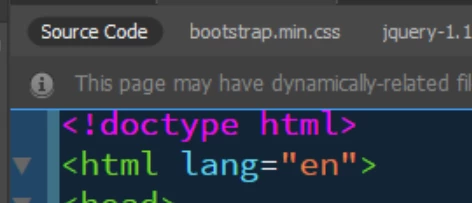
<!DOCTYPE html>

<html lang="en">

  <style type="text/css">

  body {

  background-image: url(images/ADBackgroundNew.png);

  background-repeat: no-repeat;

}

  a:link {

  color: #B265FF;

  text-decoration: none;

}

a:visited {

  text-decoration: none;

  color: #9D7E48;

}

a:hover {

  text-decoration: none;

  color: #9800CB;

}

a:active {

  text-decoration: none;

}

  </style>

<head>

    <meta charset="utf-8">

  <meta http-equiv="X-UA-Compatible" content="IE=edge">

  <meta name="viewport" content="width=device-width, initial-scale=1">

    <title>AD Design & Print|Overview Derbyshire Based Services</title>

    <!-- Bootstrap -->

  <link href="css/bootstrap.css" rel="stylesheet">

  <link href="css/addp.css" rel="stylesheet" type="text/css">

  <!-- HTML5 shim and Respond.js for IE8 support of HTML5 elements and media queries -->

  <!-- WARNING: Respond.js doesn't work if you view the page via file:// -->

  <!--[if lt IE 9]>

   <script src="https://oss.maxcdn.com/html5shiv/3.7.2/html5shiv.min.js"></script>

   <script src="https://oss.maxcdn.com/respond/1.4.2/respond.min.js"></script>

  <![endif]-->

</head>

  <body style="padding-top: 52px; max-height: 0px;">

  <nav class="navbar navbar-default navbar-fixed-top">

    <div class="container">

      <!-- Brand and toggle get grouped for better mobile display -->

      <div class="navbar-header">

        <button type="button" class="navbar-toggle collapsed" data-toggle="collapse" data-target="#topFixedNavbar1" aria-expanded="false"><span class="sr-only">Toggle navigation</span><span class="icon-bar"></span><span class="icon-bar"></span><span class="icon-bar"></span></button>

</div>

      <!-- Collect the nav links, forms, and other content for toggling -->

      <div class="collapse navbar-collapse" id="topFixedNavbar1">

        <ul class="nav navbar-nav">

          <li class="active"></li>

          <li></li>

          <li class="dropdown">

<ul class="dropdown-menu">

            <li><a href="#">Action</a></li>

              <li><a href="#">Another action</a></li>

              <li><a href="#">Something else here</a></li>

              <li role="separator" class="divider"></li>

              <li><a href="#">Separated link</a></li>

              <li role="separator" class="divider"></li>

              <li><a href="#">One more separated link</a></li>

            </ul>

          </li>

        </ul>

        <form class="navbar-form navbar-left" role="search">

          <div class="form-group"> </div>

</form>

        <ul class="nav navbar-nav navbar-right">

          <li><a href="#">Home</a></li>

           <li><a href="#">Contact Us</a></li>

          <li><a href="#">Corporate</a></li>

          <li><a href="#">Everything Web</a></li>

          <li><a href="#">Self-Publishing</a></li>

          <li class="dropdown"><a href="#" class="dropdown-toggle" data-toggle="dropdown" role="button" aria-haspopup="true" aria-expanded="false">Celebration Stationery<span class="caret"></span></a>

            <ul class="dropdown-menu">

              <li><a href="#">Wedding Stationery Items</a></li>

              <li><a href="#">FAQ</a></li>

              <li><a href="#">Wording Options</a></li>

              <li role="separator" class="divider"></li>

              <li><a href="#">Make Your Choices</a></li>

            </ul>

          </li>

        </ul>

      </div>

      <!-- /.navbar-collapse -->

    </div>

    <!-- /.container-fluid -->

  </nav>

<div class="container header-image"><img src="images/web_header1600.png" alt="" width="5000" height="947" class="img-responsive header-image"/></div>

  <div class="container band-hero">

    <div class="row">

      <div class="col-lg-12">

        <p class="text-justify">AD Design & Print was born in 1999. The driving force to its creation was small businesses wanting short print runs of a wide variety of print products and personal customers wanting unique creations, designed especially for them. The attributes that are associated with AD Design & Print are to provide excellent caring personal service, to be available at times convenient to the customer and to produce high quality items from superior quality materials at a price within the customers’ budget. These points bring our customers back through the decades from Weddings, through Christenings on to Anniversaries, we can even help at your sad times when you lose close family members. As you are travelling the path of life we can also assist with your Corporate Events, Charity balls, Fundraising Events – There is no occasion we cannot help with – Don’t be shy contact us.</p>

      </div>

    </div>

  </div>   

<div class="container band-services">

  <div class="row">

    <div class="col-lg-4">

      <div class="row">

        <div class="col-lg-12"><a href="#"><img src="images/Event_Stationery.png" alt="Handmade Celebration Stationery" width="1013" height="1013" class="img-responsive center-block"/></a></div>

        <div class="col-lg-12">

          <p class="text-center">Handmade Celebration Stationery</p>

        </div>

      </div>

    </div>

    <div class="col-lg-4">

      <div class="row">

        <div class="col-lg-12"><a href="#"><img src="images/Corporate_Stationery.png" alt="Corporate Stationery" width="1024" height="1024" class="img-responsive center-block"/></a></div>

        <div class="col-lg-12">

          <p class="text-center">Corporate Stationery & Advertising Media</p>

        </div>

      </div>

    </div>

    <div class="col-lg-4">

      <div class="row">

        <div class="col-lg-12"><a href="#"><img src="images/Responsive_Design.png" alt="Responsive Web Design, Build & Hosting" width="1019" height="1018" class="img-responsive center-block"/></a></div>

        <div class="col-lg-12">

          <p class="text-center">Web Design, Build & Host</p>

        </div>

      </div>

    </div>

  </div>

</div>

  <div class="container band-continuation">

    <div class="row">

     <div class="col-lg-12">

      <p class="text-justify">We highly recommend you surf the site, browsing everything we have to offer. Order a sample, this way you get to feel the quality in all its glory. Even if you want a bespoke design order a sample of any design to assure yourself of what quality and attention to detail you will receive for your design – we will still deduct the cost of the sample from bespoke orders. </p><p class="text-justify">Consider us an extension to your workforce or family, we are that extra pair of hands as and when you need us.</p>

    </div>

    </div>

</div>

  <div class="container band-footer">

    <div class="row">

      <div class="col-lg-4"></div>

      <div class="col-lg-4"></div>

      <div class="col-lg-4"></div>

    </div>

    <div class="row">

      <div class="col-lg-4"></div>

      <div class="col-lg-4"></div>

      <div class="col-lg-4"></div>

      <div class="row">

        <div class="col-lg-4"></div>

        <div class="col-lg-4"></div>

        <div class="col-lg-4"></div>

        <div class="row">

          <div class="col-lg-4"></div>

          <div class="col-lg-4"></div>

          <div class="col-lg-4"></div>

        </div>

      </div>

    </div>

    <div class="row">

      <div class="col-lg-4"></div>

      <div class="col-lg-4"></div>

      <div class="col-lg-4"></div>

      <div class="row">

        <div class="col-lg-12 text-center">

          Copyright &copy; 1981&ndash;

    <script type="text/javascript">

var today = new Date()

var year = today.getFullYear()

document.write(year)

</script> AD Design & Print<br>Designed & Developed by <a href="http://www.addesignandprint.co.uk" title="AD Design & Print" target="_blank">AD Design & Print</a> 01332 882022

        </div>

      </div>

    </div>


  <!-- jQuery (necessary for Bootstrap's JavaScript plugins) -->

  <script src="js/jquery-1.11.3.min.js"></script>

  <!-- Include all compiled plugins (below), or include individual files as needed -->

  <script src="js/bootstrap.js"></script>

  </body>

</html>

Then there is the bootstrap css sheet and also an additional css sheet which is as follows:-

@charset "utf-8";

.header-image {

  background-color: #FFFFFF;

}

.band-hero {

  background-color: #FFFFFF;

  padding-top: 50px;

  padding-bottom: 50px;

}

.band-services {

  background-color: EDE3F1;

  padding-top: 50px;

  padding-bottom: 50px;

}

.band-services {

}

.band-continuation {

  background-color: #FFFFFF;

  padding-top: 50px;

  padding-bottom: 50px;

}

.band-footer {

  background-color: #EDE3F1;

  background-image: url(../images/ADcurve.png);

  background-size: cover;

}

.navbar-default {

  background-color: rgba(178,101,255,0.83);

  border-color: #9800CB;

}

.navbar-default .navbar-text {

  color: #EDE3F1;

}

.navbar-default .navbar-nav > li > a {

  color:  #EDE3F1;

}

.navbar-default .navbar-nav > .active > a,

.navbar-default .navbar-nav > .active > a:hover,

.navbar-default .navbar-nav > .active > a:focus {

  color: #9800CB;

  background-color: #EDE3F1;

}

Does this help. As I say I haven't loaded the page yet until I have it all as I would like.

Measha06
Measha06Author
Known Participant
June 9, 2017

Also if I just do a coloured background to the footer container it seems to appear it is only when I put the background image in the container you only got top couple of mm to view. I have tried using several different versions of the image I want to use with different names and same thing happens. I have also removed the container and saved then put a new container back in and it still happens!