
Question
Coding two images side by side to be responsive
Hi guys,
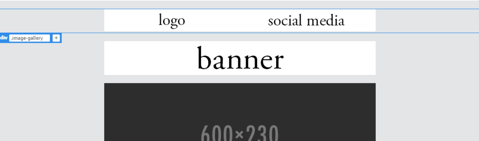
I'm struggling to fix two side by side images. I've tried different codes and div, tags but I can't seem to get them to stay on one line and also be responsive for smaller screens/mobile view.
The second image is what I want it to look line in mobile view, with both images on one line
CCS:
divimage-gallery img {
display: block;
float: static;
}
.clear {
clear: both;
height: auto;
max-width: 100%
line-height: 0;
}
and html:
<div class="image-gallery">
<img src="logo.jpg"/><img src="social media.jpg"/>
</div> 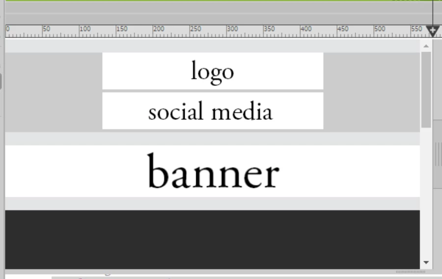
Thank you!

 AdChoices