<!DOCTYPE html>
<html lang="en">
<head>
<title>Bootstrap Example</title>
<meta charset="utf-8">
<meta name="viewport" content="width=device-width, initial-scale=1">
<link rel="stylesheet" href="https://maxcdn.bootstrapcdn.com/bootstrap/3.3.7/css/bootstrap.min.css">
<script src="https://ajax.googleapis.com/ajax/libs/jquery/3.1.1/jquery.min.js"></script>
<script src="https://maxcdn.bootstrapcdn.com/bootstrap/3.3.7/js/bootstrap.min.js"></script>
</head>
<body>
<div class="container">
<h1>Hello World!</h1>
<p>Resize the browser window to see the effect.</p>
<div class="row">
<div class="col-sm-8">
<div class="row">
<div class="col-sm-6"><img src="http://4arudp1mdn1e1owocm1o7kdf.wpengine.netdna-cdn.com/paradise/wp-content/uploads/sites/7/2013/05/room_3_room_page_2_big.jpg" class="img-responsive" alt="">
</div>
<div class="col-sm-6">
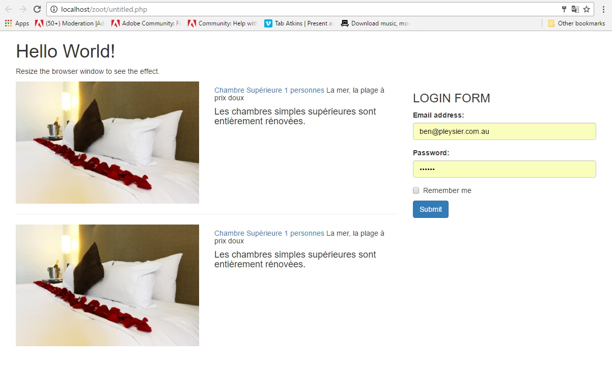
<h5><a href="#">Chambre Supérieure 1 personnes</a><span> La mer, la plage à prix doux</span></h5>
<h4>Les chambres simples supérieures sont entièrement rénovées.</h4>
</div>
</div>
<hr>
<div class="row">
<div class="col-sm-6"><img src="http://4arudp1mdn1e1owocm1o7kdf.wpengine.netdna-cdn.com/paradise/wp-content/uploads/sites/7/2013/05/room_3_room_page_2_big.jpg" class="img-responsive" alt="">
</div>
<div class="col-sm-6">
<h5><a href="#">Chambre Supérieure 1 personnes</a><span> La mer, la plage à prix doux</span></h5>
<h4>Les chambres simples supérieures sont entièrement rénovées.</h4>
</div>
</div>
</div>
<div class="col-sm-4">
<h3>LOGIN FORM</h3>
<form>
<div class="form-group">
<label for="email">Email address:</label>
<input type="email" class="form-control" id="email">
</div>
<div class="form-group">
<label for="pwd">Password:</label>
<input type="password" class="form-control" id="pwd">
</div>
<div class="checkbox">
<label><input type="checkbox"> Remember me</label>
</div>
<button type="submit" class="btn btn-primary">Submit</button>
</form>
</div>
</div>
</div>
</body>
</html>


 AdChoices