


divs not lining up in Dw CS6 responsive site
Hi, I so hope somebody can help!
I've been having a problem for ages with getting the divs into position in my Dw responsive layout.
I have tried everything with the code: display properties - margins; widths; whether a div starts on a new line or not - and I cannot see the problem behind why these divs won't line up.
I've attached a mockup of what the page should look like; a screenshot of what Dreamweaver is doing: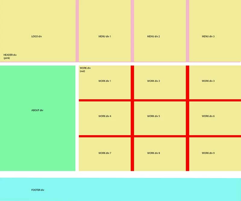
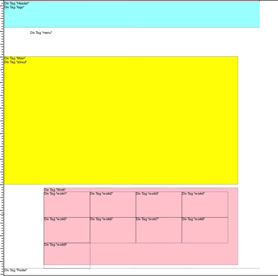
and here's the code:
/* Desktop Layout: 769px to a max of 1232px. Inherits styles from: Mobile Layout and Tablet Layout. */
@media only screen and (min-width: 769px) {
#----------------------desktop {}
.gridContainer {
width: 98.3333%;
max-width: 1232px;
padding-left: 0.8333%;
padding-right: 0.8333%;
margin: auto;
}
#Header {
clear: both;
float: left;
margin-left: 0;
width: 100%;
display: block;
}
#logo {
float: left;
margin-left: 0;
width: 15.2542%;
display: inline;
height: 100px;
}
#menu {
float: left;
margin-left: 10.1694%;
width: 83.0508%;
display: inline;
height: 100px;
clear: noneh;
}
#Main {
clear: both;
float: left;
margin-left: 0;
width: 91.5254%;
height: 500px;
}
#about {
float: left;
margin-left: 0;
width: 15.2542%;
/* [disabled]display: inline; */
height: 500px;
}
#Work {
float: right;
margin-left: 0;
width: 83.0508%;
/* [disabled]display: inline; */
background: pink;
}
#work1 {
float: left;
margin-left: 0;
width: 23.7288%;
display: table-row;
}
#work2 {
float: left;
margin-left: 0;
width: 23.7288%;
display: table-row;
}
#work3 {
float: left;
margin-left: 0;
width: 23.7288%;
display: table-row;
}
#work4 {
float: left;
margin-left: 0;
width: 23.7288%;
display: table-row;
}
#work5 {
float: left;
margin-left: 0;
width: 23.7288%;
display: table-row;
}
#work6 {
float: left;
margin-left: 0;
width: 23.7288%;
display: table-row;
}
#work7 {
float: left;
margin-left: 0;
width: 23.7288%;
display: table-row;
}
#work8 {
float: left;
margin-left: 0;
width: 23.7288%;
display: table-row;
}
#work9 {
float: left;
margin-left: 0;
width: 23.7288%;
display: table-row;
}
#Footer {
clear: both;
float: left;
margin-left: 0;
width: 100%;
display: block;
}
}

 AdChoices