Hosun
Inspiring
July 24, 2019
Answered

flex-basis and width
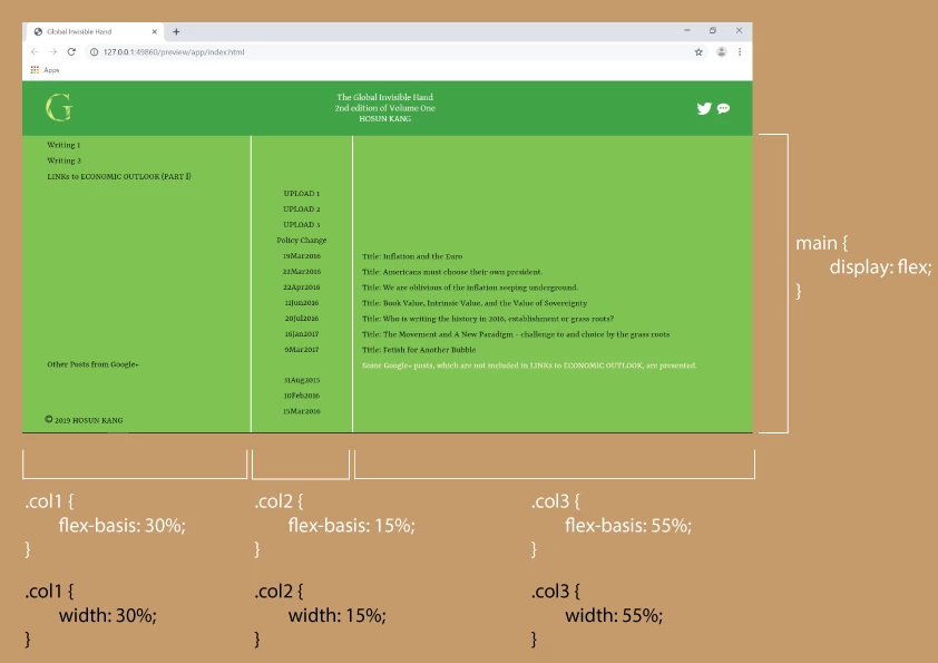
  • July 24, 2019
  • 2 replies
  • 977 views

Hi,

Currently, my work has

main {

          display: flex;

}

.col1 {

           flex-basis: 30%;

}

.col2 {

           flex-basis: 15%;

}

.col3 {

          flex-basis: 55%;

}

If I replace flex-basis with width, is there any difference?

Global Invisible Hand

Hosun Kang

This topic has been closed for replies.
Correct answer osgood_

Hosun  wrote

Hi,

Currently, my work has

main {

          display: flex;

}

.col1 {

           flex-basis: 30%;

}

.col2 {

           flex-basis: 15%;

}

.col3 {

          flex-basis: 55%;

}

If I replace flex-basis with width, is there any difference?

Global Invisible Hand

Hosun Kang

No, there is no difference. The formatting will remain the same. There may be ocassions where flex-basis has some advantages (although I dont specifically know that to be true) but as you're specifying a percentage width for each column there will be none in this instance.

Read more here

https://gedd.ski/post/the-difference-between-width-and-flex-basis/

From what I can deduce px width is used but since I rarely if ever use px width I have never encountered issues with either specifying a column percentage width  using flex-basis or width.

2 replies

pziecina
Legend
July 24, 2019

If you are using % or px values you are in effect setting to a specific value, (be that of the viewport of actual) which negates the 'flex' in flexbox.

If however you use a keyword like 'auto' you are setting the flex-basis to be dependant on the content, and available space for the container, as opposed to a given proportion. Once you start using the other flex properties such as 'grow' and 'shrink' you can then tell flexbox to grow or shrink the flexbox child element to fit, (or fill) the available viewport no matter what size. By using wrap, you can also tell it the 'how' of wanting the document to flow.

Just as a note, you should use the shorthand 'flex' property, as the individual properties are mainly for exeptions to the flex, and not the entire container.

see -

https://www.w3.org/TR/css-flexbox-1/#flex-common

osgood_Correct answer
Legend
July 24, 2019

Hosun  wrote

Hi,

Currently, my work has

main {

          display: flex;

}

.col1 {

           flex-basis: 30%;

}

.col2 {

           flex-basis: 15%;

}

.col3 {

          flex-basis: 55%;

}

If I replace flex-basis with width, is there any difference?

Global Invisible Hand

Hosun Kang

No, there is no difference. The formatting will remain the same. There may be ocassions where flex-basis has some advantages (although I dont specifically know that to be true) but as you're specifying a percentage width for each column there will be none in this instance.

Read more here

https://gedd.ski/post/the-difference-between-width-and-flex-basis/

From what I can deduce px width is used but since I rarely if ever use px width I have never encountered issues with either specifying a column percentage width  using flex-basis or width.