Full Screen Responsive Background Image Bootstrap
Hello,
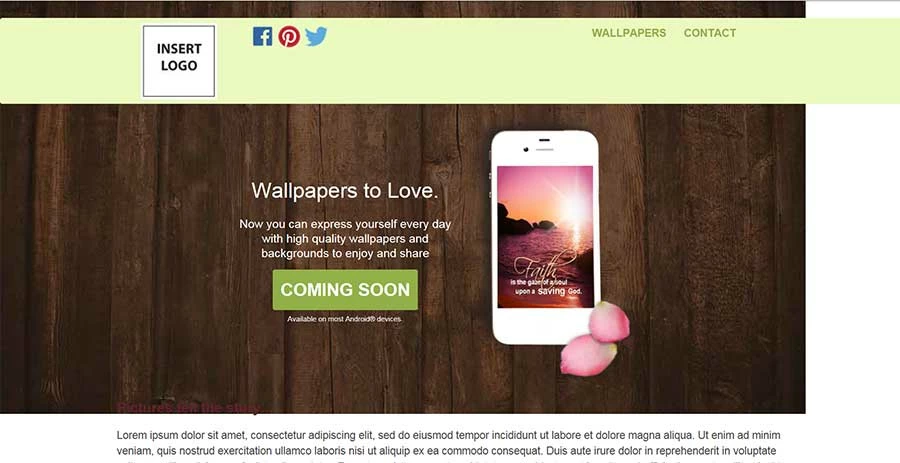
I've been working all day trying to get a background image to properly render in a Bootstrap project. I've tried .container-fluid, moving the location of the image, creating different classes and assigning it to various elements... nothing works. So here I am... I hope someone can help!
As you can see from the screenshot, the nav bar goes beautifully edge to edge with the content within the center. I want the background image to do the same but as you can see, it appears to start at the left and stop when it stops. The image is 1366x700px. I'm resisting the urge to simply create a bigger image because I want it to be responsive.
Here's my HTML but it's a mess.
<body>
<div class="container_fluid"><br>
<div class="wrapper">
<!-- START HEADER -->
<header>
<nav class="navbar navbar-default">
<div class="container">
<!-- Brand and toggle get grouped for better mobile display -->
<div class="navbar-header">
<button type="button" class="navbar-toggle collapsed" data-toggle="collapse" data-target="#bs-example-navbar-collapse-1" aria-expanded="false">
<span class="sr-only">Toggle navigation</span>
<span class="icon-bar"></span>
<span class="icon-bar"></span>
<span class="icon-bar"></span>
</button>
<!-- ORIG BOOT STRAP
<a class="navbar-brand" href="#">Brand</a>>
</div> -->
<!-- MINE -->
<a class="navbar-brand"></a><img src="images/insert-logo-image.jpg" width="130" height="130">
<span class"socialIcons"><img src="images/social_icons.png" alt="Join our Community!"></span>
</div>
<!-- Collect the nav links, forms, and other content for toggling -->
<!-- DISABLE THIS LINK STYLE
<div class="collapse navbar-collapse" id="bs-example-navbar-collapse-1">
<ul class="nav navbar-nav">
<li class="active"><a href="#">Link <span class="sr-only">(current)</span></a></li>
<li><a href="#">Link</a></li> -->
<!-- DISABLE DROPDOWN LINKS
<li class="dropdown">
<a href="#" class="dropdown-toggle" data-toggle="dropdown" role="button" aria-haspopup="true" aria-expanded="false">Dropdown <span class="caret"></span></a>
<ul class="dropdown-menu">
<li><a href="#">Action</a></li>
<li><a href="#">Another action</a></li>
<li><a href="#">Something else here</a></li>
<li role="separator" class="divider"></li>
<li><a href="#">Separated link</a></li>
<li role="separator" class="divider"></li>
<li><a href="#">One more separated link</a></li>
</ul>
</li>
</ul> -->
<!-- NOT USING THE SEARCH OR OTHER FORM FEATURES
<form class="navbar-form navbar-left" role="search">
<div class="form-group">
<input type="text" class="form-control" placeholder="Search">
</div>
<button type="submit" class="btn btn-default">Submit</button>
</form> -->
<ul class="nav navbar-nav navbar-right">
<li><a href="#">WALLPAPERS</a></li>
<li><a href="#">CONTACT</a></li>
<!-- DISABLED DROPDOWN LINKS
<li class="dropdown">
<a href="#" class="dropdown-toggle" data-toggle="dropdown" role="button" aria-haspopup="true" aria-expanded="false">Dropdown <span class="caret"></span></a>
<ul class="dropdown-menu">
<li><a href="#">Action</a></li>
<li><a href="#">Another action</a></li>
<li><a href="#">Something else here</a></li>
<li role="separator" class="divider"></li>
<li><a href="#">Separated link</a></li>
</ul> -->
</ul>
</div><!-- /.navbar-collapse -->
<!-- <div container-fluid -->
</nav>
</header>
<div class="container">
<div class="row">
<div class="block-wrapper">
<div class="left">
<div class="text-block">
<h1>Wallpapers to Love.</h1>
<p>Now you can express yourself every day with high quality wallpapers and backgrounds to enjoy and share</p>
<button type="button" class="btn btn-primary">COMING SOON</button>
<p><span class="fineprint">Available on most Android® devices.</span></p>
</div>
</div>
<!-- end left -->
<div class="right"><img src="images/wallpapers_on_phone_2.png" width="284" height="468"> </div>
<!-- end right -->
</div> <!-- ends block-wrapper -->
</div> <!--ends bootstrap row-->
</div> <!-- ends container -->
<!-- end bootstrap container -->
<!--<div class="col-md-7">
<h1>Wallpapers You'll Love!</h1>
<p>Now you can express yourself every day with high quality wallpapers and backgrounds to enjoy and share. They're free!</p>
<button type="button" class="btn btn-primary">COMING SOON</button>
<p>Available on most Android devices.</p>
</div>
<div class="col-md-5"><img src="images/wallpapers_on_phone_2.png" width="284" height="468" alt="Christ-honoring Wallpapers to build your faith"></div>
</section> -->
</div>
</header>
<!-- MY MAIN CONTENT AREA -->
<div class="container">
<section id="mainContent">
<h2>Pictures tell the story...</h2>
<p>Lorem ipsum dolor sit amet, consectetur adipiscing elit, sed do eiusmod tempor incididunt ut labore et dolore magna aliqua. Ut enim ad minim veniam, quis nostrud exercitation ullamco laboris nisi ut aliquip ex ea commodo consequat. Duis aute irure dolor in reprehenderit in voluptate velit esse cillum dolore eu fugiat nulla pariatur. Excepteur sint occaecat cupidatat non proident, sunt in culpa qui officia deserunt mollit anim id est laborum.</p>
<h2>Wallpapers you'll love!</h2>
<p>Enjoy wallpapers by theme, including:</p>
<ul>
<li><a href="#">Wallpaper 1</a></li>
<li><a href="#">Wallpaper 2</a></li>
<li><a href="#">Wallpaper 3</a></li>
<li><a href="#">Wallpaper 4</a></li>
</ul>
<p>...and we're working hard on new wallpapers for you all the time!</p>
<h2>Beautiful and Easy to Use</h2>
<p>Lorem ipsum dolor sit amet, consectetur adipiscing elit, sed do eiusmod tempor incididunt ut labore et dolore magna aliqua. Ut enim ad minim veniam, quis nostrud exercitation ullamco laboris nisi ut aliquip ex ea commodo consequat. Duis aute irure dolor in reprehenderit in voluptate velit esse cillum dolore eu fugiat nulla pariatur. Excepteur sint occaecat cupidatat non proident, sunt in culpa qui officia deserunt mollit anim id est laborum.</p>
<p>Advertising statement <a href="privacy.htm">Privacy Policy</a> </p>
<h2>We love our users!</h2>
<p>Lorem ipsum dolor sit amet, consectetur adipiscing elit, sed do eiusmod tempor incididunt ut labore et dolore magna aliqua. Ut enim ad minim veniam, quis nostrud exercitation ullamco laboris nisi ut aliquip ex ea commodo consequat. Duis aute irure dolor in reprehenderit in voluptate velit esse cillum dolore eu fugiat nulla pariatur. Excepteur sint occaecat cupidatat non proident, sunt in culpa qui officia deserunt mollit anim id est laborum.</p>
<p>Review us? </p>
<p> </p>
</section>
</div>
<!-- CLOSE WRAPPER and FLUID CONTAINER -->
</div>
</div>
<!-- START BOOTSTRAP STICKY FOOTER
<footer class="footer">
<div class="container_fluid">
<div class="col-md-4"><img src="images/insert-logo-image.jpg"></div>
<div class="col-md-8">
<p>Visit our Google Play page</p>
<p>Wallpapers</p>
<p>Terms of Use</p>
<p>Privacy</p>
<p>Permissions & Credits</p>
<p>Contact</p>
<p>Catch a Secret</p>
</div>
<!-- CLOSE FOOTER CONTAINER -->
</footer>
</div> -->
<!-- CLOSE OUTER CONTAINER -->
</div>
<!-- ORIGINAL BOOTSTRAP HELLO WORLD <div class="container-fluid"><h1>Hello, world!</h1>
</div> -->
<!-- jQuery (necessary for Bootstrap's JavaScript plugins) -->
<script src="https://ajax.googleapis.com/ajax/libs/jquery/1.11.3/jquery.min.js"></script>
<!-- Include all compiled plugins (below), or include individual files as needed -->
<script src="js/bootstrap.min.js"></script>
</body>
 AdChoices