Answered
hamburger menu
Hi,
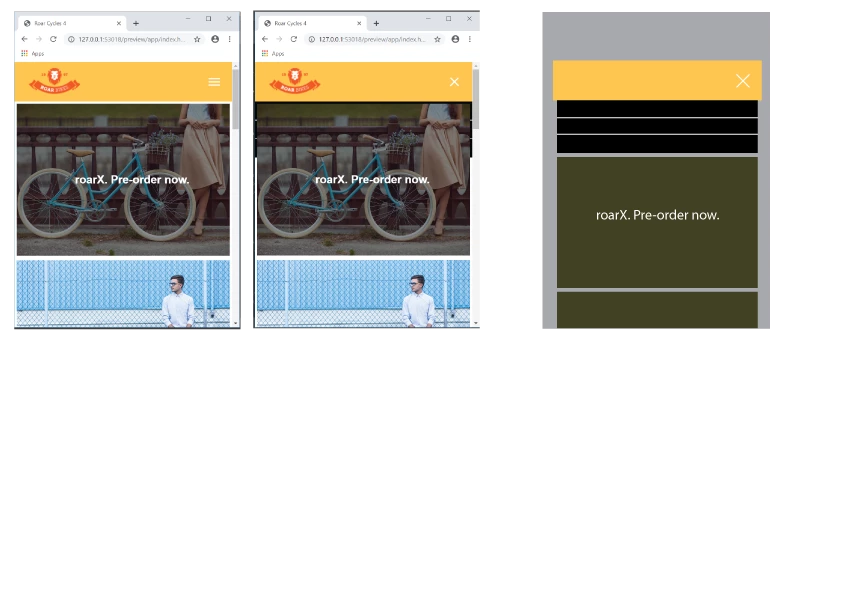
When the hamburger menu is clicked, the dropdown menu appears behind the photo.
How can I present it like the third picture?
Link
Hosun Kang


Hi,
When the hamburger menu is clicked, the dropdown menu appears behind the photo.
How can I present it like the third picture?
Link
Hosun Kang
Hosun wrote
Hi,
When the hamburger menu is clicked, the dropdown menu appears behind the photo.
How can I present it like the third picture?
Link
Hosun Kang
Remove class="logo" from the image src tag, its never needed.
<img class="logo" src="images/logo.png" alt="Roar Bikes logo">
For the mobile nav positioning you have to do a bit of re-organising at @media screen and (max-width: 500px) { }
Add to the 500px media query:
header {
flex-direction: column;
padding: 0;
}
.logo {
width: 100%;
padding: 10px 30px;
}
Also change your .site-nav css to as below for the 500px media query;
.site-nav {
width: 100%;
position: static;
display: none;
background-color: black;
padding: 0px 0px 0px 0px;/*alignment*/
}
position: static; re-connects the element to the natural flow of the html and pushes what is below it, the image, down when the hamburger menu is clicked. position: absolute; removes the element from the natural html flow therefore it is un-connected to the other elements around it, which is suitable for your dtp view.
Add margin-top: 30px; to your .hamburger-icon css for the 500px media query:
.hamburger-icon {
padding: 0.65em 0.35em;
position: absolute;
right: 1em;
cursor: pointer;
margin-top: 30px;
}
Already have an account? Login
No account yet? Create an account
Enter your E-mail address. We'll send you an e-mail with instructions to reset your password.

 AdChoices